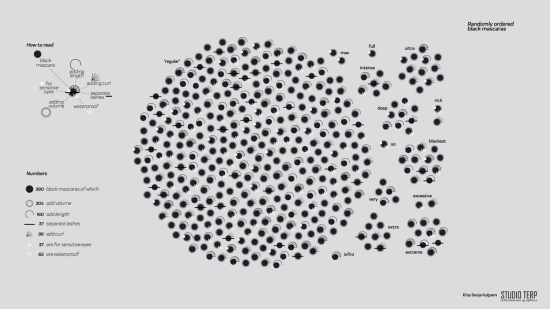
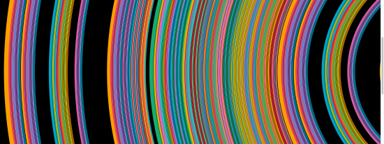
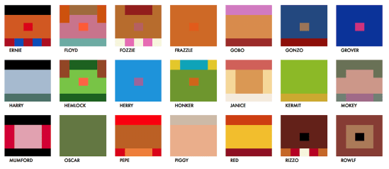
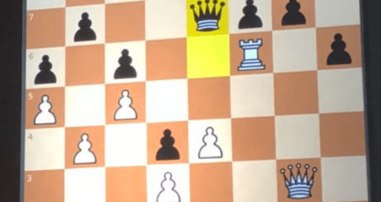
Here are some of my favourite visualisations of 2018. Many, if not all of them have influenced me in some way. I haven’t been keeping track through the year, so I have a horrible feeling I’ll publish this post and then realise something I should’ve included, but that would mean including it at the expense […]
Author: Neil
What (else) are Data Portraits?
I came across another different use of the term Data Portraits after I completed my online badges and blog posts for the Data Portraits and presented on them last month. On searching for the term I came across the work of W.E.B. Du Bois at the turn of the century. Du Bois composed a series […]
Which chart types are most engaging?
Before you skim down or look for a summary of my response to this particular dataviz question, I’m not even going to try and answer this question. I will at least discuss it though in the context of a recent project I created. First of all, here are two similar but different outputs of the […]
What are Data Portraits?
Yesterday I was invited to talk at the Northwest Tableau User Group in Manchester. I was delighted to accept, not least to support the co-organisers: Ella Worsdale, Lorna Eden, and Colin Wojtowicz – a freelance data visualisation and analyst trading as Datawoj Ltd. It quickly occurred to me that I could re-present my recent Tableau Conference talk […]
What are my follow-up actions from #TC18?
The last week has been the overload of presentations, participation and socialising that is the annual Tableau Conference – ubiquitously known as #TC18. As 17000 people descended on New Orleans it represented an amazing opportunity to learn, meet new and existing friends and be inspired for the future. And, what an amazing city to host […]
How do we visualise music?
This post follows on from my recent entry to the latest Tableau IronViz feeder competition. The brief – build a viz in Tableau that “somehow touches on the theme of water”. I decided to take the tangential approach: Handel’s Water Music I’d been interested in looking at how we could visualise music for a while, […]
When are multiple visualisations better than one?
This post is partly inspired by a recent post from Ben Jones explaining his love for dot plots here. Like Ben, I do enjoy dot plots, and it got me thinking that it would be good to go back to basics from the point of view of a data visualisation blog: when was the last […]
Haven’t I seen this somewhere before?
This post is thinking about those situations where you produce a visualisation that looks remarkably like another visualisation, whether that was the intention or not. It’s a hot topic, and with so many people entering the field it’s an issue that comes up more and more often. I think there are three separate situations that […]
How do you go about competitive data visualising?
It’s been a while since my last post (for me, anyway). Partly because I’ve been busy, and partly because I’ve been procrastinating a bit. The usual kind of reasons. But another key reason is that I had a half-written blog post which hasn’t really been going anywhere. So this represents a bit of a re-write […]