This post is partly inspired by a recent post from Ben Jones explaining his love for dot plots here. Like Ben, I do enjoy dot plots, and it got me thinking that it would be good to go back to basics from the point of view of a data visualisation blog: when was the last time I wrote about a particular chart type? With that in mind, what visualisation type is my particular favourite – if I were to do a post on the advantages of a particular chart type I love, what would it be?
And then the more I thought about it, the more I realised that though I may not particularly favour one chart type over another, one thing I do lean towards is the small multiple chart type. You probably know that the small multiple visualisation type was coined, or at least popularised, by Edward Tufte, and is also known as a trellis chart, a panel chart or a lattice chart (among others). They represent a great way of comparing values across a discrete dimension which otherwise brings confusion or clutter, by showing each slice of data repeatedly in an individual chart. Here are four situations in which I like to use them:
- Showing data change over time
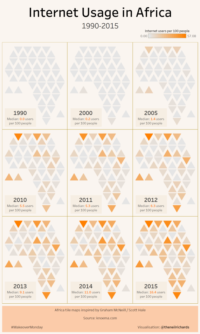
Geographical data is notoriously difficult to show over time, since the x and y axes are, by definition, used for longitude and latitude: there’s no obvious candidate for depicting time. Here, small multiple charts are an ideal solution. It doesn’t just have to be a traditional map: this example of mine is a good use case.
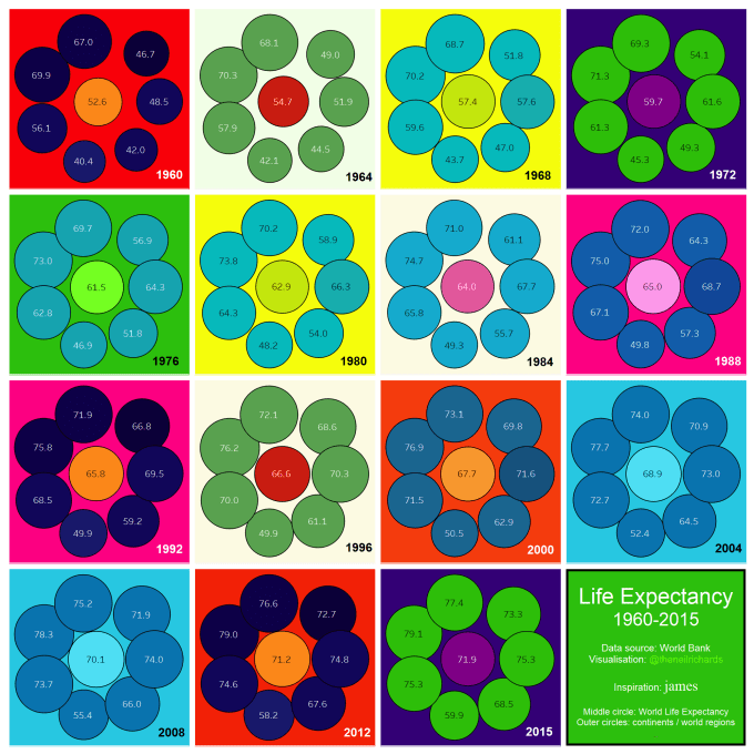
It doesn’t just have to be geographical data – other data types can also be sliced in the same way – if your x and y axes are already used and you don’t intend to make an animated visualisation: this example is a similar non-standard example comparing identically laid out charts over time.
Small multiples don’t have to be squares, but I do have a personal aesthetic preference for a square number of multiples if possible. If you don’t have the exact number of groupings, then a creative use of extra tiles (such as using for a title, legend or annotation, like above) can be a cannny alternative.
2. Showing differences across other measures:
The below chart shows the 100 companies depicted in the visualisation in a pre-determined order 1-100 in overall rating. Knowing the pre-determined order of individual visualisations allows us to “look up” our version of choice. This numbered ranking means that we can see any trends in the data should there be any from high to low overall rating (although, in this case, we don’t see any)

3. Showing differences across ordered categories
It could be that the dimension for comparison and “slicing” is a discrete categorical dimension that isn’t numeric. In these cases, it makes sense to order the small multiples in an order which makes each category easier to “look up”. This will not show trends, so much (you wouldn’t expect countries to show alphabetical trends), but will allow for easy comparison. First of all, we show countries in alphabetical order
4. Showing small identically-formatted visualisations in pleasing visual format
Finally, the links, trends or comparisons may not be obvious at all , but it can still be the case that small multiple visualisations simply look good.
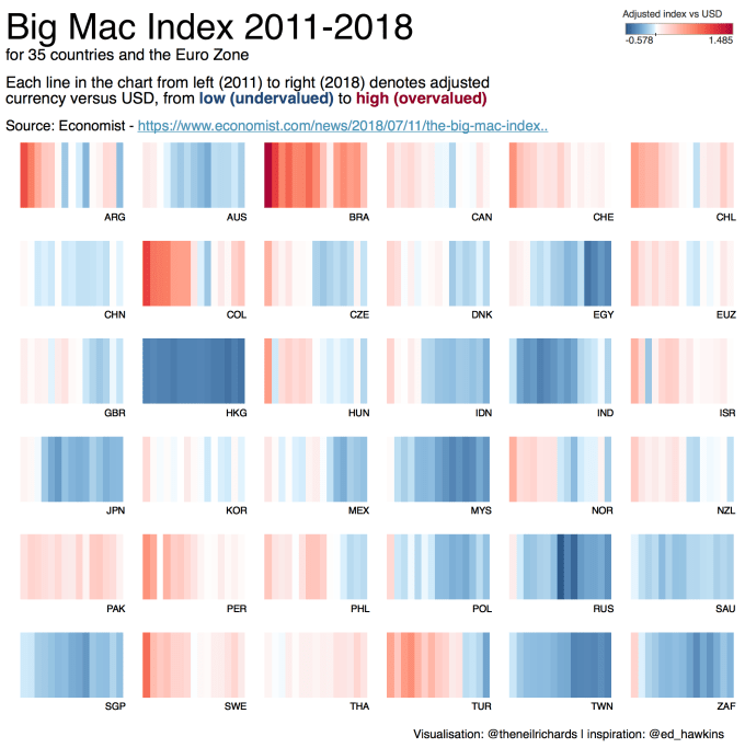
This category is not dissimilar to the one above, but this is less about showing trends, similarities or differences, but simply making comparisons in a fun format which looks good, pleasing and geometric. Below is a somewhat “meta” square small multiple of square small multiples, to display my recent so-called Minimalist Trilogy.


The key point that links these visualisations and all the above, apart from the fact that interactive full-screen versions of all of them can be seen on my Tableau Public profile, are the consistent formatting of individual visualisations within the grid, and the use of enough white space to look appealing. In all cases, each individual chart needs to be readable enough on its on merits given the smaller scale in which it’s displayed.

3 Comments