Here are some of my favourite visualisations of 2018. Many, if not all of them have influenced me in some way. I haven’t been keeping track through the year, so I have a horrible feeling I’ll publish this post and then realise something I should’ve included, but that would mean including it at the expense of one of the ten I’ve chosen (which has increased to twelve already in the course of writing this). Since it’s impossible to include all the great work from this year in data visualisation, or even in my smaller Neil-sized bubble within it, this list will have to remain both subjective and selective. On with the charts – in no particular order:
1. Nicholas Rougeux – Discovering the Elements

Sneaking in because it was published on January 14th 2018, this caught my eye the moment I saw it. I’ve mentioned it on more than one occasion in this blog: it’s an inspiration for curvy timelines and (very) minimalist text labelling, as well as for the poster art visualisation type. You can find this, along with the rest of his amazing work, at his blog right here.
2. Sonja Kuijpers – Keuzestress
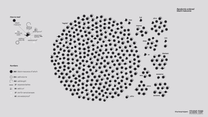
I know nothing about mascara and since I’m not a consumer, I have no real interest in it. So why do I keep coming back to this collection of visualisations from Sonja? This really helped to re-spark my interest in visualising “small data”, the similarities quirks and differences between every individual datapoint there for all to see in individual form. On Sonja’s Studio TERP website she visualises it in both ordered and random fashion, if that’s more your thing. Any visualisation which visualises a subject you don’t share an interest in, but which keeps drawing you back, can only be good!
3. Alli Torban – Women of Data Viz
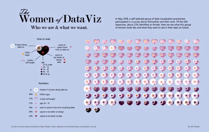
It would be remiss of me not to include this visualisation by Alli Torban – she was also inspired by the Keuzestress visualisation to make her own fantastic Tableau Public viz in similar style. Alli interviewed Sonja and spoke about her process in the Data Viz Today Podcast – if this was a Top Podcasts of 2018 (which it isn’t), then her podcast would be right up there at the top. The visualisation was an amazing example of how to take inspiration and create something, via a different medium, every bit as eye-catching and informative as the original.
4. Valentina d’Efilippo – MeTooMentum
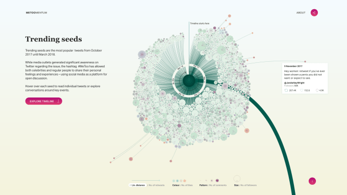
I’m a huge fan of Valentina’s work and I must confess I had this slot reserved for the magnificent Oddityviz collection until I realised that was produced in 2017. It only took me a few nanoseconds to replace with this project instead. Data visualisation covers everything from the frivolous to the serious and this represented a captivating way to represent the momentum of the #metoo hashtag which was such an important social “event” of 2018. Produced in scrollytelling style, it’s much better viewed on the MeTooMentum website rather than this static screenshot.
5. Frederica Fragapane – Stories behind a line
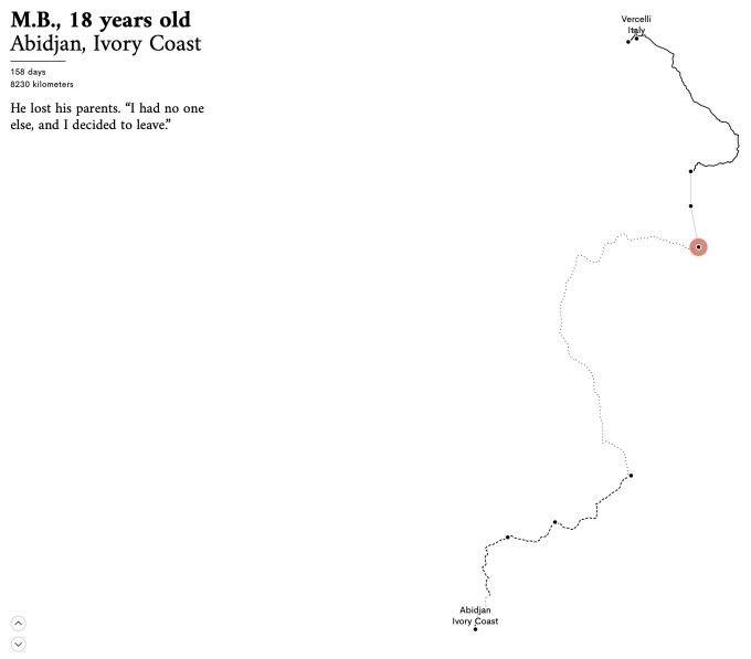
Minimalist to the extreme, but that’s very much the intention. The story of a handful of asylum seekers’ journeys to Italy are told with a single line each and just a short annotation. I was lucky enough to meet Federica, the artist, as she presented this project at the catchily-titled European Data and Computational Journalism Conference in Cardiff this year. I’m sure that being lucky enough to hear a presentation of the process and emotion behind a given talk makes a great addition to the overall experience and adds to one’s appreciation. It’s a viz that I often consider when I’m deciding on the process of how much annotation is required and how much “white space” it’s appropriate to leave, and therefore featured prominently in my talk at the Tableau Europe Conference this summer. See the full visualisation here
6. Chris DeMartini – Word Girl
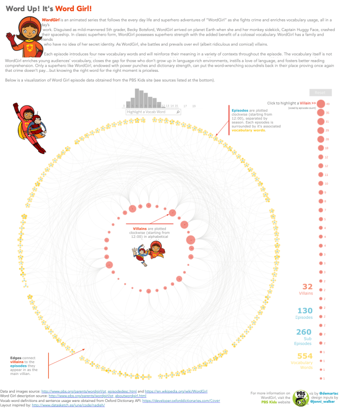
It turns out this is nothing to do with Scritti Politti’s 1985 hit, but refers to an educational US children’s TV show. This feels like it has slipped under the radar somewhat in the Tableau world, not just because it is so good, but because of the technical skill behind it and the full explanation given in the datablick blog post behind it. It represents and explains a technique which opens up a whole new way of working in Tableau. I’m pretty sure it’s the method behind two more equally stunning Tableau works this year: Adam McCann’s amazing Bruce Springsteen visualisation, and Ludovic Tavernier’s phenomenal Iron Viz entry from this year’s Tableau Conference. It’s a post and a visualisation I keep coming back to and deserves to be better known about.
7. Ludovic Tavernier – the amazing letter “e”
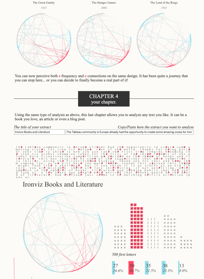
I wanted to include Ludovic’s Iron Viz final entry (mentioned above) in my top ten, but one entry is enough, and I wanted to included this visualisation too. The entry that got Ludovic onto stage, it’s a long form viz packed full of imagination and skill, from a talented guy for whom English isn’t even his first language! I don’t remember ever seeing such a stand-out candidate before from a feeder competition. The above snippet is just part of the final viz which can be seen in its entirety here. It’s been an amazing year for Ludovic and I look forward to seeing more in 2019 and beyond!
8. Klaus Schulte – Deconstructing the Big Mac Index
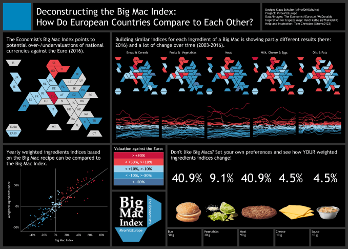
Trapezium tile maps, need I say more! Not to everyone’s taste but I think they work so well for Europe. Klaus created this (with some data prep help behind the scenes) in 20 minutes on stage in front of 2000 people in London. I love the risk he took going with an unfamiliar map type, and I love even more that he did it well enough that he won the whole thing (though the standard of all entries was amazingly high). I feel like it validated my love for tile maps, as blogged about quite extensively a year or so back. Great work from Klaus, one of many I could’ve chosen from a hugely talented visualiser to have hit the scene this year. Check out the interactive version here.
9. Ivett Kovacs – Gender & Ethnic Disparities in Tech companies
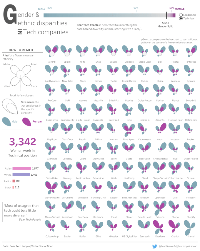
This is a beautiful and important visualisation which has been hugely influential on my own work and that of many others. So many people have been inspired to consider how to create flower charts, other polygon types, and similar quadrant charts. It was the chart I was most asked about at the Tableau Conference where it rightly held pride of place in the physical Viz Gallery. And, of course, a perfect square example of where a trellis/small multiple chart is a great consideration for comparing individual elements (in this case corporations). The interactive version on Tableau Public can be found here
10. Bloomberg – How America uses its land
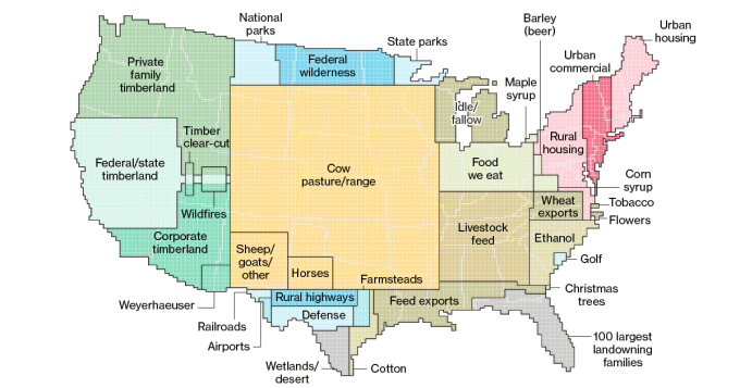
Here’s a map visualisation from this year that you either loved or hated. I loved it. If you’re a purist then it breaks all the rules because it confuses the brain into thinking that all of Florida is owned by landowners and all of Maine is urban housing. But to me it’s a perfect example of a viz that’s not supposed to be consumed in seconds, but studied with intelligence to see the true visualisation. We are so often asked to compare a size of, say, cleared rainforest to “the size of Wales” or “the size of Belgium” (forgive Euro-centric examples to explain a US map). This does it for us. And it won an Information is Beautiful award too, with a write-up on their website that mentions how refreshing it is to see a US map that is non-partisan. Amen to that!
11. Giorgia Lupi – Bruises – the data we don’t see
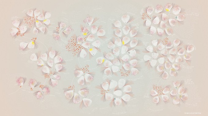
I’ve mentioned here how meeting Giorgia this year and attending her presentation in New Orleans was a huge highlight to me. This astonishing visualisation was presented and included in this talk, but in animated form featuring the guitar playing of Kaki King. I can’t really do this justice in a sentence or two here other than to urge you to see the full story behind the visualisation, along with the animated version featuring Kaki’s music, on Giorgia’s site here. The emotional reaction of many in the room, myself included, showed the true power that a visualisation can bring when combined with empathy in the hands of the master of data humanism.
12. Sophie Sparkes – inspiration by a thousand conversations
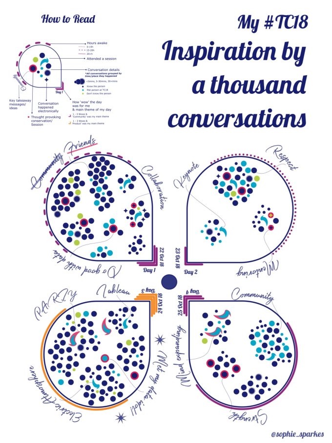
Finally, a beautiful visualisation by Sophie Sparkes. Following an intense week of Tableau in theory and practice, the standout visualisation for me which followed the conference earlier this year was this hand-crafted creation. Inspired, like me, by Giorgia, but, unlike me, using artistic talent, Sophie blew me and many away with the simplicity and creativity of this visualisation relying on self-collected data and displayed in the way that Giorgia and Stephanie Posavec might inspire you to do so in the manner of “Observe, Collect, Draw”. And she did so by highlighting the importance of conversation at conferences and meeting people both in and outside of your inner circle.
There are so many more I could’ve included but this initial dozen is a perfect showcase of the visualisations that have both impressed and inspired me during 2018.
Thank you for all the support during the year and looking forward to new ventures, new projects, and many more examples through 2019 and beyond!


