I came across another different use of the term Data Portraits after I completed my online badges and blog posts for the Data Portraits and presented on them last month. On searching for the term I came across the work of W.E.B. Du Bois at the turn of the century. Du Bois composed a series of powerful and unorthodox visualisations shown at the Great Exhibition in Paris in 1900 depicting black Americans in the US, with many focusing on Georgia in particular. No sooner was I reminded of this work than I loaded up the next PolicyViz podcast into my phone to find out that Britt Russert and Silas Munro were talking about a book they had written about them. Link to that podcast is here and I would certainly recommend listening to understand more. I was inspired to buy the book and am inspired even further now by Du Bois’ story and particularly by the visualisations included within.
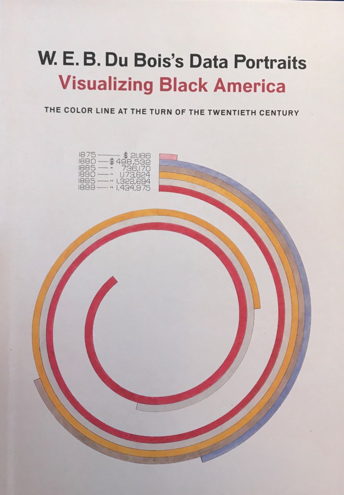
The book itself does a great job of introducing Du Bois and documenting his life and works culminating in the exhibition in Paris – consisting of a series of hand coloured visualisations created by a team of designers led by Dr. Du Bois. Reminiscent of Manuel Lima’s Book of Circles (maybe it’s not hard to see why I’m entranced by some of Du Bois’ visualisations!) the book concentrates for the first section on background before introducing us to an image a page at a time with concise commentary. A perfect mix for those of us who want to learn but also want to get quickly to the good visual stuff!
In terms of the visualisations themselves I couldn’t possibly do justice to the commentary on them already by Jason Forrest here in a series of blog posts. (Like Jason, one thing I will do at this point is to caveat the use of the word “negro” from time to time – it’s not a word that would usually be used today of course, but was used in context by Du Bois and his team, hence a word I will only repeat in context of the charts in which it is used). So instead, I have my own thoughts on just a handful of the most iconic of images: the first of which is the cover image (above).
Du Bois will have been aware of bar charts and their uses but this chart stands out as flouting those rules. Each bar is steadily longer than the bar for the preceding date but instead of a stepped bar chart, Du Bois emphasises this by spiralling each bar inwards towards the centre of the page. He would have had enough understanding of bar chart theory to know that his conscious decision to display in this alternative way was in contradiction to the orthodox bar charts first devised by William Playfair over a century earlier.
It’s my belief that Du Bois considered two things: firstly that this was an exhibition. Spirals stand out and are noticed – they intrigue the viewer and we are likely to engage with something we find intriguing, even if our speed of initial understanding is not so great. Secondly, this chart choice added variety – Du Bois knew the importance of engaging the reader with different chart types, particularly in a large group of diagrams. The analytical shortcomings of spiralling bars are negated by the clearly defined and aligned labels. allowing the visuals to have the striking and engaging effect desired.
The book describes the resultant chart as “Simultaneously easy to read and hypnotic”. Even I, in my love of the unorthodox, might accept that the chart isn’t immediately easy to read, but the description of the chart as hypnotic is perfect. There’s no better way to intrigue and engage your audience than with a chart hypnotic in nature!
Other iconic images I want to consider are shown below:
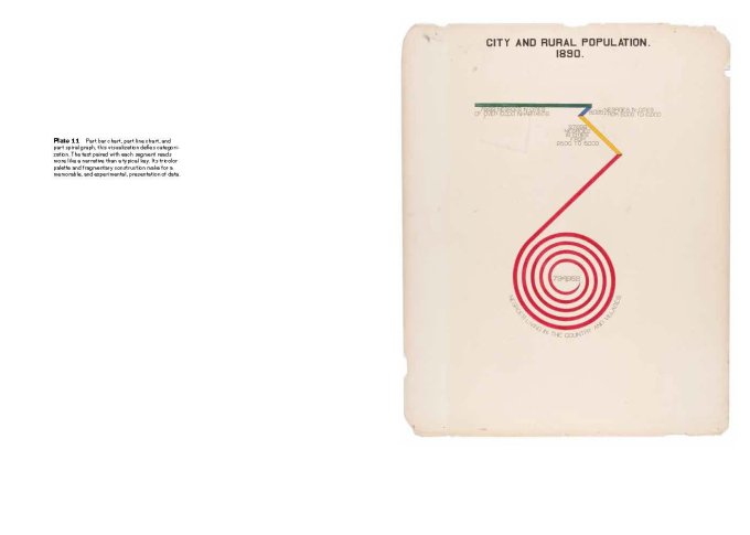
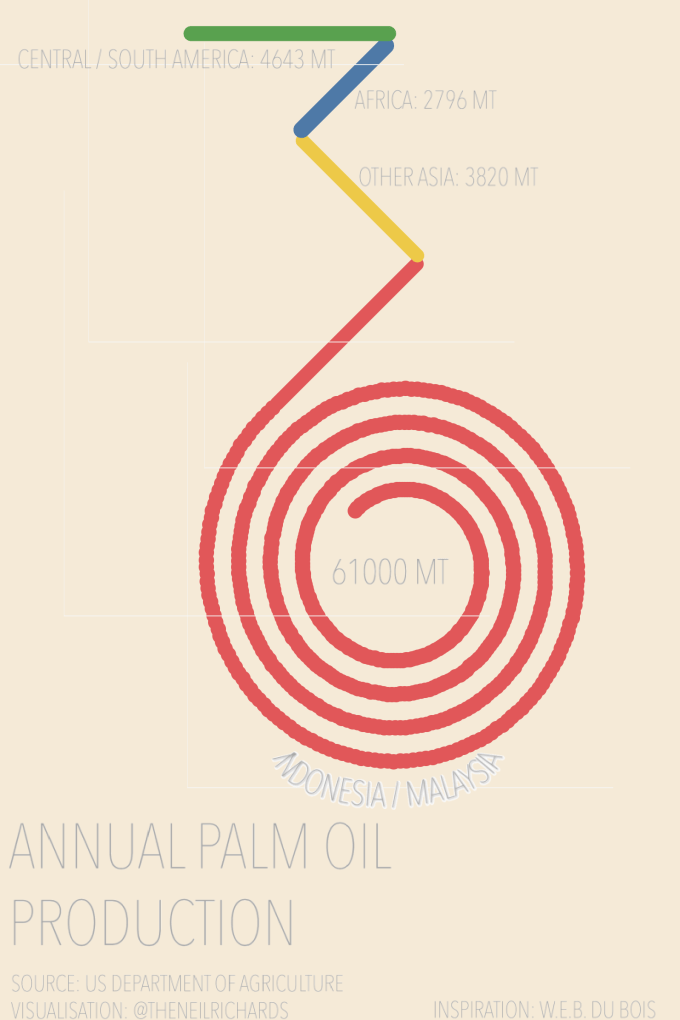
There is nothing conventional at all about this chart. Bars heading in all different directions, including a ridiculously oversized spiral. But that’s exactly the point Du Bois was trying to make: there is no way to show the red bar, representing by far the largest category, as a traditional straight line. Du Bois is being innovative to illustrate the point. You don’t need to know how much bigger the red line is than the yellow, blue or green lines (though the expertise shown in other charts leads you to believe that the proportions are correct). You just need to know the red figure is much larger than the other three. The negro population of the time were almost entirely in rural village communities. For exact numbers, you can read them from the chart. For impression and effect, go experimental!
Indeed, the book describes this chart as “memorable, and experimental” – and for those aware of Du Bois’ work, the likelihood is that the above work (sometimes described eponymously as a Du Bois spiral) is one of the best known. It doesn’t necessarily follow that experimental means memorable, but, if done well, I believe experimentation is one of the best ways for a more memorable visualisation.
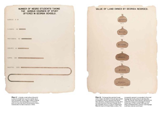
The above chart (on the left) is another example of Du Bois’ use of curves to emphasise large outlying numbers. Unconventional choices make for perfect emphasis – our takeaway from this is that far more negro students took courses in industrial schools than any other schools – we don’t need to accurately measure line length for that because we have the numbers if we need them. This is such a good, albeit exaggerated, way to emphasise the largeness of the major value here. If its unorthodoxy is another thing that makes it a talking point, then so be it!
And on the right – I haven’t analysed whether the figures are accurately represented by the money bags’ area or radii. But I can tell that the number increases year on year, and I am drawn in by the unusual use of shapes rather than any other mark types. In a way this represented an early infographic style use of icons to represent the chart’s message which is so much more commonplace today.

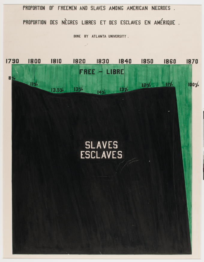
Finally, the above pair of charts shows great observation and wit. There probably aren’t many land areas which are mostly “sloping” in shape and therefore lend themselves to approximation by bar charts. But it’s surely no coincidence that Du Bois noticed the possibilities here and arranged his bar chart to resemble Georgia. No matter what the era, readers will appreciate a good visual play – a “play on shapes” as opposed to a play on words, with the double bonus of hooking the reader into both individual charts. A little bit of genius.
Elijah Meeks has also blogged on Du Bois’ work – in particular he entitles his blog post “How to Remake Historical Data Visualisation and Why You Should” – in this blog he brilliantly recreates the Du Bois spiral across all 50 US states. You can really see the unique viz type come into its own as you make comparison across states (another great example of why I love small multiple visualisations so much!). So I was inspired to do the same, to take learning from Du Bois’ methods and influences.
One thing I haven’t alluded to above is the idea of empathy – understanding one’s position in the data and being part of the story the data is trying to tell. Du Bois does this by drawing attention in unconventional ways to the large numbers knowing that they represent the underprivileged. Britt Russert mentions in her PolicyViz interview that areas representing the Negroes’ land ownership as part of the whole were displayed as jagged triangular shapes in an otherwise smooth representation, giving a real metaphor of struggle in an otherwise hard to interpret graph. Jason Forrest concedes in this article after some debate that this is not easy to interpret analytically but the metaphor is clear.

And the following visual is even more clear in metaphor – the large domineering message of slavery is a foreboding black (which, incidentally, does not result in a vertical cliff-face, but a diagonal representing the fact that emancipation was not instantaneous).
But how can I represent an oppressed minority or a struggle against supremacy if I want to recreate Du Bois? I’m a privileged white male from the UK – it would be wrong of me to represent myself as anything else.
In the end I tried not to over-think it and widened my scope from humans to fellow primates: I went for the representation of a commodity across four geographies that is crucial to the survival of a very much oppressed primate, the orangutan. My own Du Bois spiral representation is below, using Elijah Meeks’ method of scaling the top green line to the second highest value, equating that to the straight red line, with the remainder of the red line hanging in a large spiral. In showing the vastness of palm oil production being down to just two countries, I want to highlight in explanatory context that these are the only two countries which house orangutans, with palm oil related deforestation a devastating factor in habitat loss and population decline.
In today’s world, I could take the metaphor further. Doesn’t the large hanging weight look like a durian fruit hanging from a tree (the orangutan’s favourite fruit?).

Or an ape itself holding on to a tree branch for security?

With the media available to us these days, metaphors through visualisation are so much easier to consider, but in this case I want to stick to the simple and powerful visualisation of Du Bois.
I’ve found a new influence, 118 years after his work gained prevalence. Du Bois believed that experimentation and unorthodox methods got results. The intrigue and interest shown in a visualisation then leads to insight. He may not have lived in the social media age with the “dataviz police”, but if he did, I suspect he would have asserted that they are not always correct, or to be listened to!
1 Comment