This post is thinking about those situations where you produce a visualisation that looks remarkably like another visualisation, whether that was the intention or not. It’s a hot topic, and with so many people entering the field it’s an issue that comes up more and more often. I think there are three separate situations that come up here:
(1) You have produced work inspired by work from somebody else
(2) You have directly copied and adapted someone else’s work, or the similarity, though intentional, is pretty obvious.
(3) You have directly copied someone else’s work and published it with no changes
(4) You have produced your own work and find out subsequently that it’s remarkably similar to someone else’s work.
I’d love to know your feedback on each of these situations – and on re-reading this post it’s clear that I’m going to use those numbers (1)-(4) a lot so pay attention at this point! Recently Andy Kriebel spoke at length about this on the Tableau Wannabe Podcast and you can listen to that here Andy’s standing within the Tableau community, instructional experience and resultant social media reach is such that he is one of those most vulnerable to his work being replicated.
Full disclosure: I haven’t listened to this yet, but I will do in the next 24 hours. If I do, then the chances are I will agree and it will be more difficult to differentiate my own thoughts into this post, so before I do so, I will write this post from my own perspective. And if you think (1), (2) and (3) are common sense, you might be right, but please bear with me down to point (4) which it’s important for me to write.
(1) You have produced work inspired by somebody else. This one is simple: let the person know – if my own experience is anything to go by, they will be delighted! In my own case, every so often I will get a twitter mention I’m not expecting, to find that someone has been influenced by some of my work to create something different, taking my idea and going in a different direction. I take these such mentions as a compliment: somebody (a) saw my work, (b) took some time to enjoy it, (c) liked it and (d) used the idea for their own purposes. Here’s the latest example, from Lindsay Betzendahl:
Due to my love of @theneilrichards #albumcoversasdataviz projects, I kept seeing data in my clothes so I had to attempt my shirt from yesterday. Each eye is a bunch of circular plotted points. #clothingasdataviz #projecthealthviz #tableau @tableaupublic https://t.co/JrsxkEMPkK pic.twitter.com/V87DhiEvp9
— Lindsay Betzendahl (@ZenDollData) August 1, 2018
(I should add that in a moment of vanity I’ve corrected a typo in Lindsay’s hashtag in the original tweet, but nothing else!). And here’s the visualisation she created (interactive link is in her tweet above):

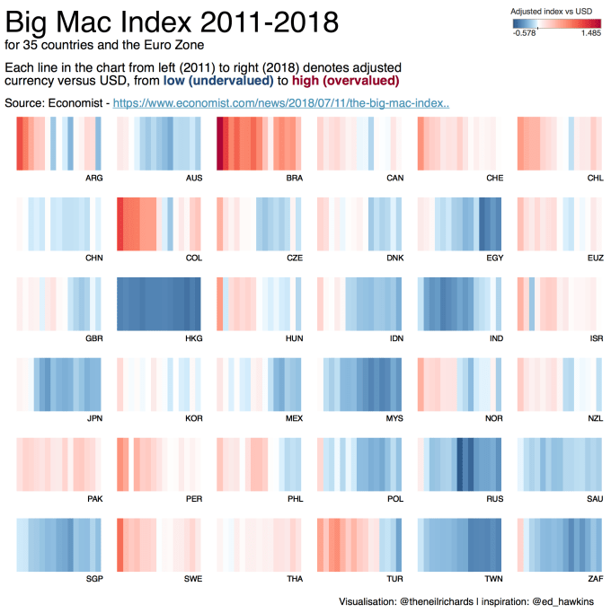
(2) This isn’t dissimilar to (1) but I wonder if in more obvious cases it’s better to make the point a little more clearly within the image or visualisation itself. Now I’ve seen cases where people have clearly submitted something very similar to my work before, without so much as a mention. It might be just about OK but I don’t feel too comfortable about it, and proper attribution should really be used. Here’s an example of mine this weekend that covered both (1) and (2). I wanted to use Ed Hawkins’ well-known climate visualisation to show the Big Mac index with the idea of showing the countries in small multiple formation. I mentioned Ed not just in the publishing message and promoting tweet, but felt it was right to include the attribution within the image itself.
Ed Hawkins’ visualisation I’m referring to is this one: with years going from left to right and average annual global temperatures going from lower to higher temperatures from deep blue to deep red (and white as a midpoint), it’s very clear that temperatures are rising, and the choice of palette and scale makes the point incredibly well. Simple, striking and iconic.

My visualisation (below) was so obviously derived from the above that it was important to include the attribution within the image – a small, low-key attribution doesn’t have to take away from the visualisation in any way.
However it occurred to me that the idea of choosing the specific measure I chose from within the available data, selecting the 35 countries and Eurozone with this valid measure and arranging them in a 6×6 small multiple was done immediately after seeing and liking this visualisation by Luisa Bez. With that in mind it was only right to let her know this too, so I acknowledged her influence in a separate message. I think Luisa was pleased to know that I was influenced in some way by her thinking. Here’s Laura’s visualisation.
Where (1) and (2) are concerned it’s very much an element of politeness that will earn you respect. We often throw the comment around “Steal Like an Artist” as a result of Austin Kleon’s must-read book and while I echo the sentiment entirely (many others advise that once you have mastered the basics, to look around and learn from those whose style you most admire; imitate their work, replicate it and use their techniques), it’s important to attribute those whose work you adapt from and take influence from. In other words: “Steal Like and Artist but be polite and tell them you’re stealing”. Not quite so catchy I grant you.
(3) This is the big one. It’s plagiarism. It’s really very difficult to see it any other way. If you see someone’s work, paste it on your own website (or in the case of Tableau, on your own Tableau Public profile) then to all intents and purposes it looks like your own work. I’m lucky that as far as I know this has never happened to me, but I have been witness to such examples. recently and it leaves an unpleasant taste in the mouth.
It’s technically very easy to do. Work published on Tableau Public is legally available to anyone to access: by default, workbooks are available to download and this is encouraged so that others may be encouraged to learn and adapt. My own workbooks (over two-hundred of them) are all 100% shareable. But are there any circumstances where you can just post a copy of another’s work?
Tableau have clarified their position here in an effort to clarify the situation. I applaud them for doing so and introducing a level of protection to those who publish their own work. I would still recommend exercising caution because it’s true that some cultures have different attitudes to plagiarism in art and culture as indicated in this article. Copies can be held in the same regard as fakes in certain situations. Regardless of intention, it’s possible that an innocent mistake has been made, and I thank Sophie Sparkes for opening my eyes to this alternative viewpoint. My own western culture would consider posting someone else’s visualisations as your own as plagiarism though, Plagiarism in the academic sense is a serious accusation and it’s safe to say that in most cases would result in at the very least a blow to professional reputation. So my own advice would be the fairly obvious “please don’t do it!”
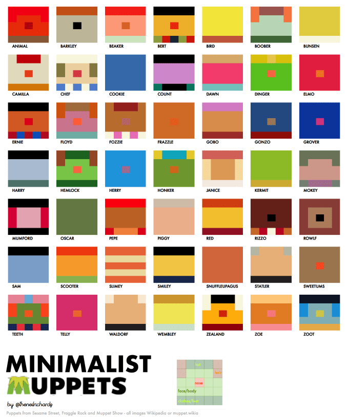
(4) You’ve produced a visualisation and received feedback and acclaim, only to find out that it’s noticeably similar to an existing work you weren’t aware of. Here’s a visualisation I created this weekend:
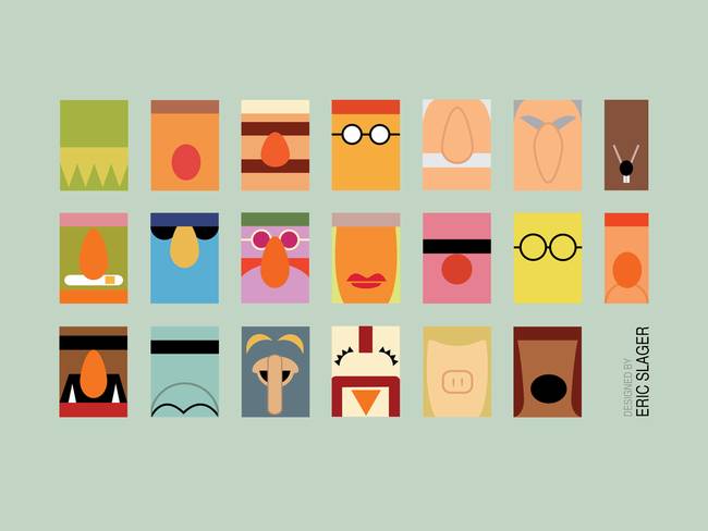
And here’s a work called Minimalist Muppets by Eric Slager

This was pointed out to me this morning and I had no idea of this other work with the same title!
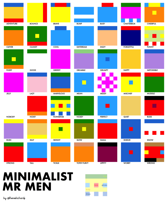
My design process that led me to Minimalist Muppets was a tortuous one, but the short version is this: for the last Iron Viz feeder competition (literature themed) I considered two ideas: one, the Hitchhiker’s Guide to the Galaxy (which I chose, you can see my final viz here); and the second idea was the Mr Men books by Roger Hargreaves. I couldn’t think of an analytical hook other that which characters were which colours, and how many of them had different colour noses. In the end, I turned into a much more “fun” visualisation showing body and nose colour, and called it Minimalist Mr. Men:

I was aware of the genre of Minimalist movie posters so “Minimalist Mr Men” made sense. A few weeks later I decided to add to the series: when I think of characters with different colour noses I think of Sesame Street, but I couldn’t find 49 suitable characters. Expanding to the full Henson repertoire of Muppets and Fraggles I had my full set, and the best alliterative title became Minimalist Muppets.
It’s a situation where had I known about this work before hand I would have had two options: either treat it as (1) or (2) above, or decide that it would be best not to pursue. But I wasn’t aware of it before I worked on it and published, so that option is not available. I have to say that any similarities are entirely coincidental, since although we clearly had a very similar idea, we had them independently.
So it’s important for me to reiterate that Eric Slager’s Minimalist Muppets work is out there too (and, what’s more, I love it!). An additional complication for me is that several people have expressed they’d like a poster of my above visualisation. I’m happy to do that, but if I pay for the process/make a token small amount of money out of the artwork which resembles a previous published work, then that does’t feel quite right to me. So it’s important to point you to ericslager.com and let you know that his work is available for sale here via Imagekind.
In short – I think it’s inevitable that work will be produced that bears a resemblance in hindsight. To ignore this will give the impression that any similarities are an intentional act of copying, which would be a shame in situations where that was an innocent mistake and never the intention. My advice is to give credit to the original in much the same way that you might have done so had the process been more intentional. The consequences of doing the right thing in (1) and (2) are an increased knowledge of skills, awareness and visualisation professionals in the industry, and there’s no reason why (4) can lead to exactly the same thing. After all, I now know another graphic artist whose work I admire.


Neil,
I follow closely the dataviz field activity and, in my opinion, reproducing ideas from other people work is the only way of valuing and promoting good practices. It would be fair to acknowledge the source of inspiration (as you did), but to transform this in a general practice can become more harmful than it looks. See below some of my thoughts regarding this matter.
1. Usually when some work is placed in a public domain without mentioning any license or copyright note, and especially when is done with a free available tool, it can be used by anyone for any purpose without restriction.
2. It would be a minimal professional curtesy to acknowledge the inspiration, but is not mandatory. It is difficult to identify the inspiration in a visual creation if is not a fresh experience. Neither the small multiples, nor the color encoded time related variation are new. But, it was nice of you to admit your inspiration coming from a fresh experience.
3. Most of the Tweeter “inspired by” references are just advertised work. I’ve seen countless bad reinterpreted work advertised as “inspired by” that made me wonder how that can make any sort of favor to the original work and its author. On contrary, the “inspired by” label can quickly became synonym with elevating the work to a level that is not deserved.
4. I think that is no better reward for a designer to see the popularity of his work among the others. IMO, that should be enough in data design field. However, if anybody feels his approach requires more consideration and it brings certain novelty that worths to be referenced somehow, writing, licensing, and copyrighting are always possible options.
Daniel Zvinca
LikeLike
Thanks Daniel
Really appreciate your expertise in the industry and happy to have you take the time to read and post a reply.
I still see myself very much as a newcomer to the field, so perhaps in some of the examples above (and similar examples of (1), (2) and (4) from my post) it’s not absolutely necessary to go to the lengths of attribution or an “inspired by” mention. So it could be that I’m viewing it through the perspective that any attribution (whether “to” or “from”) is both a good feeling to have and good publicity for one’s work; I fully accept that – as Andy Kriebel says, the lines are quite blurred. I’ll agree with you and say that just once or twice I’ve seen people attribute their work as inspired by me and my first thought has been “Really? That’s not what I was thinking at all when I posted that chart …”
My suggestions are what to me feels like the *right* thing, rather than the necessary/obligatory thing, but that’s from the context of a Tableau Public tool that’s very much community-based. It feels to me that if we are taking so much advantage of an openly available, free tool, with fully shareable workbooks, we should accept a level of conscience that goes with it.
I don’t think there can be much argument though that instances of (3), the blatant copying and showcasing of work and posting the original as your own (including cases where there it might not technically make the claim in as any words but there are no measures taken to imply that this is not the case) is something that needs addressing, albeit carefully and sometimes not always by going in with all guns blazing. I know that it’s not a pleasant feeling to become the victim of such a practice and that’s what I’d like to see addressed so that such instances are kept to a minimum, though I fully appreciate that’s not an easy process or one that can be accomplished by going in with all guns blazing.
LikeLike
Thank you for your kind words, Neil.
I totally understand and appreciate your blog post. It is an invitation to honesty. I doubt that anybody else from dataviz other than you will consider you a newcomer in the field, but your words should remind us all how much we can still learn from each other.
Two other things I forgot to mention in my previous post.
First is related to the use of designers work by people with different professions. A business analyst cannot be accused by ingratitude nor dishonesty if he is trying to reproduce a dashboard layout found on a google search. He will be grateful for the gift and he will try to implement it. He will be limited anyway by his own skills and tools. A mention like “inspired by X work” would be unusual.
Second is related to the reference to the real original design. After several iterations of a successful design it will be difficult to maintain a good trace of the original work. Several additions can change that much the original design intention that will be difficult to credit a particular author of subsequent versions.
We are all inspired by someone else work. Occasionally giving credit to the authors for their public work via any professional network would be more than welcome. This would be my preferred way of praising their efforts. However, an occasional “inspired by” label would not harm either as long as it clearly references the original work.
LikeLike
A) I agree w/Daniel. That and basically give credit to those who have helped. It’s being polite/courteous if you’re in the western culture.
B) There’s bound to be similarities and, I would say, particularly amongst beginners until they find their groove. Though it could be the entire dashboard but what if out of a dashboard full of different vizes only one looks similar? Does that discredit the entire dashboard? How far does one define “similar”? For example, I see no similarity between your Muppet viz and Eric’s. His uses physical character cues whereas yours is just colors. In fact, if you were to attribute homage to anyone it would be to the Navy’s signal flags (http://www.navy.mil/navydata/nav_legacy.asp?id=273). That’s the first thing I thought of when I saw the thumbnail view of your Muppet viz.
C) In other words, let’s not get over-analytical. In the grand scheme it’s even less important, more so since typically there’s no monetization unlike, for example, a photograph. Outright plagiarism will easily catch up with a thief as they won’t be able to sustain a job where copying is how they got into it.
Some times I think ego gets the better part of us.
LikeLike