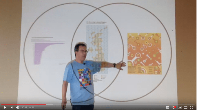
Yesterday I was invited to talk at the Northwest Tableau User Group in Manchester. I was delighted to accept, not least to support the co-organisers: Ella Worsdale, Lorna Eden, and Colin Wojtowicz – a freelance data visualisation and analyst trading as Datawoj Ltd. It quickly occurred to me that I could re-present my recent Tableau Conference talk from New Orleans (linked to in my previous post), or failing that I could present a talk I gave to the London user group in September. Easy.
The latter talk, entitled “Do we take data visualisation too seriously?” was also recorded, and based, not surprisingly, on thoughts first raised in my previous post of the same name
(online at bit.ly/LondonTUG_NR). I really enjoyed compiling and giving that talk, but it didn’t feel fair giving second hand content to Manchester. As someone living “up north” I know only how much it can seem that London gets things first and the rest of the country can get the re-runs of the same thing weeks later.
Also, my last post focused on my goals for the upcoming year. One of these was to present more. Another goal was to “be more Giorgia”. This was a first chance to work on a new project and present something new, and I came up with a plan to embrace those two goals almost instantly.
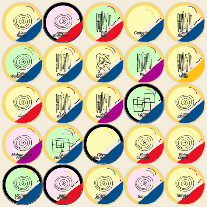
Focusing on Giorgia’s concept of Data Humanism, I remembered her work creating Data Portraits – individual hand-drawn badges which visualised various personal data elements of conference attendees: a great way to consider the personal nature of data and to get people to know each other in a fun, visual way. I decided that I would undertake this for the upcoming User Group. As far as I know, this hasn’t been done using Tableau before. Introducing this for the group would fulfil three criteria: demonstrating a new skill in Tableau, talking about the concept of data humanism, and introducing this Tableau audience to Giorgia’s work and concepts.
Before I go on to show what I did – I’ve been delighted with the feedback in just a short amount of time. People have said they are going to do this for future events, I’ve been asked to recreate it online for new groups of people, and I’ve been asked my availability to present the process at a future London group. I’ve been approached by cleverer Tableau experts than me with advice on how to streamline the survey and automatic image production process. People have really enjoyed the concept and I’m delighted at the possibilities it has opened. All this within 24 hours of publishing!
But it absolutely wasn’t my original idea, other than to recreate in Tableau. My recreation is a fairly faithful recreation of Giorgia’s work, albeit tailored slightly to my audience. She introduces the concept here where she documents not just the badges and their interpretation, but shows the finalised finished physical products. Below is her schematic and some resulting images. I take no credit for anything other than being inspired to recreate and introduce to a Tableau audience.

Now moving on to my version: first I invited the attendees to fill in the below simple survey on Google:


A quick data manipulation and Tableau workbook later, and my badges were ready in a small multiple visualisation on screen. I can’t thank the attendees of the User Group enough for the fact that an exact square number of attendees replied: sometimes a plan just falls together in the nicest way!
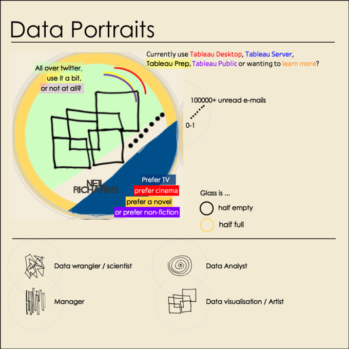
And here is my “how to read” section
And although I’m reporting on just a small gathering of 25 people (slightly more, because not everyone had a chance to complete the survey), it did seem to work as a talking point. When people talked to me afterwards, they introduced themselves first as their name, but secondly as their position on the screen (“Hi, I really enjoyed that – I’m XXX, the blue one, second row near the left hand side!”)
In terms of a “how to”, I’m more than happy for anyone to download the workbook and see how it’s done. The key is the new transparent worksheet feature which allows me to overlay eleven layers at once, all exactly the same size and in exactly the same position. If every layer is transparent, consisting of a transparent shape as its mark, the possibilities become almost endless.
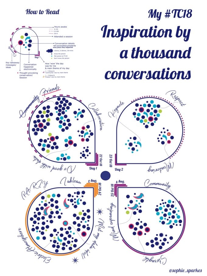
Giorgia’s work is (re-)inspiring visualisations not just from me, but from a whole new group of artists, none more than this incredible work from Sophie Sparkes recounting her conversations from the recent Tableau Conference. And unlike my effort, this is truly original!
Looking forward to seeing many more inspirational pieces of work (with advanced apologies to Giorgia for the increase in Twitter mentions!)

4 Comments