It’s been a while since my last post (for me, anyway). Partly because I’ve been busy, and partly because I’ve been procrastinating a bit. The usual kind of reasons. But another key reason is that I had a half-written blog post which hasn’t really been going anywhere. So this represents a bit of a re-write to get things moving again.
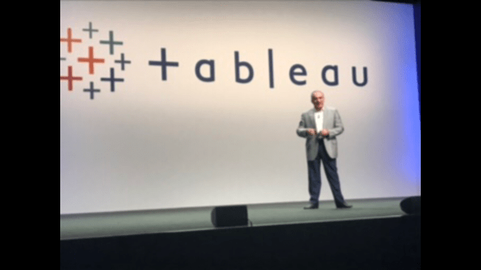
In my first attempt a blog post, I was going to base my article around chess, directly Inspired by Garry Kasparov’s appearance at last month’s Tableau Conference. Although Garry talked as a leading expert on Artificial Intelligence and gave a thought-provoking and passionate presentation on the subject (my key takeaway was to think of AI as “Augmented”, not Artificial, Intelligence) I was going to talk about what he was better known for in his earlier life (and, indeed, mine). My post started by considering the debate of whether chess was an art or a science:

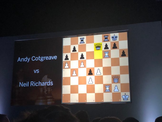
(Not only was Garry on stage live and personal, but Andy Cotgreave somehow managed to shoehorn in our game onto the main stage after the keynote so that 2000+ people now know that I had a losing position! C’est la vie …)

(photo from Annabelle Rincon on Twitter)
But I was going to reference attacking style, positional play, game aesthetics, opening theory, sacrificial combinations and more, while referencing chess-playing greats of different styles, such as Fischer, Botvinnik, Tal and my own role model in style, Jose Raul Capablanca. I was going to muse over my hours spent theorising over strategy and opening play, gaining skill through competitive play every week and practice/study most evenings, while players of frustrating (for me) talent and skill would just turn up and win brilliantly every time. Science losing to art? Theory losing to flair?
Kasparov referenced the computer AlphaGo Zero – in the years after Deep Blue beat him to become the first computer to beat a world champion in match conditions, a program was developed that learned the rules of Go (a more complicated game with more permutations of moves) from scratch. By brute force playing of billions upon billions of games with itself, it learned how to play and how to win, and was able to beat the world champion in just one day. Thus the romance of chess and similar games has been blown away for me. Not an art, but potentially a science: and what’s more, a game that can be won by brute force combinations of calculations, related neither to art, skill, talent or flair.
So now let’s move on from chess, the passion of my pre-teen and teenage years, to the point where I found data visualisation (let’s just say there was a not insignificant number of years in between). My initial blog post was framed in a way comparing dataviz to chess favourably. I could compare theory and flair to the usual spectrum of Few versus McCandless and many similar examples, and I could relish in the fact that as a skill, profession or pastime, data visualisation requires a mind-challenging blend of art and science (to me, anyway).
And then was the crowning point in my argument where data visualisation trumps chess: there is no “right answer”, no winning formula. Yes there are rules and guidelines: don’t truncate your bar charts; don’t move your queen where it can be taken; always include informative takeaway messages; don’t weaken your castled king’s position unnecessarily … I could go on. But chess has a goal: criteria for winning. Put your opponent’s king in checkmate so it is attacked with no legal flight move. A computer can now be programmed to reach that position against any human player by looking at many billions of possible positions. Data visualisation doesn’t have that goal. You decide on the final outcome, and that’s it. It might be generally acknowledged as “good”, “bad”, “effective”, “impactful”, “confusing” or the like, but the user’s input to even the simplest dataset means there are an infinite number of outcomes. Not, like chess, a very very very large finite number, but an infinite number.
But here’s why I abandoned the above train of thought: partly it was kind of obvious, but partly I was missing the point. Chess isn’t an art or a science. It’s a battle (literally, the aim is for an army of pieces to weaken the opponent’s army leading to the capture of the king). Or, more simply, it’s a game. A competitive environment. And while a game per se might be a competition among just two protagonists (white and black), bring leagues and tournaments into it and it becomes a competition.
So back to data visualisation: how do you win a data visualisation competition? In chess, forget everything else I’ve said about flair, talent, study and the like. To win a game you need to checkmate your opponent and to win a tournament you need to be the best chess player over the course of the tournament (in much the same way the best tennis player over two weeks every June/July wins Wimbledon). But data visualisation competitions need to be judged: determined by one person or one panel of people based on opinion and expertise alone.
Plenty of sports are like this: consider diving as one of many sports where points are awarded subjectively based on skill, difficulty and elegance. I’m no expert but I watch keenly every time the Olympics and other major televised competitions come round.

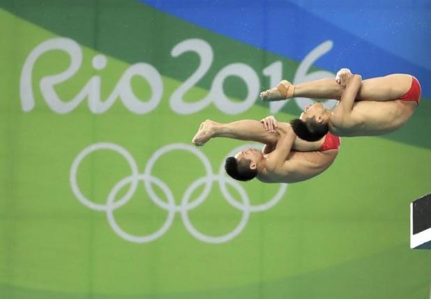
(photo from ptv.com)
TV commentators will watch a dive that lasts no more than a second or two and instantly know the mark. “That’ll get 8s and 8.5s” they might say as Daley and Goodfellow perform an excellent dive. Most people watching will know that a synchronised shape with the partner will get a good score, and too much splash will get a bad score, but they wouldn’t know much more. We can’t tell a 5 from a 9, for example. But the expertise and level of agreement between each judge means that there is very little spread of marks and the expert commentator is almost always shown to be right too.
Data visualisation, done competitively, is not always like that. Tableau run an Iron Viz feeder competition four times a year (once in Europe and three times worldwide). There is usually a theme, but other than that the criteria for the winning visualisation are usually quite open. However entries are judged on three elements: design, storytelling and analysis. These can be so much more subjective than measuring, say, rotation, angle or amount of splash. Judges can acknowledge the presence or absence of each item but it’s very difficult to quantify.
Other competitions have simpler rules: the “best”, or the organisers’ personal favourites, will win the prize or be featured in the company’s publicity. In a way, these are easier to understand. Not easier to win, but easier to understand what might be needed: meet the organiser’s brief and submit something good! Even the main industry standard awards, the Kantar Information Is Beautiful awards, have different categories but don’t have particular winning criteria, they simply just award to the outright “best”.
For Iron Viz, the most recent feeder competition has been the subject of much conversation. There are two judging stages: one panel of Tableau judges reducing the pool of sixty entrants to ten, and one panel of industry experts marking the top ten vizzes out of ten on each of the three categories. A lot of questions have arisen: how did the top ten get chosen? Weren’t there many stronger entries not chosen? Why is there so much variation among the judges’ scores? What were your thoughts overall? Were they marked collaboratively, or individually? How are you defining storytelling/analysis, and what’s the distinction when considering data visualisations? The selection of entrants, all on the theme of health and wellbeing, caused a lot of powerful reactions among the Tableau visualisation community: some important emotional subjects handled sensitively and powerfully, with many wonderful examples of data humanism shown.
You can see the full list here:
https://public.tableau.com/en-us/s/blog/2018/07/iron-viz-health-and-well-being-vote-crowd-favorite
And you can see the winners here – a huge and deserved congratulations to winner Corey Jones:
https://public.tableau.com/en-us/s/blog/2018/07/iron-viz-health-and-well-being-winners
I haven’t got an answer – and can give full disclosure that I didn’t enter this time around. My only conclusion is that is’ hard! Not just hard because of the skill and talent required, but difficult to understand how criteria are interpreted and how any given individual judge might vote. My advice for what it’s worth is to really enjoy the days and weeks preparing it. Do your best to meet the judges’ standards and throw yourself into a subject that fascinates you, or at least one that won’t put you off if you have to immerse yourself in it day after day. Then you’re embroiled in art, design, science, storytelling, competition and analysis. When you have all that to deal with, you won’t care if you win or lose – the result is a bonus.
It’s not easy though Anyone for a game of chess?
1 Comment