This post follows on from my recent entry to the latest Tableau IronViz feeder competition. The brief – build a viz in Tableau that “somehow touches on the theme of water”. I decided to take the tangential approach: Handel’s Water Music
I’d been interested in looking at how we could visualise music for a while, and because I thought a more traditional and predictable infographic and fact-based visualisation about water wouldn’t play to my strengths, this gave me the opportunity to take the word “water” and allow me to indulge myself in a completely different (and yet loosely water-themed) way.
I was pleased with the outcome – I had wanted to animate my visualisation in synch with each part of the music, and I wanted to use the work of Nicholas Rougeux as an influence (not for the first time). Below, Nicholas visualises Pachebel’s Canon.
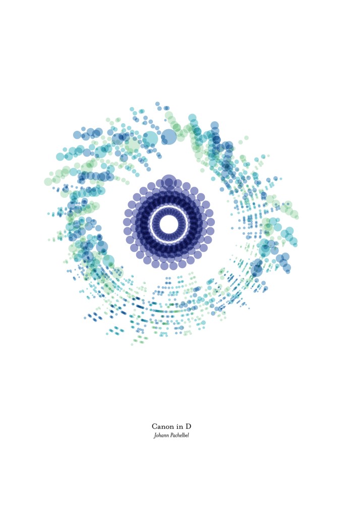
You can also click through to the website to see an animated version. Nicholas’ version draws the animation in time to the music, showing the notes appear circularly around the clock. Better still, his excellent blog at c82.net takes you through the stages of how to convert a MIDI track downloadable from musescore.com to a data file of notes, pitches, musical parts and durations which you can then use to visualise. Though my method diverged from his here, this was exactly what I needed to start working on visualising Handel’s Water Music.
My version is similar, but because I wanted an alternative approach, I have “moved” the notes clockwise with every frame (i.e. every beat of the music) so that the notes are played and highlighted in the fixed twelve o’clock position. I was pleased when Sarah Bartlett commented that it reminded her of traditional calliope musical instruments (click through for an example) which she had just seen that day on the streets of Amsterdam. I remember these too, where the disc with holes would rotate for the notes to be played -it’s a metaphor effect of the visualisation which comes through nicely. If anyone at this point is wondering how Tableau does animations, I’m afraid to say that it doesn’t. The visualisation above is 2736 exported still images merged together in stop-motion style. You may need to channel your inner Nick Park (Wallace and Gromit creator) but in the end you can get a satisfying result.
The brilliant thing about visualising the Pachebel piece in particular is the metronomic regularity of the dark blue cello part – its low pitch means it doesn’t overlap with the melody colours, and it results in a perfectly regular symmetrical pattern. But I did wonder whether Handel’s Water Music would show similar insights. After all, I hadn’t picked it with a musical reasoning in mind. I picked it for no other reason than a word in its title.
Fortunately I knew I was choosing a Baroque classic. I knew that Baroque music was more systematic and melodic than its classical and romantic descendants. Masters of Baroque music loved to demonstrate and repeat a theme, often with variations – in other words there is more mathematics in Baroque music, and more regularity of patters to be discerned. Pachebel certainly falls into that category, but so does Handel. Handel was born in the same year (1685) as Johann Sebastian Bach, and so was an exact contemporary. The book “Gödel, Escher, Bach: An Eternal Golden Braid” is a seminal book linking the themes of regularity and recursion as found in the works of mathematician Gödel, artist Escher and baroque musician Bach. It uses this as a basis for talking about cognition and intelligence in computing (pretty forward thinking for a 1979 book). But from my point of view, as a mathematician who adores the tessellating patterns of Escher, it’s enough of a signpost to let me know that I’m looking in the right sphere of music.
The way to read Nicholas’ piece and mine is essentially the same, whether static or moving. We are looking at a timeline, but showing the timeline in circular form rather than straight, and then showing pitch of each individual note on the axis. What would be the y-axis on a normal horizontal timeline graph becomes the radius, or distance from the circle’s centre, on a radial timeline graph. It won’t surprise you to know that viewing the exercise as an alternative way of visualising a timeline had a particular appeal to me.
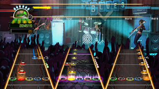
(We’re actually not restricted to traditional horizontal timelines either – does anyone remember Guitar Hero? Presenting a vertical moving 3D timeline … this game visualised notes of different pitches moving towards you, to be played when the note reached the “front” of the screen)
Which begs the question – when we visualise music, are we really restricted to different ways of showing a timeline? Here’s a simple line of music visualised in traditional form, as a musical stave. Amadeus is the iconic middle name of Wolfgang Amadeus Mozart, so this a clue that this is a simple melody from one of Mozart’s most famous compositions, right?
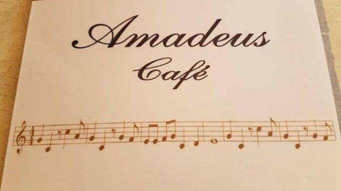
Those of you who can read music might be smiling, or looking smug at this point. Or rolling your eyes, because you’ve seen this before. In fact, this has a lot more in common with the gentleman on the left than the gentleman on the right …
We don’t know what kind of mistake, in-joke or visual fakery led to the Flintstones theme tune being shown on the Amadeus Cafe menu but the point is that the visualised music in its most traditional form is a skill that needs learning. It’s not an instant gratification visualisation that can be understood in seconds, or even in minutes to the untrained eye. The reader needs to learn a whole new language to read music.
But the time taken to interpret a visualisation shouldn’t be considered a detriment. After all a musical score is just another example of an alphabet: in itself a complex visual encoding message to visualise and record the sounds, tones and patterns of individual languages. This argument is expertly put forward by Sheelagh Carpendale on a recent Data Stories Podcast – and surely if a concept such as language, or music, is so detailed, varied, complex and beautiful to the extent of being almost infinite in its possibilities (I’d argue that music *is* infinite – there are an infinite number of places you can put your finger on a violin string between the positions of C and D, for example, and you can play that note for an infinite amount of time – so that’s infinity squared already!) then why shouldn’t our methods of visually encoding be simple but not so simple that they are instantly understandable without skill or practice?
Leaving Guitar Hero to one side, most ways of visualising music seem to be either horizontal or visual timelines. I wanted to add some more visual analysis to my Water Music animation, so I was able to add some static circular timelines. The following tried to highlight repeated patterns across sections of the music as well as across different instrumental parts. I think it does this reasonably at best, but needs a certain amount of instruction to the reader.
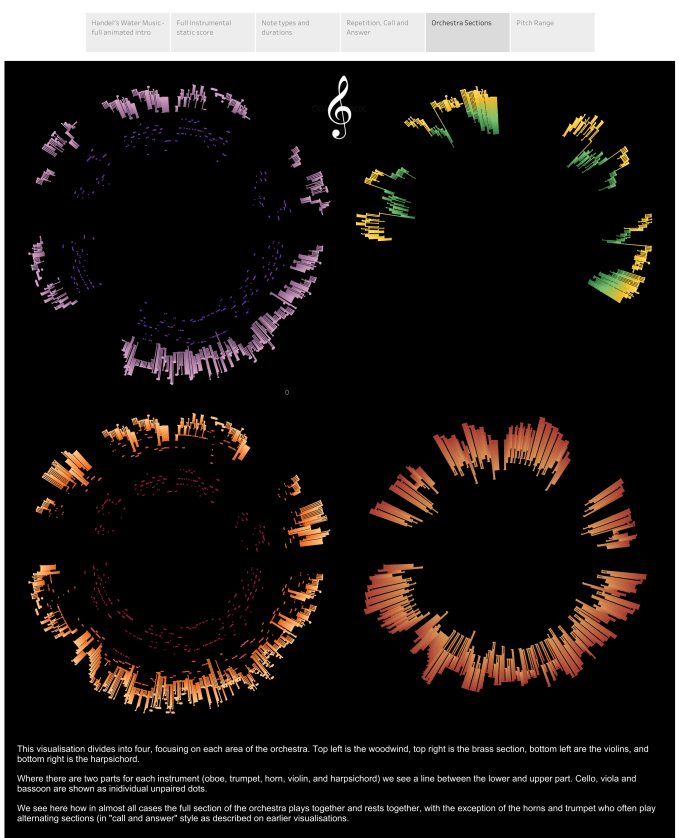
Another option was to make comparisons along the radius of the circle by looking at what different instruments were playing at different times, which could be done in a striking manner in this visualisation, also included in my Water Music Iron Viz suite. This splits the visualisation into four copies, one for each section of the orchestra, and displays the distances in pitch between “first” and “second” parts for trumpet, horn, oboe. violin and harpsichord.
There’s little doubt that the attraction of a circular depiction comes from the iconic shape and image of a vinyl record. I think without even realising it, that was one of the reasons behind my all-black background choice. That, and my “anti-water” colour scheme, where I deliberately wanted to bring out the variety of pitches and patterns in the music in colour rather than invoke the water metaphor. I knew 90+ of other entrants would be blue themed, rightly so! But the vinyl album metaphor can be used to visualise many more elements in music than just the pitch. Valentina D’Efilippo and Miram Quick worked on OddityViz – a series of record-themed visualisations about David Bowie’s Space Oddity. Here are two of their works below, focusing on “structure” and “emotion” the full suite of ten records can be seen at oddityviz.com
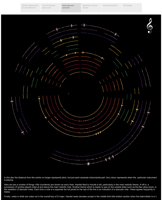
This inspired me to think that it’s possible to visualise much more than just the notes, parts and pitches. If I took pitch out of the equation, I could depict a lot more other dimensions using length, shape and colour. Below looks at all of the parts (one per colour), indicating note duration, whether a trill was played, and whether the note was not in the original key of D major. Tableau’s resolution isn’t perfect (and less so when compressed for this blog) but I was able to see a lot more about the melody’s structure and reliance on triplicates of three staccato notes (unconnected dots), as well as the middle third being played in a different key (much more white areas).
Circular visualisations had allowed me to emulate the circular examples I’ve shown, and gave me a really pleasing experimental entry for the IronViz competition. At time of writing, I don’t know which entries fared well, but I do know that I enjoyed my submission and learned a lot on the way, which was my only motivation for entry.
But I felt that I hadn’t answered all the questions I was looking for. I could see some of the repetitions between the first and third sections, but that’s because I knew they were there and could point them out to the reader (and because I’d heard the music repetitively on loop!). It’s not at all easy to see this within the context of a circular timeline – we like to see similar things next to each other or at the very least aligned at the same angle.
As I looked for more inspiration, I came across “Pantone Canvas” by Maria Tsirodimitri. Maria visualised the different parts of a piece of music by assigning a colour to each note, in a horizontal timeline form. Crucially, the legend element used a colourful but cyclical palette. Since music scales repeat every 13 notes (for piano players, that’s seven white and five black in every octave), this shows us the flow of the melodies regardless of octave, and allows us to compare parts of different pitch (so a melody played on the oboe and the bassoon an octave apart will show the same, and the colour hue difference between any two notes a semitone apart will be consistent even if you have gone up from one octave to another).
Maria’s work is cut into sections, partly I think to allow a portrait style artwork, but I could do something similar, looking at three sections of music, to see how similar sections 1 and 3 were. Now they are aligned and depicted by discrete colour bands, this comes alive in a better way than we could manage in circular form.
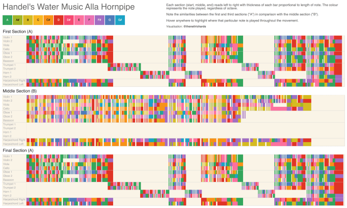
The look is a little different – there are more sustained gaps where instruments don’t play, and there are more short gaps between notes (due to the short, staccato notes I mentioned above). But this shows the “A/B/A” nature of the piece better than I’d hoped. I knew from listening (repeatedly) that after the bit in the middle, the same themes returned. Until I visualised it this way, I didn’t know it was *exactly* the same, note for note, part for part! Really pleased how the simplest of all the visualisations showed this so well, and finally did a good job of visualising some of the structural themes that Handel used in the music. (And I still think it looks rather good!)
Almost done, and I as I was compiling this blog I wondered if there was a more appealing visual way I could display this in a circular fashion. Now that I had the idea of “normalising for pitch” (i.e. playing the note D will show in bright red, whatever the octave and whatever the instrument), the visual look of what I was able to produce opened up different ideas. With the ideas of Valentina in mind (and more importantly, the website still open!) I came across the idea of visualising colours in movies. Below is her visualisation for the Shining. In this case, position round the circle is not important, it’s simply a timeline of scene colours radiating out from the centre.
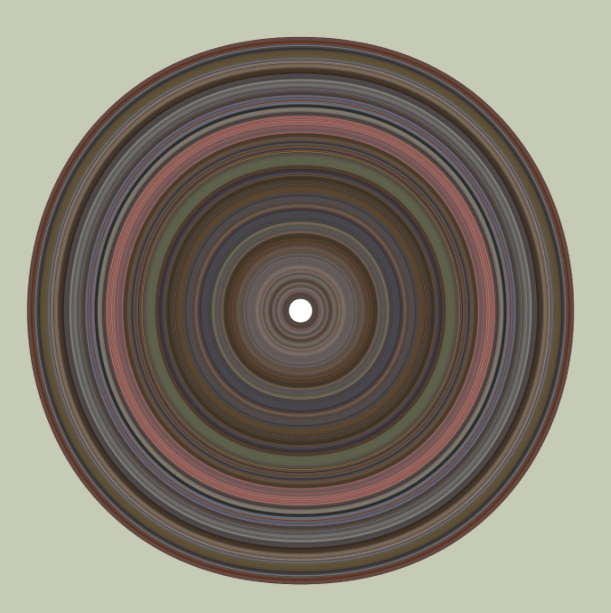
Now that I have my Water Music encoded entirely into colours, could I do something similar? …
Of course, because I’ve used the full spectrum of colours, and visualised a melodic hornpipe rather than a menacing horror classic, the look is a little less dark. But looking at a different visual per orchestra part, we can recreate something similar. Below is the main violin part visualised:
And, because I can’t resist a small multiple, we can see context of how the lead violin part looks versus the rest of the string section here:
This has just scratched the surface of what is possible analytically and artistically – in converting music into data then the possibilities are endless – I’d welcome feedback or alternative suggestions (or I’d welcome a submission of what the Pachelbel cello part would look like in the above form … I think I have a pretty good idea!)




Gorgeous! Too much goodness here to absorb in one go, but reads like a concert / art gallery mashup!
LikeLiked by 1 person
Thanks Cathy – that’s very good of you to say so!
LikeLike