Before you skim down or look for a summary of my response to this particular dataviz question, I’m not even going to try and answer this question. I will at least discuss it though in the context of a recent project I created.
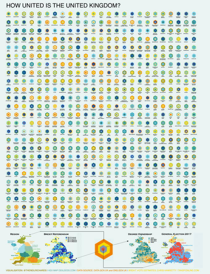
First of all, here are two similar but different outputs of the same datasets where I wanted to show characteristics of each of the UK’s 650 parliamentary constituencies. Essentially the two charts are not very different. The first is in the form of a hexmap:

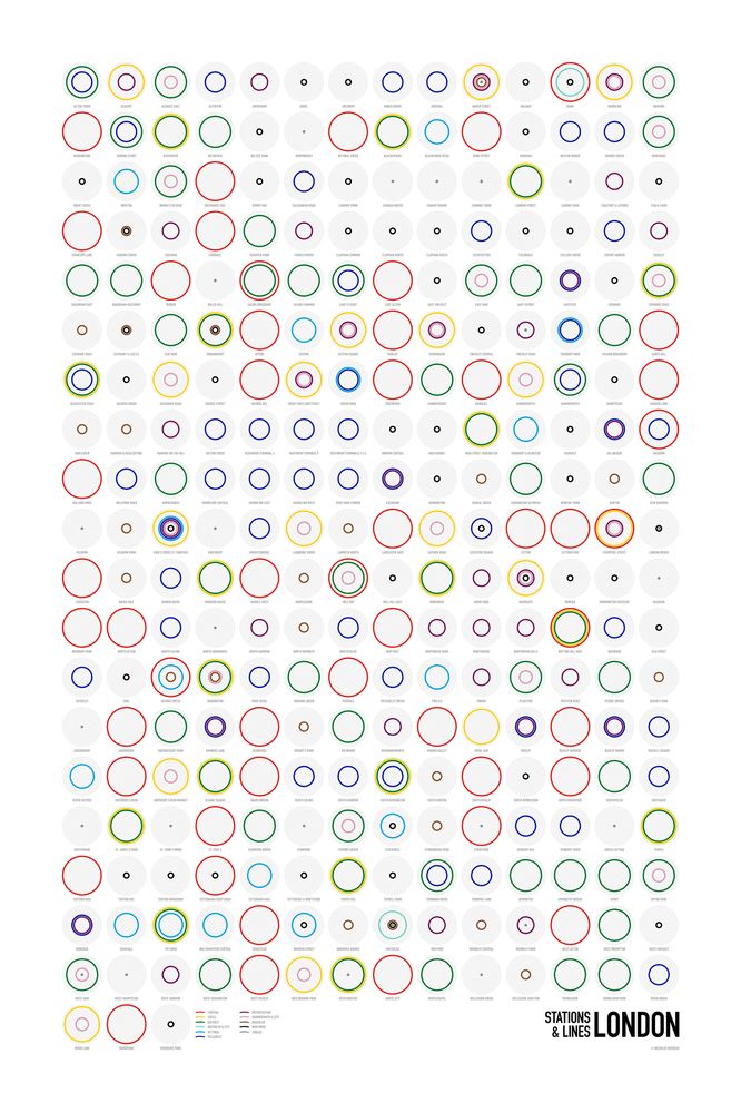
And the second is in the form of a small multiple:
First, some background to the inspiration behind these charts. Essentially there are three drivers to this:
(1) The ability of Tableau to more easily pile transparent layers on top of each other (as explored in my recent Data Portraits) makes for a lot more detail to be included in a given mark.
(2) The above fact then inspired me to revisit tile maps, which I have spent a lot of time working on previously. I never found a UK hex map which used my favoured coordinate systems though although several people have asked me for advice in the meantime. And though I have designed quite a lot, I never quite got the momentum to work on a 650 tile version for the UK (sorry!) There are several versions out there using polygons, however my low-tech mind likes to design and place shapes on a tile/grid coordinate system. I then found this great resource from ODI Leeds which enabled me with a bit of manipulation to load up exactly the tile grid system I wanted.
(3) Have I mentioned I love small multiples? Many of my recent projects have involved arranging constituent parts of visualisations in grid formation which makes for a pleasing visual effect which lends itself ideally to poster format (or even T-shirt format!).
My idea was therefore to look at four aspects of each constituency to see if patterns emerged: UK region, Brexit referendum vote, degree ownership and current sitting member of parliament. Starting with the map, obviously the region would cluster, but it was important to have region encoding to help people find constituencies on the map. Given that each constituency represents approximately the same population, then for example in the UK it’s clear that greater London is far larger and more bulbous than the area it represents in a typical map. Similarly this will explain the distorted nature of Scotland or mid-Wales where sparse population density results in far fewer constituencies over larger land areas.
The other metrics ask the question as to whether there are relations, or geographical clusters, between degree ownership and Brexit vote, or geographical area and Brexit vote for example. Are there patterns to be seen among Conservative and Labour voters in their traditional rural and urban heartlands?
The map raised user experience questions to me that are typical to tile maps though. How easy is it to find your constituency? Ask a reasonably clued up Brit to find Isle of Wight, or Anglesey, they’ll probably get it right away. St. Ives? Probably. But Cardiff North? Cannock Chase? Bet you don’t get those first go. My own consistency is Bolsover, and though I knew it was probably in East Midlands in a boundary constituency with Yorkshire, it still took me four attempts to find.

The small multiple map came from the idea that 650 constituencies divides beautifully into 26 x 25. Not quite square, but nicely divisible into an almost square rectangle. If I want to find Bolsover, or Cardiff North, or any constituency, I have room for the names and can then just look alphabetically. You can then keep exploring the chart for similar and different colour combinations.
I’d already made the decision at this point to complete and publish both versions. I liked the way both were showing, but was genuinely interested to know which people preferred? Map or small multiple? I put out the question on twitter: which is most engaging? Do people prefer to explore on the map to find the constituency information in the tooltip on hover, while their eyes can more easily see the colour similarities and differences? Or do they prefer the poster style small multiple?
I’m not going to make huge findings out of the results because my sample was particularly small. However, needless to say I got answers preferring both styles. The majority plumped for the map though. Most agreed that the geographical arrangement and ability to explore made for greater engagement. Those that agreed that they preferred the small multiple approach had the same view that I did – it’s easier to find your own constituency and an enjoyable experience to explore and compare when the constituencies are labelled.
So can we say “It depends”?
It occurred to me during the construction that my small multiple version was influenced in some way (as much of my work is) by Nicholas Rougeux. He has small multiple visualisations deconstructing mass transit systems into concentric circles like this. If, like me, you love this kind of visualisation, you can buy and admire it!
But perhaps the clue as to why more preferred the map to the small multiple is that you wouldn’t use the map above to navigate from Kensal Green to Cockfosters and see the stations you need to pass through and change at in your journey. You’d use the traditional and iconic London Underground map.
I’ve had fun creating both and if you were to push me for a favourite it would be the small multiple version. But perhaps that indicates my recent aesthetic preference for impactful poster-style visualisations rather than a choice for the most engaging experience to result in an analytic answer from the data. Either way, I would say that the combination of the two doesn’t detract, but hopefully improves and makes for a doubly-engaging experience. My version on Tableau Public has two separate tags so you can toggle between the two.
Some last feedback that it’s important to share is that of the legend. Thank you to Josh Jackson (@vizjosh) for the feedback:
The key is fantastic. I really like how the small multiples are complete by themselves. I can keep going back to check what patterns I am seeing. Much better than just explaining a blown up example.
And in the interest of balance, feedback from Twitter User @sib313 (aka Steve the Skeptic)
A valiant attempt to show many things on one map #dataviz, but I think 4 separate maps (like the top right) actually works better.
Here is the legend I used for both versions:
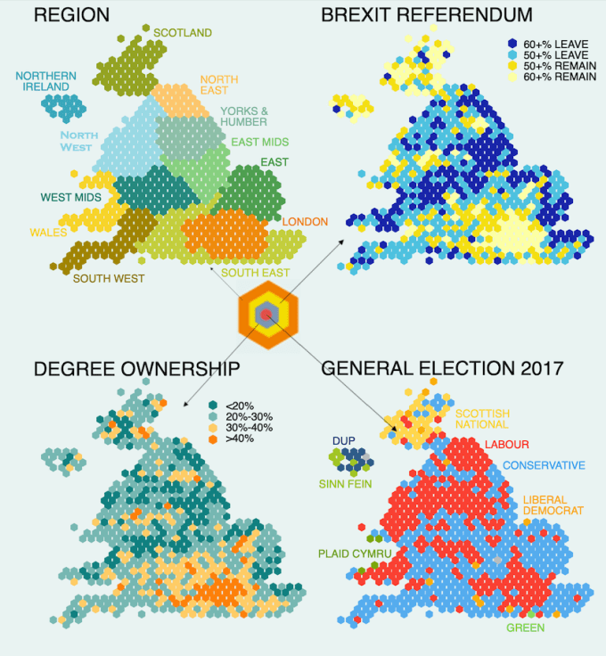
This feedback (in both cases) affirmed to me how important it is when using non-standard visualisation types to explain what is going on – I often choose to sacrifice clarity for impact, so this will help to redress the balance. Steve’s reply is probably right – there is just as much value in looking at each metric separately and combining four metrics on the same small space won’t always work for everyone. But blown up like this, the legend makes a great static viz within a viz (it’s even a small multiple in its own right): something, thanks to the positive feedback, I will consider more in the future.
