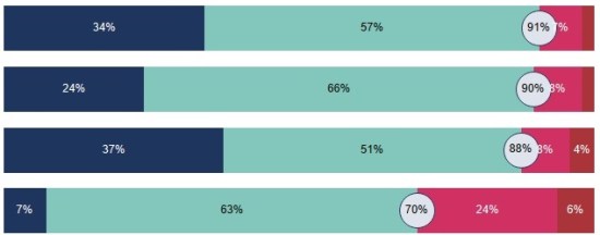
This post is on my to-do list to write tonight, because I’m keen to share my thoughts on the subject based around a couple of my recent visualisations. But it’s pertinent that I was in a training course today at work (edit: earlier this week, it’s taken me a while to finish this!) – nothing […]
Author: Neil
Where can I get hard to find datasets?
Often for personal visualisation projects, the hardest part can be getting hold of an interesting or relevant dataset. I’m not talking about the drudgery of cleaning or reshaping data for your chosen visualisation tool, which we know can also be difficult and/or time-consuming, but of actually getting hold of data in the first place. Currently […]
What questions would you like me to talk about?
Next month, on 3rd-5th July (exact time and date tbc), I’ve been accepted to speak at the Tableau Conference in London. I’ve decided to theme my talk along with this blog, so my idea is to talk for about 10 minutes on each of 4-5 questions, with a few minutes left over at the end […]
Why is sport such a good topic for visualisations?
Sport visualisations won’t be for everyone, but I do think that the debate on this question is quite simple. Sports by their nature are full of numbers and data: times, goals, scores, dates, rankings, statistics, averages, records, tables, and the like. Most of these are not too difficult to get hold of, either via Wikipedia […]
What is design driven data?
A short post, with a short title, but which links to a much longer presentation. But before I link to the presentation, I want to feature perhaps my most unorthodox visualisation yet. A few weeks ago, while having breakfast in a hotel bar in Manchester, I saw the following uncredited artwork on the wall: Now […]
How should we visualise stacked bars?
This question arises from a recent article in Datawrapper’s blog by Lisa Charlotte Rost – in this post she discusses why they don’t provide diverging stacked bars as a standard offering. I’ll offer the “tl;dr” option here that she gives: “We don’t recommend using diverging stacked bars for showing percentages. The 100% stacked bars are […]
Do we take data visualisation too seriously?
It’s been a while since my last post – there’s a good reason for this. Well, a reason anyway. I have a 90% written post which I have been mulling over for a long time. Because I haven’t felt comfortable with it, or finished it, it’s been a bit of a logjam for the blog […]
Why do we visualise data?
Well that’s a big question. Chances are that if you’ve found my blog then you’re already involved with, or interested in visualising data and you’ll be well aware of the advantages of charts and visualisation types over and above columns and raw data. But I’d like to frame my answer around a meeting where this […]
What alternative ways are there for visualising timelines?
In my last post I led up to a first draft of a timeline chart featuring the lifespans of US presidents. Without further ado, here’s the final version: There were quite a few changes from the previous version, mostly with the addition of bars to indicate number of future and ex- presidents alive at any […]