A short post, with a short title, but which links to a much longer presentation.
But before I link to the presentation, I want to feature perhaps my most unorthodox visualisation yet. A few weeks ago, while having breakfast in a hotel bar in Manchester, I saw the following uncredited artwork on the wall:

Now you probably know what I’m like, what with my recent penchant for creating data visualisations based on album covers and similar sources. If you don’t know what I mean, you can see some of these works here or here. And I know how easily I can be spontaneously tempted to create visualisations based on design inspiration. I joked with my breakfast companions, and also in a tweet, that I bet I’d end up creating a visualisation based on that poster.
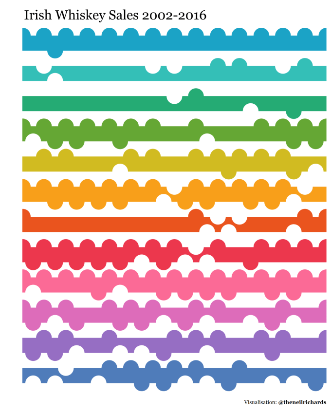
And sure enough, a couple of days later, I released this: (as usual, click through for the interactive version which has a “how to read” tab)
For me, this represented design driven data in its purest form. I wanted a specific design for my visualisation and I found data that matched it, yet from that point the process took its traditional linear form – using the data to generate an accurate, albeit artistic and abstract, visualisation. And so, last month, I was privileged enough to give a talk at the online Tableau Fringe Festival, where I shared my thoughts on design driven data.
It’s important to note that in my talk I directly challenge my thoughts in this earlier post of mine – I’m always happy to change my viewpoint as my experiences change. One of the first viewpoints I remember having instilled in me was that you need to know and understand best practice (the rules), in order to know when to break them.
Grab a coffee, sit comfortably, watch and listen while I explain my thoughts.
To me, while not everyone’s cup of tea (apologies for mixing my hot drink metaphors), design driven data is an important data visualisation design technique which unleashes creativity and imagination, allowing the designer to learn new skills. Without this approach, we may miss the opportunity to try a particular variation on a chart type that works for your data but hasn’t been tried yet. What have you got to lose?
Thank you for those of you dedicated enough to listen to the full talk, and as always I welcome your feedback.

4 Comments