Often for personal visualisation projects, the hardest part can be getting hold of an interesting or relevant dataset. I’m not talking about the drudgery of cleaning or reshaping data for your chosen visualisation tool, which we know can also be difficult and/or time-consuming, but of actually getting hold of data in the first place.
Currently Tableau are running their first feeder for Iron Viz – a global competition to come up with the best visualisation you can, using any data source you see fit, based around a different theme each time. This round’s theme is Books and Literature. More often than not, I don’t enter (the exception being here) but this time the added pull of feedback and judging from Alberto Cairo and Cole Knaflic is a great incentive to enter. If anyone reading this is working on a great literature-themed visualisation in Tableau but still in two minds whether to enter, I’d strongly recommend you do!
Now, I knew that I wanted to do something on my favourite book: The Hitchhiker’s Guide to the Galaxy. (finally, the question this blog is tackling is the Ultimate Question to Life, the Universe and Everything!). I couldn’t find a dataset relating to the book online. True, I’m not sure what I was expecting to find, but whatever it was, I couldn’t find it! I do, however, own the book (both in old-school paperback format and as an e-book).
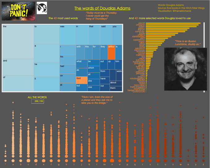
That in itself could be considered a dataset – a dataset consisting of a large number of individual words. I’ve had fun with this before when I created this simple, unsophisticated data visualisation looking at words used by Douglas Adams throughout the trilogy of books:
But I wanted to analyse what happened in the book, in some way to visualise events, to tell the story. With close attention being paid to storytelling (yes, I know, storytelling … it’s been covered on many occasions), what better than to actually visualise the story. In the end I had just one option.
- Read the book, and then
- Create/curate my own dataset
Now of course this adds a significant time element to the process, but because this is a personal project which I wanted to enjoy creating, I didn’t mind that. It’s not always going to be the ideal solution (got no data? create your own!), but in situations where you want something particularly bespoke, sometimes you have to revisit the event or subject you plan to visualise, review it and then record and create your own data.
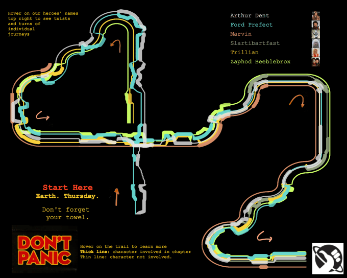
My idea was to recreate the timelines of the six main characters in the book and display them in a similar way to Kurt Vonnegut when he displayed the “shapes of stories” as mentioned here Those who know the book will understand why I chose the particular twists and turns and the resulting shape it ended up taking.
So, I read the book, noted every plot point from every chapter and assigned it to the relevant character(s) and its position within the book. Eventually, this lead to one brand new dataset which was perfect for my purposes., and one viz creator who may have had to spend a little more time creating the data but who got to slowly read and categorise his favourite book in doing so. Every dataset has to start somewhere with somebody responsible for the collection of that data. That person might have to be you!
Here’s a still from my visualisation

You can see the full interactive version here
And it’s not the first time recently I’ve done something similar. Challenged by Simon Beaumont of Sports Viz Sunday last month to produce a snooker themed visualisation, I realised that snooker data was quite scarce. Rather than look for data to visualise, I decided what it was I wanted to visualise, and came up with the decision to create the data myself.
In deciding to tell the story of every shot in the final frame from 1985 (most British people of a certain age will remember exactly what I’m referring to) I had one option. I found the match on YouTube, watched it, and recorded the details and outcome of every shot. This allowed me to create this very specific visualisation (animated version shown below)
Now I didn’t “win” the challenge – when Simon put our visualisations out to a vote, he got the majority of the votes. Given the amazing quality of his latest work, that’s barely surprising – check out his profile here. But the fact remains, often the best way to get hold of data, if there’s something very specific you want, is to record, curate, collate and shape it yourself. If it means you get to watch your favourite TV programs or films. or to read your favourite books, then so be it!

1 Comment