Well that’s a big question. Chances are that if you’ve found my blog then you’re already involved with, or interested in visualising data and you’ll be well aware of the advantages of charts and visualisation types over and above columns and raw data. But I’d like to frame my answer around a meeting where this was particularly brought home last week. A big thank you to the organising team of Rebecca Roland, Ali Motion and Tim Andrews for BrumTUG – the affectionate name for the Birmingham (that’s UK, not Alabama …) Tableau User Group. Rebecca has blogged about the evening here
First of all, our customer speaker summed up Tableau perfectly. Clive Benford from Jaguar Land Rover explained that the three great advantages are data analysis, exploration and collaboration. Forgive me if I’ve misremembered this – it’s almost a week on and I didn’t take a photo of any slides. Not quite true – I should have taken a photo of more pertinent slides for this write-up but instead I chose this one. Douglas Adams might be the one thing I enjoy as much as I do data visualisation …

He emphasised that the often underestimated element of these three advantages is exploration. The greatest advantage to a fast, powerful and accessible data visualisation package isn’t necessarily the end analytical results, but the ability to explore – to open up the path the end point in the first place, which might not have been the original destination.
After a book club session (the group recommended the excellent Big Book of Dashboards, which I would also thoroughly recommend, and this also gives me a chance to recommend my most recent addition to my library inspired by my timeline exploits from my last post, which is Cartographies of Time), we moved on to the Hackathon section.
The group had been pre-supplied with data on medallists from the Commonwealth Games, to celebrate Birmingham’s awarding of the tournament for 2024. We’d had the opportunity to look through it and prepare something in advance, but my case, I only allowed myself the time on the train journey up to Birmingham to try something (half an hour or so). I was quite pleased to have got to a good starting point by producing this bump chart. It was far from finished (disclosure, I haven’t added to it since other than to add the title and the tooltip, shown below, which was added during the evening to demonstrate), but I had attempted to do some analysis.
Who are the top ten nations over the years, how have they changed from competition to competition, and how did being host nation affect them? (host nations below are shown with double-sized circles)
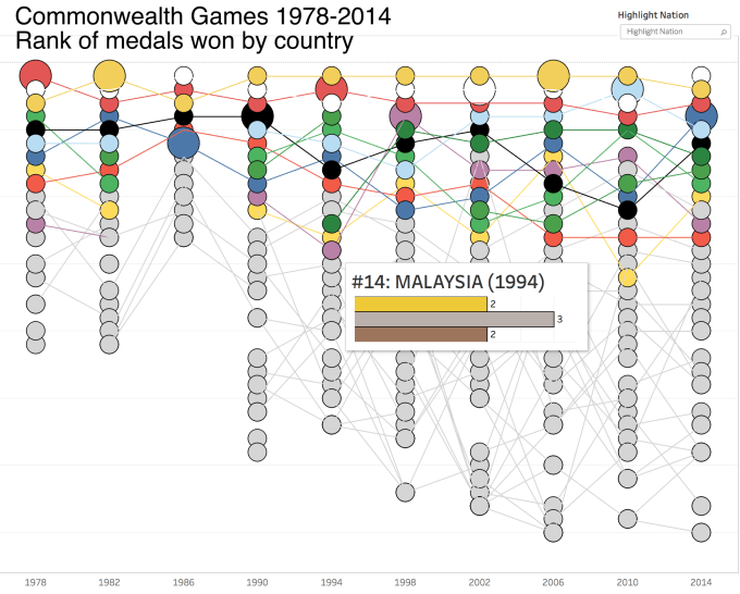
OK, so I’ve got some analytics here. It’s not earth-shattering though. I haven’t added a colour legend but my version of the viz had the countries identifiable on hovering, and the main countries generally use the national colour associated with their national sports teams. Australia (in a gold colour) usually ranks top, with England (white) and Canada (red) doing well. Host nations usually get a spike in medals – this just about holds true but it’s a pretty well known fact, and the host nations are generally always from the top few performing countries anyway, so it’s hard to make much of that.
It’s quick analysis, it looks OK. But one thing stands out to me that I wasn’t looking for at first. What’s going on in 1986? Why such a short column, with far fewer countries obtaining a medal of any kind? Maybe that’s where the story is?
At the Hackathon element of the evening we paired together, largely with those we hadn’t met before: I joined with Andrew Flynn, head of Research and Analysis at Christian Vision. Andrew hadn’t started on any visualising of this dataset, but he had sourced a dataset including national population data for all countries and was keen to look at correlation with population. With the population data included we decided to look at first medals, then country rankings, considering number of medals pro rata.
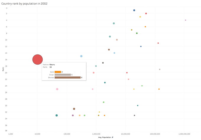
Any charts we did looking at medals per person kept showing up two outliers that skewed the graph and hid any correlations. First instinct was to ignore India (huge population) and Nauru (tiny population) but then it became pretty obvious that Nauru was the story.
We devised a rough and ready Rosling-style scatterplot (note a log axis was needed just to get India in on the same scale!). Tableau isn’t animation-friendly, so here we just show the picture in 2002, when the big red circle is at its biggest. Fittingly (though irrelevantly) this occurred on the day of the once in several hundred years occurrence of the super-blue-blood moon in the skies over the UK, but I digress!
So our chosen data visualisation tool: Tableau, had been brilliant in terms of initial analysis but had led us to exploration. We moved away from the affect of host status on medal tally or the effect of population on medals won over time. This is why there aren’t two finished visualisations here.
The last five minutes of the session were spent away from Tableau, but on Wikipedia. I was still intrigued about the countries taking part in 1986, or more to the point the countries not taking part. Why so few? There were well-known boycotts in the 1980 and 1984 Olympic games which I remember well, but the 1986 Commonweath games? Look at the countries whose line graphs have a gap there: Nigeria, Kenya, India, Jamaica …
Visualising this data led me to discover there was a widespread boycott of the Commonwealth games in protest over South African sporting links. It was very obviously, and, uncomfortably so as I write this in the USA’s Black History Month, an overwhelmingly “white” games as the predominantly non-White countries stayed away. This just wouldn’t have been obvious had the data been shown in a less visual way, and that’s why I love visualising data, for those times when we look for a story to tell and find another one we weren’t expecting.
I then still found time to learn about Nauru’s proud weightlifting tradition and their resultant regular success at the Commonwealth games. Furthermore, a total of seven gold medals were won by one athlete over the course of four tournaments: Marcus Stephen. And whatever happened to Marcus Stephen? He went on to become President of Nauru, that’s what!

Photo: Wikipedia
Again this is something I would never have known about and found very hard to find without the exploration that visualising the data allowed me. With more time we could have really focussed on this aspect or completely redesigned the visualisation to tell the story of Nauru. I left with two incomplete data visualisations but had uncovered extra knowledge. That’s the opportunity that data visualisation offers.
