This post is on my to-do list to write tonight, because I’m keen to share my thoughts on the subject based around a couple of my recent visualisations. But it’s pertinent that I was in a training course today at work (edit: earlier this week, it’s taken me a while to finish this!) – nothing to do with data visualisation, but rather a management training course – where the importance of giving and receiving feedback was also emphasised on several occasions. If it helps you improve your performance as a manager, does it help you improve as a visualisation practitioner?
It’s easy to say that all feedback is a good thing, and in particular anyone who publishes their work via social media is opening themselves up for feedback whether they ask for it or not. Mike Cisneros blogged a while back on the trouble of being an introvert in data visualisation here To paraphrase, Mike explains that he has done all the iteration and improving he wants to do already, this all took place before publishing. Do we really want feedback on work we consider finished, into which we’ve invested all of our creative energy? It’s not always easy.
In terms of spontaneous feedback, or community feedback (by which I mean unsolicited feedback submitted online from friends and/or followers), there’s one thing I’ve noticed: you are much more likely to receive feedback if your visualisation is successful and is being noticed.
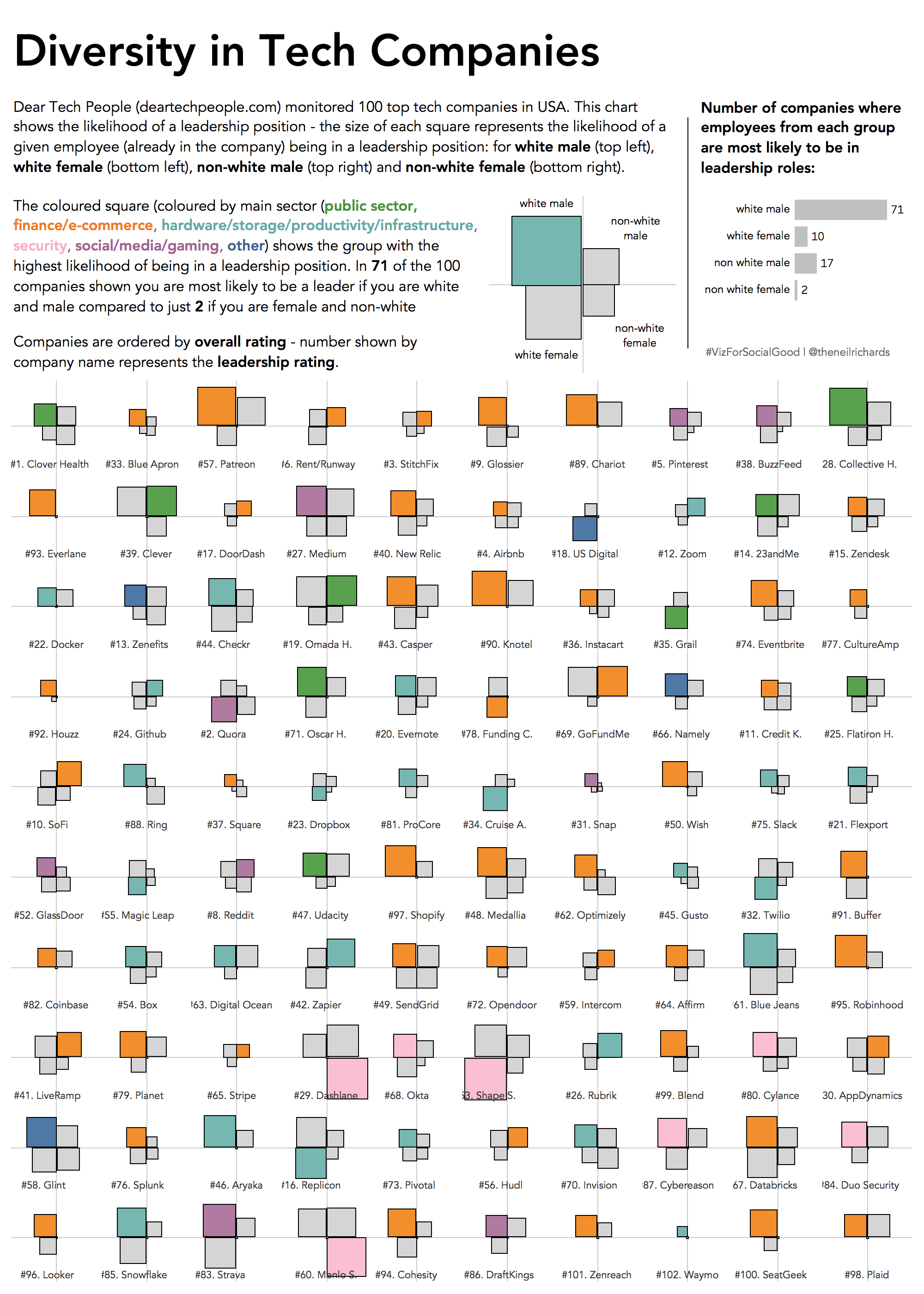
The above visualisation was submitted for the VizForSocialGood initiative a couple of weeks ago. In trying to produce an unusual and creative viz, I was delighted fo find a story which really emphasised the difference in the chance of reaching a leadership position for all those who were not white males, and non-white females in particular. I wasn’t delighted in the story I found, but I was delighted that in my role as data artist and analyst that I’d been able first to find it and then to demonstrate it visually.
Though I was pleased with the look and feel as a result of the design choices, I was well aware of its shortcomings. It’s hard to see the number of each quadrant highlighted (hence the addition of the simple bar chart). And the coloured sectors add context but are also difficult to aggregate – Gestalt principles are clearly lacking here. And also, my decision to focus on percentages of each demography group gave me the advantage of being able to normalise by ignoring sample size, but also the disadvantage of small base sizes in some cases, particularly in the non-white female categories.
The viz has been really well received – some lovely comments along with 70+ likes on twitter and an unheard of (for me) 80+ likes on LinkedIn: a platform I use far less for sharing my visualisations but I thought it might be appropriate due to the business/tech nature of the subject matter. But along with this came the constructive criticism.
First of all came the kind of feedback I never mind – a typo (well, not a typo, but a text error) – I’d mentioned two categories the wrong way round in the explanatory text. Needless to say this is now fixed. Nobody minds this kind of feedback, we all miss typos!
Next was some feedback from Fi Gordon (@vizchic) who wondered if absolute numbers would be more appropriate. Is using percentages misrepresenting the sample, showing 1 non-white female from 5 in the same prominence as 200 white males from 1000? I didn’t make any changes as a result of this but I didn’t disagree, and did appreciate the discussion. It’s a discussion point and a potential downside, though in order to represent likelihood of reaching leadership roles I felt I had to go down the route I had done.
The next person to talk to me was Sonja Kuijpers from Studio TERP (@SoniaKuipers). I’m a big fan of Sonia’s work (and if you check it out at the link above, I’m pretty sure that you soon will be too), so when she has some ideas, I listen! Could I change the way tooltips showed above the images (sadly not). Could I order the companies in a different order (absolutely, yes – perhaps grouping together by percentage white male would group the companies together, but would it promote the story of one demographic group above others?). Could I do something more with the colour – instead of, say, three grey squares and an orange square, what about three orange squares and a darker, more saturated orange? I really liked that idea (and all the ideas mentioned) but have left it on hold for now.
And finally I have more great constructive criticism from Giorgia Lupi, who I have mentioned many times in this blog before. In this case I reached out to her (well, I asked her, but these days you’re supposed to say “reached out”, aren’t you?) for feedback specifically, since she was kind enough to offer it on on many of the submissions. Like the others she loved the viz but had several ideas for improvement. Would it be better to be able to highlight or filter using the different sectors? Maybe we could have the option to switch between absolutes and percentages? I agree that both these could potentially add value to my visualisation.
All of these constructive elements of criticism were suggestions from improvement from the baseline context of people who liked and were interested in the visualisation. In this case I feel honoured and empowered that my viz was noticed and commented on by three people in the context of being interested in the visualisation and the story that it told. Perhaps no coincidence that all three are talented female leaders in the field!
Generally if you are disinterested in a visualisation or it doesn’t capture your imagination then you are less likely to give constructive feedback (certainly spontaneously at any rate). It certainly seems that’s the key to improving further. For now, I’m going to leave the visualisation as it is – I’m not sure if it’s likely to be used by Dear Tech as part of the Viz For Social Good initiative since there were so many other good submissions, but if so then that’s when the iterative process begins, through more feedback.
Also this week I was introduced to an excellent video blog by Ann Jackson and Luke Stanke called Hashtag Analytics. Ann is a Tableau Zen Master and Luke absolutely should be – together they discuss the Iron Viz submissions from earlier this year and in particular discuss the subject of feedback, giving their own thoughts on the top submissions, the also-rans, and interestingly discussing their own thoughts on receiving feedback.
For the first time this year, feedback was made public on the top ten entries, opening the judges up to scrutiny on their decisions and allowing those not chosen as victors to reflect on their own thoughts as to whether they agreed with the judges and how to improve.
There were few disagreements all round as to the quality of the top three entrants which you can see here
My own view, for what it’s worth, coincided with the judges on the overall winner from Ludovic Tavernier. I might have picked other candidates as top ranking in the other places but certainly don’t disagree that the judges’ choices for numbers two and three were absolutely deserving of the awards. The cream very definitely rose to the top.
Ann and Luke both had opinions of other visualisations they might have included in the top ten (and a big thank you, Ann, for your first recommendation!). I think both would agree that there is a difference between building a visualisation to your own strengths, style and preferences, than there is to building a visualisation to meet an exact set of competition criteria. The difficulty comes when there is a disparity in feedback. Did Ann’s visualisation deserve 1/10 or 10/10 for storytelling? Whichever you think, how do you in that situation react to it and improve for future submissions? If the judging criteria rate you lower in analytics and design than the overall winners, but you met your own criteria in producing exactly the visualisation you set out to create, then how do you react to the feedback? Luke and Ann both agreed that Ann’s submission lacked a text element to help explain the story the visualisation was telling. But that matched Ann’s style and preference – it was a deliberate choice – and is also a contributing factor in her preference of my own visualisation. So, even the most constructive feedback can often confirm an intentional design choice that you have no intention of changing!
In my own case, I knew my submission wasn’t a competition winner, not even close. Here’s the main screen:
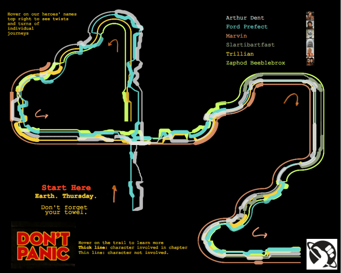
I thank Ann for describing it perfectly succinctly: a Neil Richards original! For me it was a creative exercise, a chance to have fun, to re-read my favourite book, to put up an interesting style visualisation and to intersperse a collection of in-jokes. I succeeded in all four of those criteria. I didn’t succeed in analysis, storytelling and design, but I’m OK with that. Ultimately, in the book, Arthur was clueless with just a book stating “Don’t Panic” as a guide (literally). So in recreating some of that feel, it’s possible that user experience of the visualisation suffers. And it’s never going to be a deep and meaningful analytic viz. But I hope it struck a chord with those who like “Neil Richards originals”.
Ultimately the judging process is as objective as it is subjective. I know (sweeping generalisation alert) that there are people who really enjoy the visualisations I produce, and others who really don’t. I mentioned above that, unless provided as part of a specific judging process, feedback generally comes from those who do like the specific creation in the first place. Perhaps it behoves us to make sure we burst out of our feedback bubbles from time to time and find out what it is that those who like our work less think, and why (and whether that matters to us). Luke, Ann, and myself have probably shown that it’s easier to provide constructive feedback on other visualisations than it is to receive it for your own, but in general, the nuanced difference in community feedback (offered to improve visualisation by those who like them in the first place) over judges’ feedback (offered by those looking at specific criteria) makes it easier to iterate in the creation process, should that be what you wish to do.
To answer the question of how important feedback is (in a roundabout politician-style way), I’d certainly conclude that there’s no such thing as bad feedback: whether you welcome feedback to improve your submission; whether it is at odds with your own goals for the particular submission; or whether it is unsolicited feedback that you don’t feel the need to act on. Nobody ever got worse as a result of (constructive) feedback unless they stubbornly misinterpreted it, and if feedback comes with good intention then I would always welcome it. But be nice!
