Once again, this is a post a few months in the making. It’s a topic that often comes up, and a question that can have a number of answers, depending on the type of competition, your own career and circumstances, and other such considerations. Or, like most of my questions, it could have one valid […]
Tag: tableau
What are Truchet tiles?
In January, I was inspired by the amount of generative art being produced, in particular on my twitter feed. The hashtag #genuary2021 was full of examples of generative art, with each day having a different “rule” to inspire their participants. It’s hard to pick a favourite given there were 31 days’ worth of contributions from […]
What are Data Portraits?
Yesterday I was invited to talk at the Northwest Tableau User Group in Manchester. I was delighted to accept, not least to support the co-organisers: Ella Worsdale, Lorna Eden, and Colin Wojtowicz – a freelance data visualisation and analyst trading as Datawoj Ltd. It quickly occurred to me that I could re-present my recent Tableau Conference talk […]
What are my follow-up actions from #TC18?
The last week has been the overload of presentations, participation and socialising that is the annual Tableau Conference – ubiquitously known as #TC18. As 17000 people descended on New Orleans it represented an amazing opportunity to learn, meet new and existing friends and be inspired for the future. And, what an amazing city to host […]
How do you go about competitive data visualising?
It’s been a while since my last post (for me, anyway). Partly because I’ve been busy, and partly because I’ve been procrastinating a bit. The usual kind of reasons. But another key reason is that I had a half-written blog post which hasn’t really been going anywhere. So this represents a bit of a re-write […]
How should we visualise stacked bars?
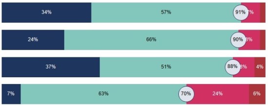
This question arises from a recent article in Datawrapper’s blog by Lisa Charlotte Rost – in this post she discusses why they don’t provide diverging stacked bars as a standard offering. I’ll offer the “tl;dr” option here that she gives: “We don’t recommend using diverging stacked bars for showing percentages. The 100% stacked bars are […]
Do we take data visualisation too seriously?
It’s been a while since my last post – there’s a good reason for this. Well, a reason anyway. I have a 90% written post which I have been mulling over for a long time. Because I haven’t felt comfortable with it, or finished it, it’s been a bit of a logjam for the blog […]
Why do we visualise data?
Well that’s a big question. Chances are that if you’ve found my blog then you’re already involved with, or interested in visualising data and you’ll be well aware of the advantages of charts and visualisation types over and above columns and raw data. But I’d like to frame my answer around a meeting where this […]
What are my data visualisation goals for 2018?
I’ve just gone and added the words “data visualisation” to the title – nobody here knows that I need to eat less and exercise more (though it’s true). I’ve decided to think about my goals because (a) it gives me a focus to look back on to see if the year, and my progression in […]


