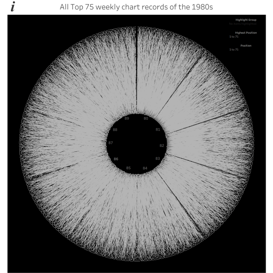
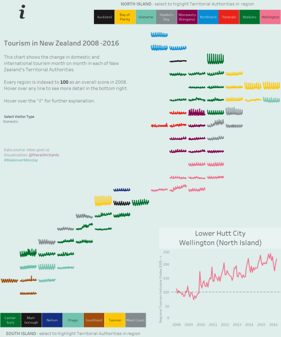
This is another post that’s quite difficult to frame into a question, but I want to take the opportunity to show off a bit about my latest album cover themed data visualisation project. After all, it’s a niche (some might say pointless) thing I’m doing, so why not justify it with some writing, pictures and, […]
Tag: tableau
Who are my data visualisation inspirations?
I wanted to write a post about my inspirations in data visualisation. First of all, I feel a little bit uncomfortable citing inspirations, not because I feel uncomfortable expressing praise to others, but because I feel that as someone so inexperienced in the field, you might think that I am eliciting comparison. Please don’t think […]
What can be achieved by collaboration?
At the start of the year were a lot of tweets, messages and blog posts covering predictions in data visualisation for the year ahead and people’s own resolutions for what they might do in a new and different way this year to develop their skills, experience and exposure. Personally, I ducked out of that approach, […]
How did I create the spiral chart?
Jump, Darn Dolt! My latest visualisation is the spiralling chart below this paragraph, showing all the tweets of a certain dolt in anagram form who I don’t want to give any more publicity than he already craves, part of the Makeover Monday project. I’ve been toying with a spiral chart for a while (for example, I […]
What did I learn from Tableau Conference 2016? (part 2)
Part 1 was posted a few days ago here, featuring numbers 1-8. We’ll jump in at number 9. 9. Tableau is moving into data preparation. With the announcement of a three-year roadmap followed by the developers on stage, Tableau announced a raft of new features large and small. These are all well documented now in […]
What did I learn from Tableau Conference 2016? (part 1)
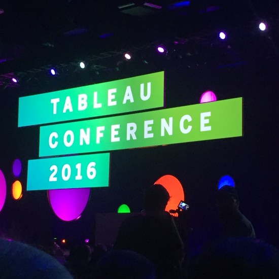
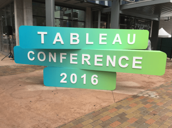
Last week, I had the great fortune to attend Tableau’s yearly conference, in Austin, Texas. In the interests of disclosure, I should say that my entry was paid for by Tableau, as winner of an entry competition. With so many sessions to attend, things to learn, speeches to hear and people to meet, I’ve tried to […]
How should you prepare a visualisation project?
Here’s a post about my latest significant visualisation – it’s Olympic-themed, centred around all the decathlon greats from 1984 to the present day. I’m genuinely quite happy, but not delighted, with it. Click on the image below to see the interactive version on Tableau Public. And please, if you like to explore this kind of […]
What makes a “viz of the day”?
First – an explanation. The majority of my visualisations are done using Tableau and published on Tableau Public (here). Available for all to see, it’s a great resource for experimenting and publishing work that you’re happy for all to see. Click on it today and you’ll see there are 190000+ authors, 25M+ views/month and over […]
Should the data drive the visualisation?
Obviously the answer to this is “yes”, at least inasmuch as it can’t be the other way round. I’ve learnt (well, I knew really – let’s say “confirmed”) today that you can’t just decide on a visualisation without thoroughly knowing your data and its suitability for the job. Take the excellent visualisation below, published in […]


