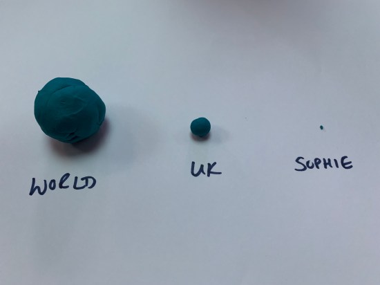
Lockdown (due to COVID-19) has been a difficult time. As I write, we are entering the sixth week of not leaving the house except for essential food and exercise, with a full family staying, working from home. It doesn’t feel right writing this, since I am neither an epidemiologist, nor a mental wellbeing expert. But […]
Recent Posts
What happens when you combine map visualisation types?
It’s been a while since I posted – but I wanted to draw attention to one of my recent visualisations and the design thought processes behind it. I’m going through a stage of having a lot of half-finished ideas, not to mention busy times professionally, so in order to get something completed, I wanted to […]
How can we visualise decimal numbers?
As a mathematician, I’ve always been interested in numbers and patterns between them. So many mathematical formulas, numbers and concepts can be “explained”, or at least shown visually, that I was tempted to create data visualisations (or, if you prefer, data art) based on numbers and their patterns. One of my first fun mathematical facts […]
What did I learn from Encode 2019?
For those who don’t know, Encode was a brand new conference hosted in London on September 18th-20th featuring workshops, debates and presentations. It focused on the pillars of design, education and journalism within data visualisation. There were many great takeaway quotes, inspirations and ideas from the conference, so without further ado let’s get started: Grab […]
Why do we visualise using triangles?
OK, so the title to this is a deliberate reference to an earlier post: Why do we visualise using circles? That particular post celebrated Manuel Lima’s amazing book and went over many of the opinions that people have expressed about circles in data visualisation – love them or hate them. But what about triangles? I don’t […]
When are two maps better than one?
This post refers to a recent visualisation of mine which aimed to look at poverty rates across the 47 prefectures (regions) of Japan. Because each individual prefecture was reported with average poverty rates, and therefore each had the same amount of importance placed on it regardless of size or population (and because I love tile […]
Can data sonification help us see data?
What is data sonification? Data sonfication is to auditory perception as data visualisation is to visual perception. In other words, sonification allows you to hear data in much the same way as visualisation allows you to see data. So, representing data as sound/music is not the same as representing musical data visually (which I’ve done […]
Does it matter if shapes overlap in a visualisation?
This post is a brief journey through the design process for my recent visualisation showing the first 3500+ members of the Data Visualisation Society By way of a challenge, we were provided with anonymised data – consisting of just sign-up dates/times, self-reported scores averaged over three areas (summarised using the terms “data”, “visualisation” and “society”, and […]
Do tile maps need to have regular shapes?
Some context to this blog post – I’ve got a couple more blog posts on the go and viz projects that are a little bit stalled. I have every intention of getting them moving again in the near future, but on days like this when momentum is low, it’s nice to revert to some of […]