OK, so the title to this is a deliberate reference to an earlier post: Why do we visualise using circles? That particular post celebrated Manuel Lima’s amazing book and went over many of the opinions that people have expressed about circles in data visualisation – love them or hate them.
But what about triangles? I don’t think I’ve heard them mentioned much before. And I certainly don’t think there’s a classic data visualisation Book of Triangles. What are the pros and cons? First thoughts are that similar issues arise as arise with circles. If we’re encoding with area, we can’t judge triangle areas so well as we can judge lengths. In fact, if we’re considering the length of a triangle, are we measuring the length of its base? One of its sides? Its height above the base?
But before I write off triangle completely, I had a think as to whether I’ve used triangles much in data visualisation. And it turns out I have, quite a lot. Unlike circles, which come in all different sizes, triangles come in all different shapes and sizes:

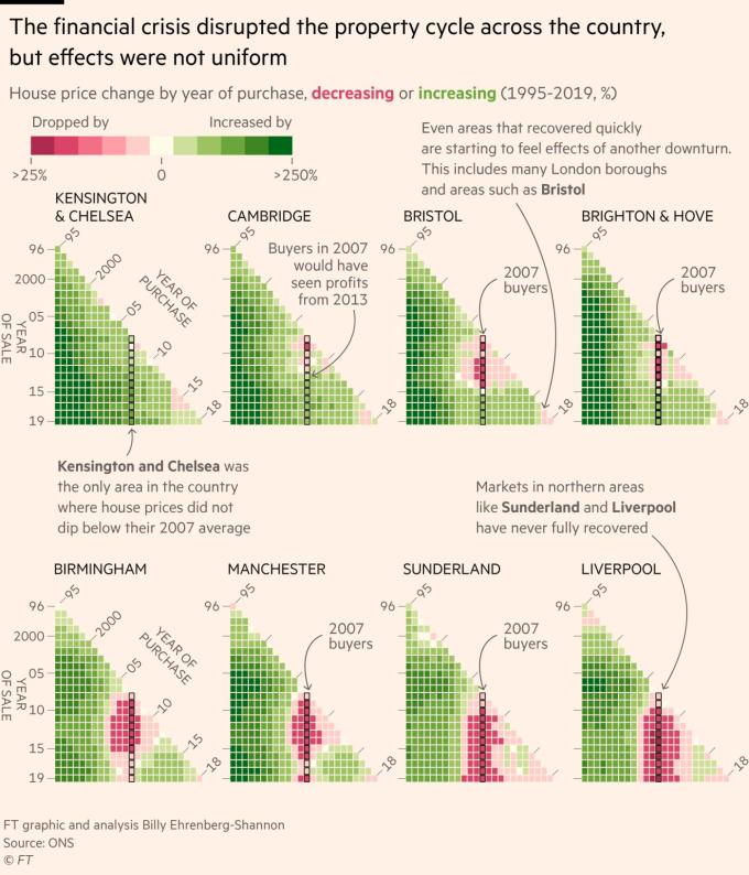
Spoiler alert – I have been working a lot with them in my latest viz, which has prompted this topic in the first place. Prompted by the chart below by Billy Ehrenberg-Shannon from the FT Data twitter feed, I noted how much the triangular shaped charts popped out from my screen and told the story of house price changes in an interesting way:

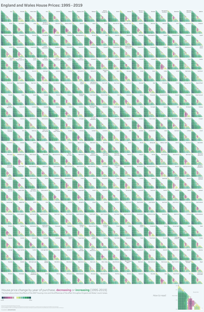
My first thought was to find the data to recreate these charts using Tableau – and if I could find the data then I could make a full small multiple poster style version of all the councils. Luckily the data was easily available via the ONS website. So I converted the visualisation from 8 triangles to 391 …

Triangles, when not tessellated (when the white space is filled in), stand out because of their angular nature. These right angled triangles, given they are all oriented the same way, pop from the screen and leave their own white space at the top right of their own “grid square”. I tend to think that the unusual nature of having a triangle means that you’re forced to invest time in the chart and how to read it – after all, we don’t see charts consisting of triangles often. Although that assumes that you’ve made the initial decision based on first impressions to do that in the first place!
After publishing the chart above, my friend (my boss!) suggested another way of visualising the above. Instead of the small multiple triangles, where it’s not really possible to spot geographic trends, why not make one large triangular matrix with each section a chloropleth map of England and Wales, which would better show the slow recovery in the North West compared to London and the South East. Challenge accepted!

This chloropleth matrix (with thanks to Maarten Lambrechts for the name) shows the regional effect really nicely. And it’s not lost on me that the shape of England and Wales can be approximated by a triangle!
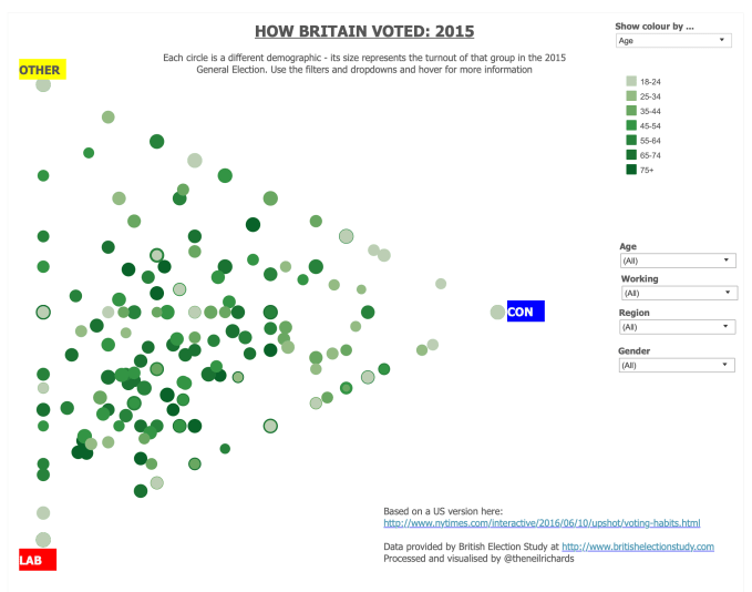
One of the reasons each of the charts above have gravitated towards a triangular form is because there there three dimensions to display: region, buying price and selling price. A similar situation occurs in examples where you may want to create a chart on three axes. What’s better – three axes in a two-dimensional triangle … or a 3D chart? Here’s an example when I was much more of a design novice, but the fact remains that when looking at three measures with equal importance, a triangle is an obvious consideration.
In each of these examples, I think the shape of the triangle, whether at the “micro” level or the overall level, stands out because we’re expecting something round or something rectangular. Perhaps it’s the same reaction as seeing a triangular flag, or a triangular stamp?
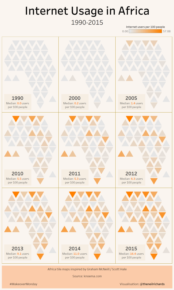
Triangles. when not standing out because of their angular nature, can also be tessellated – a great feature for tile maps. When I was privileged enough to see Nadieh Bremer speak at a conference in Leeds this year, she mentioned how much she loves regular hexagons – we all know how well hexagons tile in a honeycomb-like fashion, but six equilateral triangles can combine to a hexagon and tile in the same way. And sure enough, my triangle hexagon map of Africa was a great success – not only did it have the compact tiling common to hexagons, but had more versatility in the overall shape derived from the acute angles of the triangle (as seen in South Africa)

The final thing about using shapes to visualise is that they can approximate the shape of areas or objects. We might use circles in a visualisation about tennis (to evoke balls), or in a visualisation about planets (as seen in my recent Holst visualisation here). In much the same way, triangles can approximate other objects. We’ve already seen how the shape of England and Wales can resemble a triangle. My recent visualisation for the Data Visualization Society also used a lot of triangles …

The triangular shape was a legitimate shape (here are the scalene triangles I mentioned before), since the distance of each point from the triangle’s centre represented three different attributes. The reason it worked well (partly through luck!) is that different (autumnal) coloured triangles of different shapes remind us of trees in a forest. And I like to think that its distinctive and eye-catching nature is one of the chief reasons why it was chosen as the banner for the DVS’s own industry survey:

In all, I don’t think we can really answer why we visualise with triangles. Every example I have given could equally well be visualised in a non-triangular way. But as someone who likes to design for impact, intrigue and aesthetics (whether others agree with my categorisation), the triangle, of all its forms, is definitely a tool in my data visualisation design sketchbook.

The initial one reminds me of two types of triangle chart I was familiar with growing up, both of which I found fascinating. The first was, not unusually for a 9-12yr old boy a grid of all the football results across a season – Home team on the Y-axis, away team on the x-axis. Then I found a similar chart for (driving) distances between UK cities (pre-internet days). So I love these, particularly the chlorpleth matrix.
Only thing with the first one is that I’m puzzled why the 2nd axis goes along the hypotenuse, rather than the more traditional X-axis. Was that a deliberate choice away from Y & X and, I guess, if so I’d be curious to know the reasons for it?
LikeLike