For those who don’t know, Encode was a brand new conference hosted in London on September 18th-20th featuring workshops, debates and presentations. It focused on the pillars of design, education and journalism within data visualisation. There were many great takeaway quotes, inspirations and ideas from the conference, so without further ado let’s get started:
- Grab people’s attention or we don’t get paid!
Before the conference started officially there were two workshops – I was fortunate enough to attend the journalism-themed workshop run by the Financial Times’ Federica Cocca and John Burn-Murdoch. They co-host a video podcast called Crunched, and the workshop started with a live recording, which has at the time of writing not yet made it online, so instead I’d recommend checking out previous versions such as this one debating whether data is sexist. Our workshop task was to undertake a similar investigation – looking at a current topic and appreciating the number of articles and data sources needed to give context and validity to any conclusions. The quote above, from Federica, was particularly relevant because it can be hard to come to firm conclusions. And from a journalistic point of view, without a firm conclusions that grabs attention, nobody will click through to the visualisations which pay the journalists’ salaries! Our own work focused on water footprints of different food groups, using low-tech visualisation forms, such as bottles of coloured water, flip charts and coloured pens … and this plasticine work of art!

2. Artists without financial backing need help, especially women artists.
The pre-conference welcome event was hosted by Outliers in Dataviz, with presentations from two data artists. Both artists had long careers in IT as well as acclaimed works of data art installations, but both acknowledged it is not an easy career to forge without financial backing, which may be in the form of needing to hold down a second career. As a white middle-aged man myself, it’s never comfortable listening as I wonder what people like us can do to help talented female creatives in the field. I don’t have money. But I have a blog, and followers. And I can help by sharing and publicising. Rachel Ara focuses on feminist data visualisation and has a mesmerising installation currently at the V&A entitled “This much I’m worth” – her talk made us realise how much work goes into such an installation and all the carpentry, electronics and logistical skills Rachel also needed just to get her idea into fruition. It’s been all round the world but check it out in London if you can.

Dr. Julie Freeman has done some amazing work watching the interactions of animals in nature, from fish to naked mole rats. I’ve posted an earlier version of one of her talks here, again just so you can see the brilliant range of her recent work in particular.
3. Record your ideas, however random – keep a healthy backlog
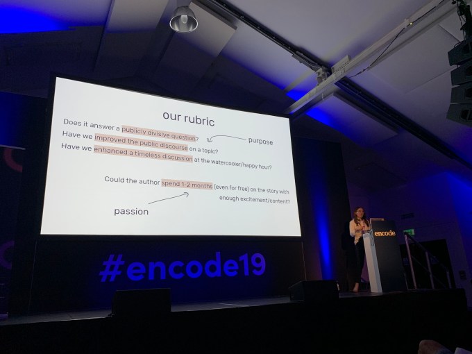
This was advice from Caitlyn Ralph, data journalist at The Pudding. All of their team are encouraged to do so – they deliberately have a policy of avoiding topical/political subjects in the news/social media bubble but finding stories that answer a publicly divisive question (see below). I always have ideas, sometimes I dismiss them as daft – other times I am excited about them for a while, but in most cases I just forget them. Such a good idea to make a note of these ideas – at some point a few months later there might just have been a new angle or a change in circumstances that make the idea the right project for the right time, but it’s no use if you can’t remember it!
4. Hand drawn world maps make for a personal story and great ice-breaker
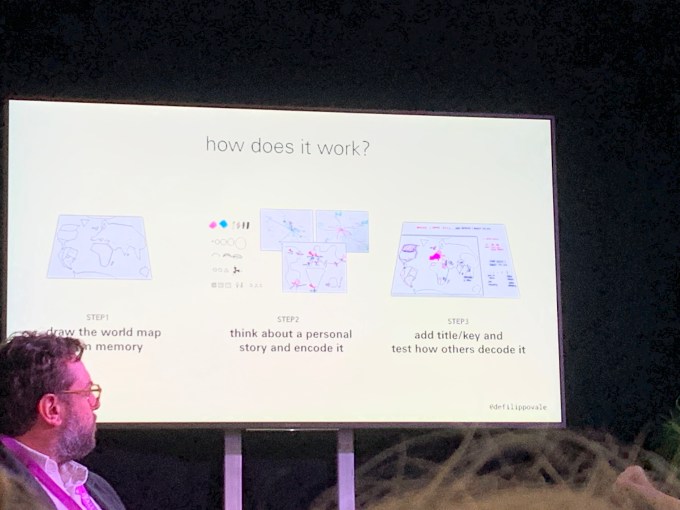
The education debate included great advice from Valentina d’Efillippo around some of the workshops she hosts. Starting with hand-drawn world maps, every delegate can create a personal story, and the way they draw the map can say many things around the focus of their personal life stories. It’s also a great canvas on which to visualise and annotate. I picked out two other great pieces of advice – help yourself to colours and then restrict each person to a maximum of three being another one! Below is a slide from Valentina’s discussion explaining more. I’m fortunate enough to have the opportunity to run occasional data visualisation workshops professionally, and many of the tips and tricks discussed will be very useful to me!
5. Present each other’s work
This was an amazing tip from David Hunter at Ravensbourne University from the same panel debate. He was referring to the data walks he runs with graphic design students but it occurs to me that this would work in any data visualisation workshop or hands-on session. I always like to allow time for presenting work back at the end of a session (for example, if running a Makeover Monday style session and allowing an hour for working on the visualisation, I’ll ensure the session is 1:15-1:30 in length to allow for presentations). Not only is presentation skill an important skill to learn in the data visualisation field but it’s an element of ensuring that the user testing phase is included – can you get your visual message across to those who are seeing your visualisation for the rest time? But presenting each other’s work goes a step further – it really ensures that you make your visualisation understandable and that you include the correct level of explanation/annotation and legends. If your friend can successfully present your work without a hitch, you’ve spent time to ensure this is the case. A brilliant and simple idea I’ll use in the future!
6. Collaboration is fun – data and research are both creative
This stems from the presentation co-delivered by Miriam Quick and Stefanie Posavec. Miriam and Stefanie have collaborated on many projects and they focused on their friendship which meant that collaborating was always a pleasure. The key thing was that while Miriam may focus mostly on data and research, and Stefanie may focus on design, both of these can be thought of as creative elements and therefore decisions are arrived at collaboratively. And of course both elements can face the same obstacles when it comes to “sucking it up” – as demonstrated in an unmistakably Stefanie Posavec way!


I’ve spoken about wanting to collaborate before and never really got it off the ground, but the more I see great collaborative projects the more I realise what a good opportunity to get the very best of each person’s skills.
7. Data is both a structure and a jumping-off point
This was a quote from Miriam Quick in the above-mentioned talk, and she went on to demonstrate it beautifully. The “structure” element in the above quote could be thought of as the standard element of most data visualisations – we convert raw data (granular or aggregated) into our visualisation. Miriam and Stefanie were able to do that in a project which measured and visualised breathing patterns in themselves and their husbands. But then came the jumping-off point, where the data and patterns within were used to compose a choral piece (linked to below)
https://miriamquick.com/sleep-songs
Such an interesting concept which gave me the idea of secondary visualisations or performances based on original structured “primary” visualisations (the jumping-off points).
8. Happiness is key to creativity
This was the message behind the conference’s opening talk, by Wesley Grubbs from Pitch Interactive. I wasn’t sure about this at first – the reserved Brit in me isn’t interested in street art on the office walls or “shredding the gnar” California-style (no idea). But the more prosaic elements of this did make perfect sense. From an agency perspective, you shouldn’t start without an initial contact consisting of purpose, data, timeline and medium, a phase of requirements gathering and a statement of work. If any of these are missing or incomplete how can you be happy leading into your project? It might be slightly more crucial in an agency setting than a business setting or a personal project but it still makes sense to me – the stage before even starting off on a project is crucial to your happiness and the project’s success.
9. Visualisation allows us to see data hidden in plain sight
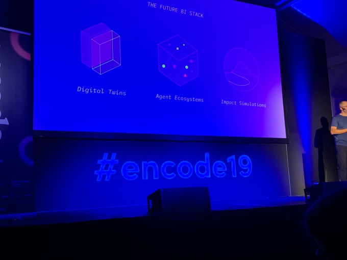
This was a sentence from Matthew Falla of Signal Noise in his presentation. It seems obvious but I hadn’t considered it as a concept in that way before. Matthew explained the concept of a “digital twin” where a visualised simulation of a system allows us to understand, analyse and investigate a system. This was potentially within the context of AI simulations in what he called the Future BI Stack. The idea of looking for data hidden in plain sight is an interesting one and another great justification/explanation of data visualisation.
10. r/dataisbeautiful is restricted to computer-generated imagery
This was mentioned in a talk by the Economist’s Marie Segger. Marie’s talk was entitled “Data, I love you, but you’re bringing me down.” Marie focused on the difficulties of creating an environment where women and minorities can thrive in an environment that could otherwise be becoming more and more male, pale and stale. As part of her argument she mentioned the sentence above. The r/dataisbeautiful subreddit is huge within the data visualisation industry. I must admit it’s not a page I ever check – I am perhaps too much of a dinosaur for the reddit world, but I do acknowledge that views and clicks there can be huge, and therefore no doubt reputations can be made. But, apparently, all images must be automatically generated, or accompanied by a computer generated version.
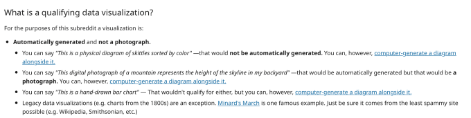
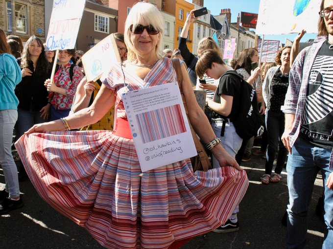
No place for creative non-coded data visualisations. If I think of those who this rules out, I think of Amy Cesal, Mona Chalabi, Giorgia Lupi, Miriam Quick, Stefanie Posavec, Rachel Ara and more (for example this wonderful dataviz take on Ed Hawkins’ climate stripes from twitter user @ladybibrd_athome in the Climate Strike protests)
A sub-genre that seems to favour women, all of whom are excluded by virtue of their chosen medium. This is not a good thing – I, for one, think that the visualisations of those mentioned are all beautiful and this needs to be rectified. Until then, the work of those who are not eligible (female or otherwise) needs to be celebrated and shared in equal measure.
11. Be like the worst tabloid at the front and the Academy of Science in the back
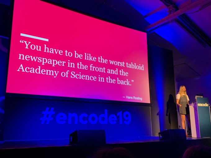
This was a new quote for me, and just too good (from the legendary Hans Rosling) not to include in its own right. Again from Marie Segger, it emphasised the importance in having confidence in your work – be blatant in your self-promotion and make sure it is absolutely rigorous in its construction. Again presented within the context of gender inequality in the field, this is important for all still making our way in the industry.
12. Sonification is here to stay
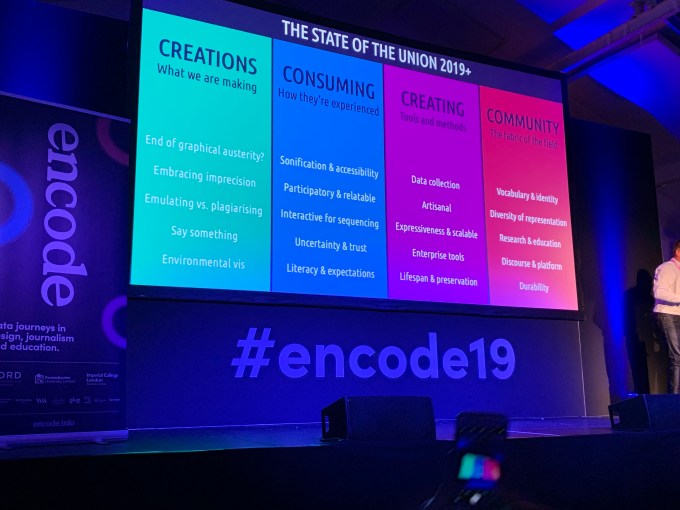
You’ll get no arguments from me here, particularly following my own attempts at signification. Andy Kirk’s “State of the Nation” data visualisation roundup divided industry facets and trends into twenty different areas. There’s nobody better at having their finger on the pulse of data visualisation than Andy, and I could therefore have taken all 20 of my bullet points for this blog post from Andy alone.
Where sonification is concerned, we saw how it is a real benefit from an accessibility point of view. Referring back to Alan Smith’s work at the Financial Times we saw how the sonification of yield curves allows those who are visually impaired to hear differences in data over time. In addition, the team from Datavyes showed a sonification of noise levels across the Paris subway network which was a perfect accompaniment to the visualisation.
13. The future of data visualisation is the future of uncertainty communication
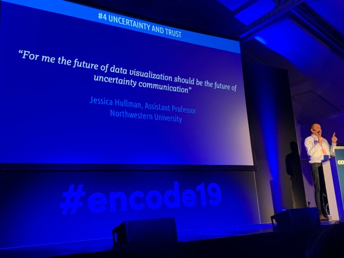
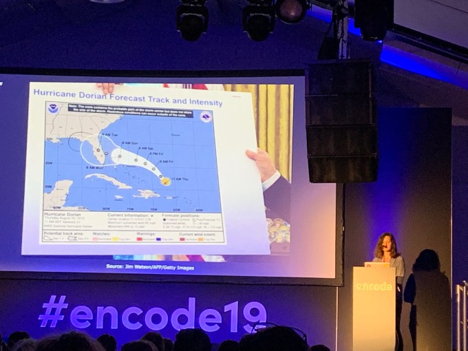
I must admit I took the bait here as Andy paused in the acknowledgement that this was a very photographable slide, but even I don’t just photograph and retweet anything. It’s a topic that’s been bubbling under in the field for a while, but has never been more prominent. Rebecca Conroy from Beyond Words featured this infamous image in her talk on the importance of truthful data (a sharpie, a tiny hand, you know the one …) and it’s prominent in this week’s Nightingale article (described as a Tragicomedy) from Alberto Cairo. We absolutely have to be on top of the importance of uncertainty in visualisation and how we make it clear so that even the simplest of minds (ahem) can understand.
14. Don’t just be a practitioner – be a critical practitioner
This was a side comment from Andy Kirk in his address which perfectly tied in with my earlier thoughts above, concerning presenting the work of others. User testing is key in visualisation, and will usually be the first thing to be missed in a personal project with just one person involved (well, it often is in my case). So to extend that, you need to be a self-critical practitioner. Really liking the look of something i have produced and published myself isn’t enough. Does it meet the goals I was attempting to meet? Does it answer the crucial question/the user story? Is it obvious how it needs to be interpreted, or if not, is it adequately explained? These are basic questions but all summed up by Andy’s quote of advice above, which is one I need to adhere to more.
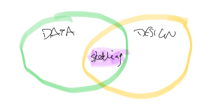
15. Sketching with paper leads to sketching with code
Valentina d’Efilippo’s main presentation was all about sketching. The realisation that sketching is an important process in the prototyping of a visualisation is not new to me, and is something I have tried to implement recently but by no means regularly. My visualisations might be of two forms – analytical visualisations in Tableau, where the exploratory phase can often be performed within the tool, and design-driven personal projects. In the latter projects, whether in the drag and drop friendly Tableau or not, it still makes sense to sketch. Because sketching with paper can then lead to “sketching” with code in advance of the final project. In my case particularly, overcoming the lack of confidence to start committing to blank paper (or a blank iPad screen) is just the impetus I need to start working on a project, as I remember that a sketch does not have to be a full drawing.
I started by making notes on this talk in sketch form. I’m trying!
16. Facts are stubborn things
In her talk on the importance of using truthful data, Rebecca Conroy quoted the above, attributed to US President John Adams. A quick google reveals the full quote: “Facts are stubborn things; and whatever may be our wishes, our inclinations, or the dictates of our passion, they cannot alter the state of facts and evidence.” Perhaps this goes all the way back to my first quote in this blog, and the difficulties of fact based journalism. But Rebecca followed up the quote by saying “Keep them stubborn”. I like that – a reminder that we should never take the easy option (a sharpie, perhaps … see above?!) just to give the outcome we want.
17. Dark backgrounds/colour schemes avoid draining battery
This is a new one on me! I’ve recently heard that using dark backgrounds is a clever way to avoid or discourage clients printing dashboards, but not this more practical reason. This was a tip from Bronwen Robertson who presented the work of data4change. Rightly so, the talk focused on the hard work and diversity of data4change’s volunteers, assembled in affectionately-labelled “motley crews” to address issues and help agencies in less advantaged areas such as Yemen and South Sudan. The above tip is one of accessibility – the teams need to consider things such as poor vision and low bandwidth. And the additional tip that darker colours drain less battery power is something that never would have occurred to me. As I write, a thought occurs to me – is *that* why twitter has introduced its annoying night mode?!
18. Hacking the box is better than thinking outside of it
Another phrase from Bronwen Robertson’s talk about data4change which again brings the emphasis towards collaboration, resources and teamwork. Sometimes thinking “outside the box”, as the cliche goes, is not really the right or viable option. With a skilled and diverse enough team in place, you are often better off stretching the resources and physical tools that you do have rather than inventing more creative solutions – that’s what you get the right people together for in the first place!
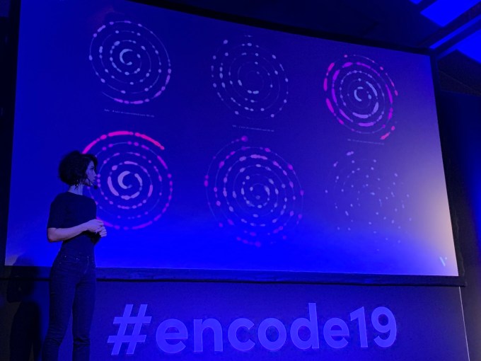
19. When data becomes visible / showy, people take ownership
This quote came from Caroline at Dataveyes, a French agency who presented their work on smart cities and how they visualise noise pollution. The quote is a corollary of the advice given by Alberto Cairo and others about putting yourself in the visualisation. In this case the implication is that if a city’s noise pollution can be shown in an eye-catching way, then that’s the point at which the authorities (or inhabitants) have the chance to notice the results and take action. Understandably, given my penchant for spirals and small multiples, it was this “showy” visualisation that caught my own attention
20. The creative data visualisation industry is full of talent and enthusiasm all round the world
This was the the biggest takeaway for me. The attendees and presenters came from countries all around Europe and beyond, with the goodwill and enthusiasm so evident from everyone I met. Thank you to all who made for such a great experience across three days. The organisers could barely hide their excitement at the idea of hosting a 2020 version next year, and if that’s the case I can barely hide my excitement either!

What an insightful post and so much food for thought. Thanks for taking sharing these!
LikeLike