This post is a brief journey through the design process for my recent visualisation showing the first 3500+ members of the Data Visualisation Society By way of a challenge, we were provided with anonymised data – consisting of just sign-up dates/times, self-reported scores averaged over three areas (summarised using the terms “data”, “visualisation” and “society”, and geographic data (latitude and longitude).
Reverting to type, I wanted to show a small multiple type visualisation which would look great in poster format. I decided to show the three metrics as a triangle and colour each triangle by longitude to reference each member on the map. Here was the resulting image:
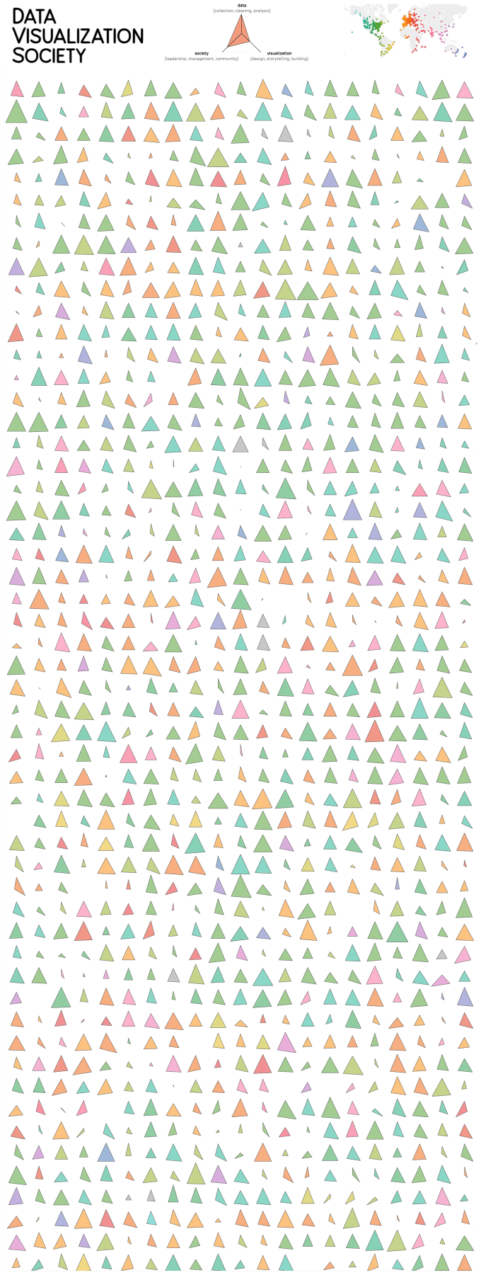
It was fun and colourful but I wondered if I could do better. Instead of creating a grid and dropping a triangle in each, I remembered the technique alluded to by Klaus Schulte in his vizjockey.com blog – put into words, instead of creating a grid with an individual shape/chart in each slot, instead calculate the exact position of each shape and then you don’t need the grid structure in rows and columns. “Get rid of the grid!”. It was a technique he used in order to create more complex visualisations within hex maps, and a technique I had borrowed previously to create something similar myself a little while back (click through for the interactive version):

On recreating the data visualisation society visualisation without the Tableau grid using the above technique, I had the chance to be more creative. Iterating with different parameters for triangle size, I made each shape wider and taller, to give the following:

You might think there’s an obvious downside to this. All the triangles now overlap – it’s hard to tell which is which. There’s no analytical value in this. But consider the initial viz at the top of this post. The triangles may be less haphazard, not overlapping, and easy to distinguish. But the data is still anonymised so each individual triangle can’t be traced back to an individual member. So does it matter? Each shape still shows analytical data as hard-to-read triangle dimensions. The aim is to show the variety of self-reported skills, the geographic locations, and the overall fact that everyone is different. In that sense, nothing has changed.
So now we have a busier looking visualisation that looks like a forest. Many comments of appreciation told me that it looked in particular like an “autumn forest”. There was a large element of luck to this – I aimed for triangles, not trees. The colours largely came through as shades of green and red/orange, mainly because of the geographic position of North America and Western Europe, with occasional splashes of alternative colour. I think the shapes being closer to each other doesn’t lose the emphasis on the individual members’ differences, but it does bring with it an idea of closeness. Once I realised this metaphor, I was happy to keep it and emphasise it, but it was the process of iteration which brought out a design idea I hadn’t planned. Neither data driven design, nor design driven data! But the overlap didn’t matter, it served only to emphasise the design choice (accidental or otherwise).
If you don’t need to see exact analytical values, I contend that overlap doesn’t always matter. And I didn’t even mention joy plots!

Does it matter if the first 35+ estimates, averaged overseas (summarizing terms individualization cinematographic latitudinarian type, I wanted to show which w poster to show metrics as triangle and color each triangle longitude to reteach member map. qua uninteresting:
LikeLike