It’s been a while since I posted – but I wanted to draw attention to one of my recent visualisations and the design thought processes behind it. I’m going through a stage of having a lot of half-finished ideas, not to mention busy times professionally, so in order to get something completed, I wanted to to back to my comfort zone and create something using styles and processes familiar to me already. I also wanted to honour a promise to brand new Zen Master Lindsay Betzendahl to participate in her #ProjectHealthViz project. February’s dataset focused on access to sanitation across the world, and my resulting visualisation can be seen below:
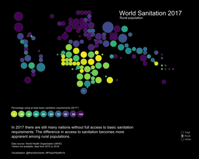
You can toggle between all areas, urban, and rural areas on the Tableau Public version here.
Some context around the design choice – I had recently completed the following visualisation for the Viz For Social Good project, to highlight the work of Furniture Bank Toronto.

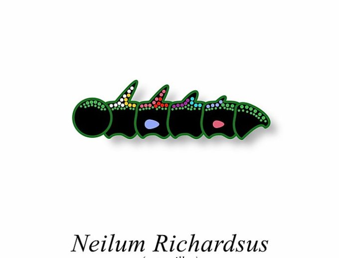
Possibly as a result of this, when Martin Telefont created his brilliant Dataviz Butterflies series, he created one for me that looked like this:

(and following my comment that I didn’t feel I deserved a butterfly to myself, that I was still a caterpillar in relation to many of the great names included, I also had this version created!)
So perhaps it’s not surprising that I found solace in a minimalist look, with colourful circles, black background and Helvetica font. But if I was to answer the title question – “what happens when you combine map visualisation types?” in a different more self-promoting way, I could legitimately give the answer “a Tableau Viz of the Day”. Given the extra exposure this visualisation has got as a result, I want to talk more about the map choice.
In particular, I was interested to see this message on the Tableau Public Viz of the Day site. I know that I like to create somewhat unconventional visualisations … could this be aimed at me?

In fact, I know this is a recent addition. Tableau, understandably, wants to showcase the unusual, the eye-catching, and the visualisations that showcase what the software can do above and beyond the default options, but are also at pains not to suggest that such visualisations are the best practice option, or the most appropriate in a business context.
This wasn’t the first time I’ve used this world map template. I’ve discussed options for tile maps a few times on this blog, not least on this page, where I introduced my world tile map options. Most of all, I want to avoid the choropleth option. Maps where we are interested in summary figures at the national level will give undue prominence to the likes of Russia, while the same information for the likes of Singapore, Swaziland or San Marino can be very difficult to find. But the alternative world tile map (an example of which I devised below) is quite geographically distorted. It can be easy to lose USA in the Caribbean, or hard to distinguish European states from their smaller neighbours, for example.
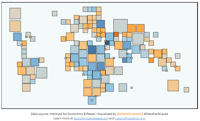
My hybrid first came to light a couple of years ago when submitting a viz on the Global Peace Index. Here I used squares rather than circles, but with otherwise the same template. The idea is to create a tile map that much better approximates the familiar world geography of a more standard tile map such as this …
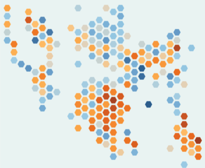
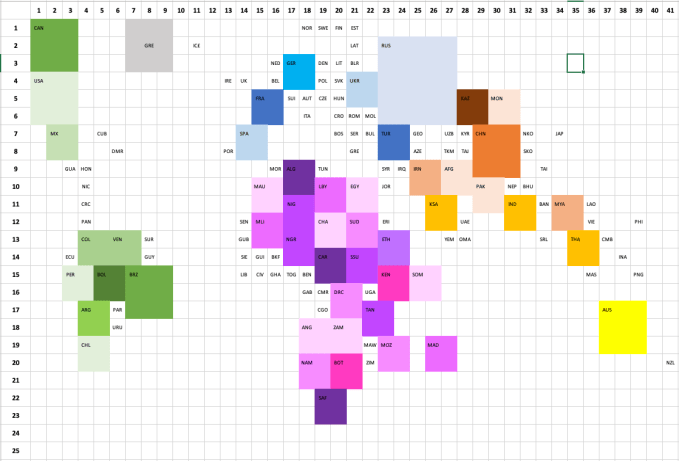
… but still allows for each individual country to be seen. To do this, I have essentially used just five tile sizes, based on overall land area:
Tiny: covers many island states and smallest nations. (n/a)
Small: most countries are “small” or “large” – an example small country might be Belgium (1×1)
Large: larger standard countries which require more tile space, e.g. Sudan (2×2)
Very large: Brazil, USA, Canada, China, Australia only (3×3)
Huge: Russia (5×5)
There are some nice aesthetic benefits to this – firstly that the largest nations show as good placeholders (e.g. Brazil, China help us anchor our place in the world), secondly that when designed on a grid, the “tiny” countries have the option of being placed on the vertices (corners) rather than on a square, allowing for them to be tucked into the map without taking up “space” (e.g. Luxembourg or Burundi), and even allows for anomalies such as the entirely surrounded Lesotho. Another advantage is that if a country is not included in the dataset, chances are it’s a “tiny” country in size, so it is less likely to affect the overall look of the graphic.
By ensuring that the “tiny” countries take up spaces on the corners, it allows for the sketching process (in my case, colouring in square in Excel) then allows me to fill in an approximate world map shape, knowing that the tiny countries can be added in. Below, I’ve highlighted all of the countries which are “large” and above. In this case, colours are just for fun, different shades of each base colour correspond only to each continent.
So does it do the job? I have three encodings for each country.
Position. Here I think each country is much easier to find than on a standard tile map. Countries are closer to geographical positioning on a true map, though not perfect. It does particularly well for Africa and South America, which are often the areas most important when visualising data where more significant results are found in developing countries.
Colour. Colour is used as my main encoding for the quantity visualised, in this case access to sanitation. I’ve chosen the Viridis scale for two reasons – firstly because the extremes of the scale (from green to yellow) are most pronounced, highlighting the issue I want to focus on. And secondly because the low values stand out clearly, but the high values, against a dark background, do not. That’s just what I want. Of course, analytically we can’t compare colours quantitavely, but I hope it does a good job comparing nation to nation, and highlighting areas of concern. I’ve been sure to include a legend with scale. I make sure to include country names and exact metric values on a hover tooltip for each country.
Size. As mentioned above – size is just a proxy for the size of the country, and doesn’t represent the value we’re trying to highlight. Is this a downside to the visualisation, particularly because the form is unfamiliar? I think what you gain in country/map recognition more than makes up for any confusion, but I accept that it’s an interesting trade-off that not all will agree with. It’s particularly important when the map is being shown as a kind of “minimalist” representation.
The visualisation set off an interesting discussion with Steve Wexler. Steve is a Tableau Zen Master Hall of Famer and co-author of Big Book of Dashboards. He’s certainly a person I look up to in the industry and I value his opinion greatly – it’s important to me to consider these points of discussion:
It’s hard not to shake “big blob… lots; small blob… few”
— Steve Wexler (@DataRevelations) March 3, 2020
That’s true – I could argue that in some ways we are using the “lots/few” though, but rather in square kilometres. It’s a trade-off for accuracy though in this sense.
Of course. I think you have something that is less misleading than a choropleth but still suffers from some of the problems. VERY easy for me to critique, but I’ve not offered an improvement. Circles of the same size with the map showing underneath will kill some of the soul.
— Steve Wexler (@DataRevelations) March 3, 2020
In a stubborn way, I take this a compliment. There is no underlying geographic map underneath it – the suggestion that there is means that my design has worked well! And I’m glad there’s an acknowledgement that I have to make certain design decisions in order to incorporate soul – ultimately that’s what the above paragraphs try and consider.
Mitigating the downsides of two approaches can result in a compromise which is unlikely to entirely solve either approach’s issues. The decision then becomes down to the designer, who must consider his/her audience and design wishes, as to whether a compromise is even an option for the particular scenario. I’ll continue to use my hybrid world map as a tool for representing metrics by country, and though it may not be the best option in every case, I’m sure I’ll use it again.
P.S. I’m not doing a coronavirus map though!