Lockdown (due to COVID-19) has been a difficult time. As I write, we are entering the sixth week of not leaving the house except for essential food and exercise, with a full family staying, working from home. It doesn’t feel right writing this, since I am neither an epidemiologist, nor a mental wellbeing expert. But if I can give my spin on it, from a not-to-detailed perspective as a data visualisation enthusiast, then maybe some of you can recognise and empathise with certain elements.
Once the logistics of lockdown living are sorted (quite a sweeping generalisation to start with, I admit) lockdown has been hailed as a great opportunity to change our lives, to learn, to train, to make great virtual social networks, and to enjoy our time of leisure.
Let’s start with what I haven’t done, and things that haven’t happened:
- I haven’t written a single blog post.
- I have barely produced any data visualisations.
- I haven’t read any books.
- I haven’t learned any new skills.
- I haven’t signed up for any new courses.
- I haven’t been involved in any talks
- I haven’t touched anything to do with COVID19 visualisation
Much of this is because … as someone who regularly works from home, I haven’t actually had any more time to myself.
All the above are true – they could be suffixed with asterisks in some cases, but so many of the things that social media are telling you are happening, and that people are doing because they are embracing the lockdown and making great use of their time, well those are things that seem to be passing me by. What am I doing wrong?
I can identify a couple of things that have take up time instead of the list of things above. I spend far too much time, without realising, reading, scanning and re-reading news articles. Over and over again. I know it doesn’t help but it sucks time and leaves you mentally and physically exhausted. And in the downtime I’ve had, when I’ve realised that I want to make a break from the endless news/social media cycle, I’ve deliberately gone offline to mindless pursuits. Whether that’s a binge watch TV series, or an expertly crafted and simulated football management career (and I know at least a few of you will know exactly what I’m talking about here), I’ve identified these things as ways of escaping – less of a mental load than throwing myself into the above.
So it’s OK to be like me. It’s OK to be better than me, or worse than me. I don’t even define what “better” or “worse” means here, you can of course make your own context, I just hope that if other people see their lockdown traits in what I’ve been doing (or not doing) then it’s not such a big deal.
But I’m a glass half full person. I can turn things round and recognise come of the things I have done, or have at least started.
- I might not have written a blog post, but I’m writing two now!
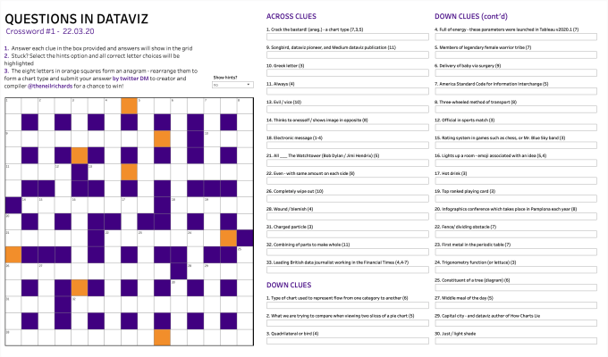
- I might not have produced much in the way of data visualisations, but I haven’t been completely remiss. I started a #QuestionsinDataviz themed series of lockdown puzzles. My best intentions were to make them weekly, but instead I just produced two puzzles, a crossword and a word search. A third was deemed so weak (by me) that it was never published and the series ended abruptly. But I hope you enjoy the first two as much as I enjoyed designing, compiling and sharing them.
The crossword: (interactive version is here)

The word search: (interactive versions for desktop here and mobile here)

- I started a fun collaboration project – it’s stalled but not dead in the water, so I don’t rule out seeing that come to fruition in the next few weeks. A new game designed in the seventies and recreated in Tableau, that’s the plan.
- And OK, I did manage to increase my Minimalist Series by one – with tongue slightly in cheek, I found an easy way of producing the sixth in my Minimalist Trilogy (the first two are posted here – the remaining three are all on my Tableau Public profile). It’s always good to revert to a favourite style you know when you want to produce something new without having to worry too much about a new technique or style. Manual data collection, and a visualisation that’s basically colouring in by numbers!
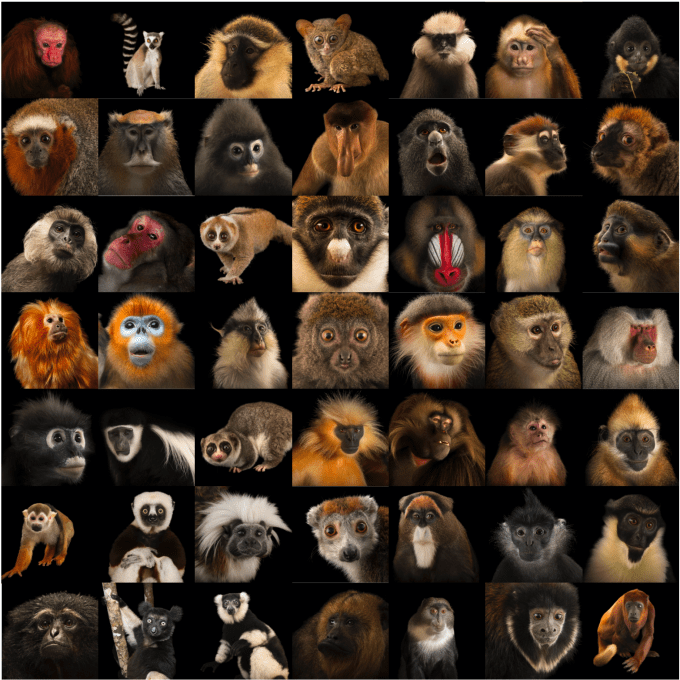
I’ve spent probably longer on projects I abandoned. What if I used real life creatures instead of cartoons and animations for my minimalist feature? I did a lot of work on a Minimalist Primates project, using magnificent photos from the National Geographic Planet Ark series. But minimising these in the same way I’ve done on previous projects just made them look like space invaders.

- I have helped a non-profit through my work with Tableau Foundation. I’m so proud to be a returning Zen Master and the first thing I wanted to do this year was give my time to the Tableau Foundation. Yes, I’ve been slow on this too this year, but I’m confident now that I have been helpful to a great cause.
- I continue to work behind the scenes for the Data Visualization Society. I don’t mention them much on here, but 12000 members and rising can’t be wrong, right? And I’m the Knowledge Director – so much work goes on from so many talented people to make this a success that I’m honoured to play a small part. If you’re not involved yet, and it sounds like an obviously good idea to you (and why wouldn’t it?!) then why not sign up now!
- I might not have read them yet, but I’ve *bought* some books though and am still excited to read them when my design and visualisation mojo completely returns. A fascinating recent discussion on favourite fonts exposed my lack of experience in that area, so I’m looking forward to reading “Why Fonts Matter” by Sarah Hyndman as well as “The Art of Statistics” by David Spiegelhalter and a couple of other non-dataviz books. I still have time!
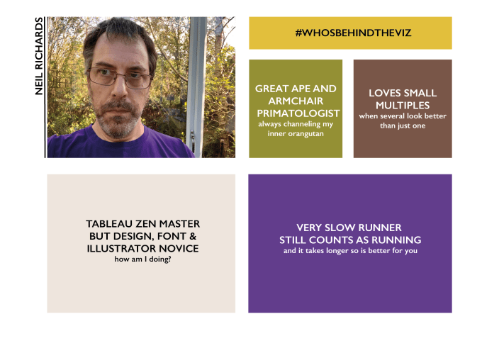
- Actually I have signed up for courses, just via work and not in free time, but I still think that counts! Thank you Tableau e-learning for a fun and comprehensive learning program. And also I’ve dipped my toe into the world of Illustrator, by re-learning the absolute basics. I really want to get over my creative and lack-of-artistic ability block. Here’s a simple project I created inspired by Judit Bekker and this talk she recently gave on combining Illustrator and Tableau for her visualisation projects. So maybe I do have some new skills on the horizon after all?

- I’ve signed up for so many talks and virtual conversations, it’s been delightful to know how many events and informal gatherings are going on. I’ve been able to attend far less than originally hoped, but still enough to keep me visible and to keep in contact with friends in the industry. I quickly came to the realisation that I couldn’t attend everything, in fact nowhere near everything. I’m good with my amount of contact. And what’s more, I’m glad to be presenting at conferences again, look out for two online conference appearances at the end of May – I’d say they are based in Tbilisi and London, but in reality they will be based in my garden office. Watch this space!
- I have a job which is taking up a lot of time, literally and emotionally. With lay-offs and furloughs way into four figures, it’s been a mentally intense time to be working. But I have the chance to visualise, to train, to educate, to evangelise and to rally communities round. I won’t say this is easy in current times, but it keeps me busy. And it allows me to share my dataviz passions – rest assured that if and when I’m not doing it in this blog then I am doing it elsewhere, in “real life”, no less!
- I’ve had some projects that have gone nowhere. I want to do another music viz – I must have downloaded dozens of MIDI files and not yet made the leap to converting the data files and opened the data. But … I still have the files and the ideas! And I’ve had proposed talks for Tableau Conferences which have been scuppered due to … well you know. The time spent in preparation is never a bad thing though.
- And finally, I kind of want to stay away from the COVID discussion both in this blog and in the dataviz space. It’s impossible to avoid and I’m in awe of some of the great work being done by John Burn-Murdoch and discussions being led by Amanda Makulec, to name just two people. I’m extraordinarily lucky not to have had the physical health of me or those closest to me affected by the virus. But go to one, two or three degrees of separation and the story is of course very different. Since I’m not an expert, I don’t feel I should be visualising COVID themes, especially case and death data. I will leave that to those that know best.
I could have made this blog a lot longer (I’d say exponentially longer but then I’d have to cringe at myself for just throwing in a buzzword incorrectly). If I have two messages from this it would just be:
- It’s OK for output, enthusiasm and drive to go down, not up, regardless of whether you technically have more time. Everybody has a new normal now, and they’re all OK.
- As a “glass half full” person, I’m realising that actually I am achieving some things, even if they are only partly done or barely started. That’ll do for me.
Oh, and I even followed one of the stereotypes of middle-aged men in lockdown – I baked bread!

And finally, one thing I didn’t mention, is that I have an ongoing visualisation/data art project about how to visualise an album. I’ve been wondering how best to this since January, and the answer (spoiler alert) is that I still don’t know. But that’s going to form my next project and next blog post, coming right on the heels of this one. Hopefully by the end of the month I’ll have a much better idea. And if I don’t, I will have had fun trying!
