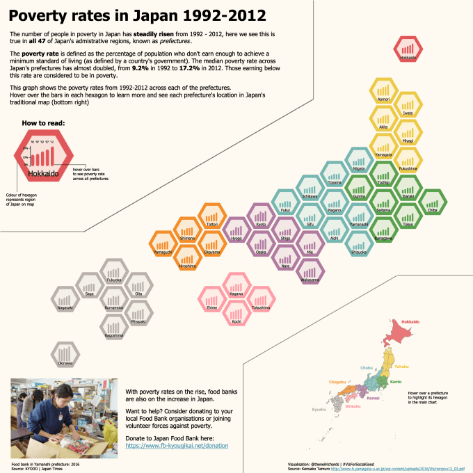
This post refers to a recent visualisation of mine which aimed to look at poverty rates across the 47 prefectures (regions) of Japan. Because each individual prefecture was reported with average poverty rates, and therefore each had the same amount of importance placed on it regardless of size or population (and because I love tile maps!), the scene seemed perfectly set for a tile map. See my final visualisation below (and click through for the interactive version on Tableau Public)
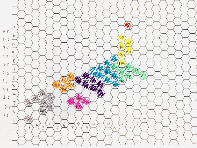
I’ve blogged lots of times about tile maps (I would normally link back here, but on this occasion I’ll plough ahead, though do feel free to check out my other tile map work on this blog). I’m fairly certain that I’ve made it clear that my process starts from good old fashioned “graph paper” – in other words hexagon grid paper that you can find online and print. Here’s how my Japan map started out in life – you can see that this is almost the final grid I ended up using, though I tidied the green and yellow hexagon arrangements to make arguably a neater, more accurate hex map for the final version.

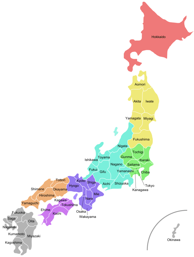
But an important part in any hexmap design is to keep regional integrity. Below is the map I used – available from Wikipedia. As well as having each prefecture delineated, it also colour coded Japan’s eight main regions.

Having these regions included allows me to cross-reference during the design stage. Not only do I have to make sure the final map is reasonably accurate versus Japan as a whole, but that each region sits roughly in the right place versus the other regions, and each individual prefecture hasn’t been moved so far out of place as to sit in the wrong larger region. In other words, when considering difficult positions of individual hexagons, make sure that the purple regions are all clumped together, are all to the southwest of the light blue prefectures, and all to the east of the orange ones, etc. It might sound like an additional design constraint but it’s too important to ignore, and tends to have the opposite effect of being a really good guidance during the process. It also helps draw attention to anomalies that might otherwise seem strange, such as the fact that the whole of Japan’s northernmost island (Hokkaido) is just one prefecture, hence is represented by a much smaller area in proportion to its real area than you would otherwise expect.
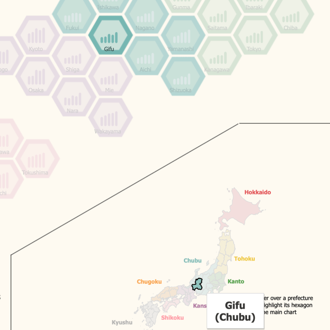
Since the additional colour cue of Japan’s regions was such a help in setting up and designing the tile map for me, especially as the provincial geography of Japan was so unfamiliar before the project, it can sometimes be easy to forget that such an annotated and subdivide “real” map can be just as helpful to your readers. Even a reader with good Japanese geography will be coming across this particular hex map for the first time (since I’ve just invented it!). The overall diagonal shape of Japan means that displaying it in any rectangular frame/canvas on the page allows for white space and explanation in two places: top left and bottom right, and so I had the perfect space, bottom right, for a “real” map for the user to use as cross-reference between tile and geographically accurate prefecture.

I’ve had some great feedback for this particular project, but of the specific positive feedback given, almost all centred around the use of the “real” map as reference. Tile maps are not easy to read at the best of times, and it’s always worth remembering that while you, yourself, might have immersed yourself in a project right from the time of colouring in your first hexagon with your first coloured pen, your reader is seeing an unfamiliar geographical depiction for the very first time, and will need help!
So that’s answered my question as to when two maps are better than one.
Finally, I should mention that this post is a contribution for Viz For Social Good – an initiative where visualisations are created for the benefit non-profit organisations. This aimed to raise awareness of rising poverty in Japan for Japan Food Bank, and more information, as well as links to get involved, can be found on the interactive version. You can sign up yourself as a volunteer at the website, the current project runs until May 31st, and other projects will be added throughout the year.
