A short post, with a short title, but which links to a much longer presentation. But before I link to the presentation, I want to feature perhaps my most unorthodox visualisation yet. A few weeks ago, while having breakfast in a hotel bar in Manchester, I saw the following uncredited artwork on the wall: Now […]
Category: Uncategorized
How should we visualise stacked bars?
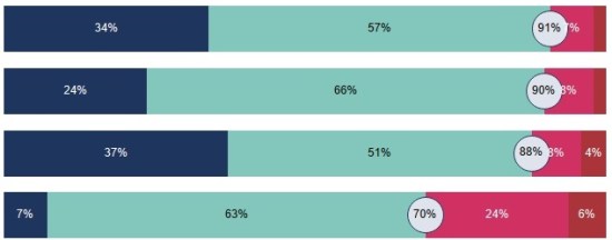
This question arises from a recent article in Datawrapper’s blog by Lisa Charlotte Rost – in this post she discusses why they don’t provide diverging stacked bars as a standard offering. I’ll offer the “tl;dr” option here that she gives: “We don’t recommend using diverging stacked bars for showing percentages. The 100% stacked bars are […]
Do we take data visualisation too seriously?
It’s been a while since my last post – there’s a good reason for this. Well, a reason anyway. I have a 90% written post which I have been mulling over for a long time. Because I haven’t felt comfortable with it, or finished it, it’s been a bit of a logjam for the blog […]
Why do we visualise data?
Well that’s a big question. Chances are that if you’ve found my blog then you’re already involved with, or interested in visualising data and you’ll be well aware of the advantages of charts and visualisation types over and above columns and raw data. But I’d like to frame my answer around a meeting where this […]
What alternative ways are there for visualising timelines?
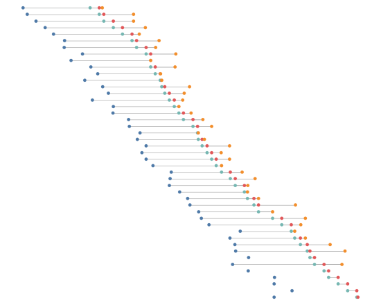
In my last post I led up to a first draft of a timeline chart featuring the lifespans of US presidents. Without further ado, here’s the final version: There were quite a few changes from the previous version, mostly with the addition of bars to indicate number of future and ex- presidents alive at any […]
How much labelling should you include in a visualisation?
The inspiration for this post, and for the visualisation(s) accompanying it, comes from two places. One, from my last post, where I considered the importance of white space – when considering every text element, does it really need to be there? The other inspiration was from the latest work from Nicholas Rougeux below: The original […]
Is white space always your friend?
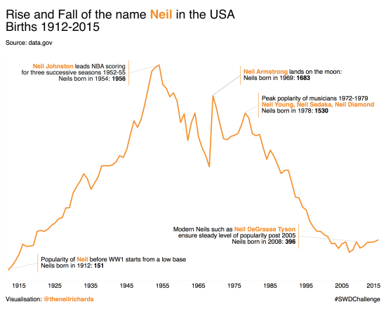
Today’s blog post focuses around a visualisation challenge set by Cole Knaflic, author of the seminal work Storytelling with Data. This year she is setting a monthly challenge, with the first challenge set out here The challenge is simple. Using any data you care to source, create (and share) an annotated line graph. As is […]
What are my data visualisation goals for 2018?
I’ve just gone and added the words “data visualisation” to the title – nobody here knows that I need to eat less and exercise more (though it’s true). I’ve decided to think about my goals because (a) it gives me a focus to look back on to see if the year, and my progression in […]
What were my favourite visualisations of 2017?
As promised, part two of my review of 2017 focuses on my favourite six visualisations I created in 2017. I’m not overly comfortable about self-promotion and am having second thoughts about showing these, but I think it’s inevitable that blogs should be a combination of learning, sharing and self-promotion so as to get the maximum […]


