As promised, part two of my review of 2017 focuses on my favourite six visualisations I created in 2017. I’m not overly comfortable about self-promotion and am having second thoughts about showing these, but I think it’s inevitable that blogs should be a combination of learning, sharing and self-promotion so as to get the maximum benefit. So with that in mind, here goes in no particular order:
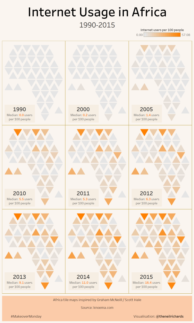
1. Internet usage in Africa

Yes, I did a lot of tile maps this year! This was one of my favourites, because the design choices just seemed to work, I wrote more about this here:
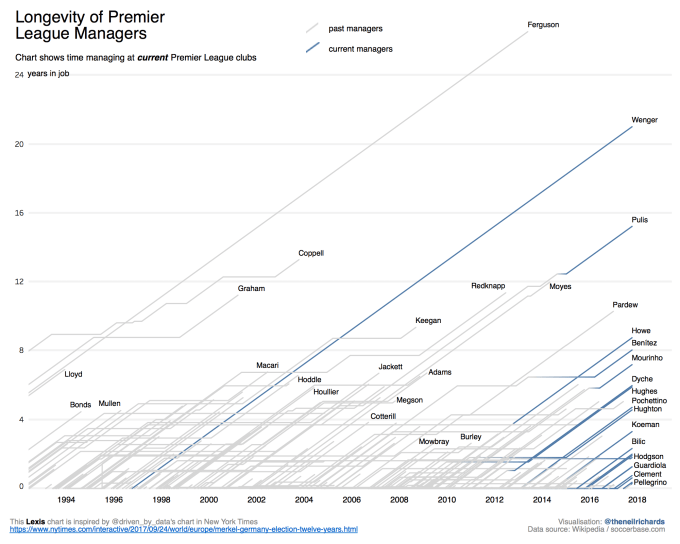
2. Longevity of Premier League Managers
I got a lot of satisfaction from this – learning and replicating a new chart type and a fair bit of interest in the results. More about this process here
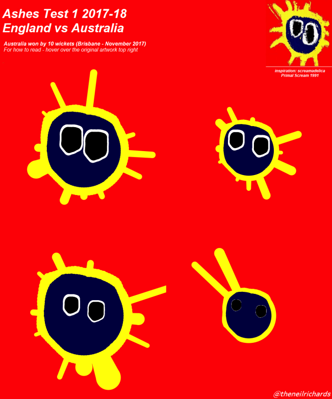
3. Ashes First Test
I’m having a lot of fun with the side project of visualisations as album covers. Here’s my latest, which I blogged about recently here:
4. Changing Colours of cars in the Netherlands
One of two visualisations chosen for the Tableau Art gallery at the London Conference. I think I’ve mentioned this one a lot in passing on this blog, not least here:
5. Top 20 CO2 emitting countries
I was going to include my United Nations Viz for Social Good viz here, since the process and experience has been fantastic for me in 2017. But I’ve since found out that the above has been accepted by World Resources Institute, also thanks to the same nitiative. So I’m including this instead, since I just love area bump charts! See more about this viz here:
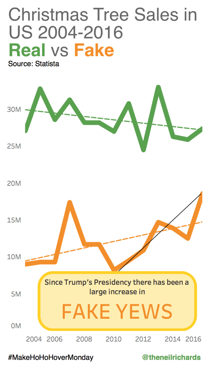
6. Christmas Tree Sales
With so many to choose from, why choose this hastily scribbled line chart which took me all of fifteen minutes to create? Well, as a farewell to Makeover Monday which has been a highlight for two years. 104 out of 104 challenges accepted and a huge gain in experience, reputation and portfolio later, it has been a consistent two year highlight for me. This is also to remind myself to keep things simple and not take myself so seriously, you can tell a message (albeit a daft one in this case) with a line chart that doesn’t have to be spiral, heavily formatted or in the guise of an album cover!


1 Comment