My most recent visualisation could probably be described as an unnecessary visualisation but that’s never stopped me before. I was looking to visualise information on the Premier League and the changing squads of each of the twenty teams, and I chose to represent the teams using flowers:
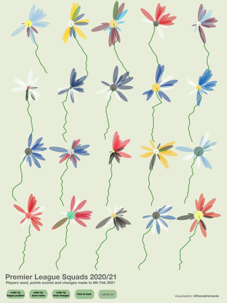
Click through to the online version to toggle between views and/or see how to read the chart. But back to the question – why flowers?
There are two things that drive me to make the kind of visualisations I love to create. First of all, I’m a mathematician by trade (well, by study anyway), so I enjoy using geometric shapes and the calculations needed to place them on the page driven by data. And secondly, I have no artistic ability whatsoever. I can’t draw, or paint, and if you asked me to use Illustrator or Procreate, say, to draw a flower, I couldn’t do that either. But with a flower being a combination of circles, ellipses and line charts (the stalks), arranged in a regular grid, I can enjoy the challenge of placing every element with mathematical precision. And that mathematical precision is determined by data, not my artistic skill, which gives much more preferable results!
Take the bottom right flower in the viz above, which represents Manchester United (you can toggle the team labels on/off in the online version of the viz). The petals are generated by data points (squad numbers are encoded by position, number of matches by size, and presence in the initial team by colour). All of this gives an irregularity to the flower which makes it look more natural. Overlapping petals give a more organic feel and the different centre sizes (also encoded by data – overall team score) also give a nice heterogeneity to the range of flowers. I would not have the skill or the nous to draw a flower that wasn’t much more regular in shape (and would be much less skilfully drawn/created).
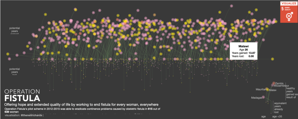
Before I go further into the benefits of visualising in this format, I realised that it’s not the first time I’ve tried something like this. In fact, I’ve used flowers (and their stalks) a couple of times before. Firstly in this visualisation for the Operation Fistula charity, where the flowers’ colour and position encode relevant data points, as well as the curve of the stem. This is also the only one of my three flower vizzes to encode the roots as well, giving the effect of a field of flowers in the breeze.
And secondly in this visualisation for the Rugby World Cup in 2019. A lot more free-form, the flower has been chosen to resemble the Japanese cherry blossom but the colours, positions and sizes of each flower represent teams and scores.
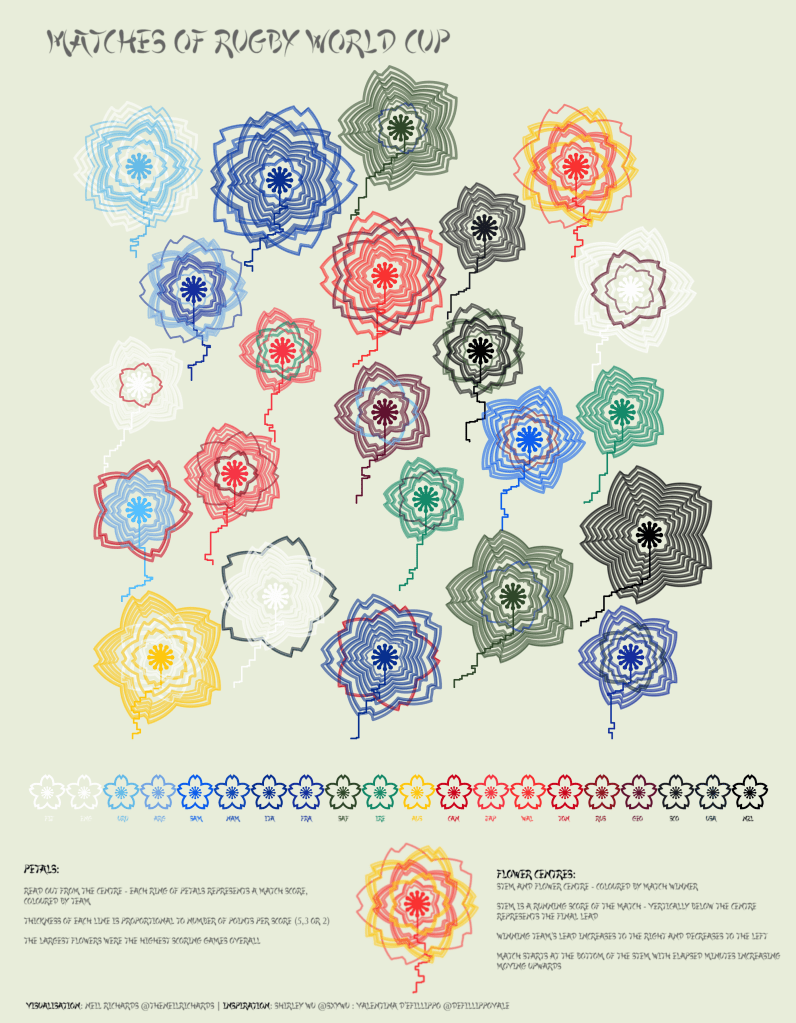
Flowers (and their stalks) give the opportunity to encode many different dimensions. Petals can be different shapes, sizes, colours, in different positions, as well as being filled or empty. The central area (the stamen?) can also be represented by different shapes, sizes or colours. That’s up eight different dimensions to encode in one flower. One trick I have used in each of my flower visualisations is to tell a different story with the flowers’ stems. The football and rugby visualisations disguise a line chart in the form of a stem, both designed so that there is a possibility of them sloping on average to the left, right, or vertically. This has the tendency to “sway” the flower to the left or right, adding a less regular and more organic look to each visualisation. The Operation Fistula visualisation also encodes slope into the stem, curving in relation to each woman’s age.
Flowers are sometimes emotive, but a simpler explanation, on occasion, is in their aesthetics. In other words, they look pretty and attract the viewer’s attention. Sometimes the flower metaphor is important (such as in the Operation Fistula example above, with growing flowers representing hope and life), and sometimes less so (there’s no obvious connection with Premier League football). But ultimately I enjoy using data visualisation software, developed with the purpose of displaying business analytics, to create something appealing to look at. And it’s something I’ve often seen in some of the most prominent data visualisation leaders in the field.
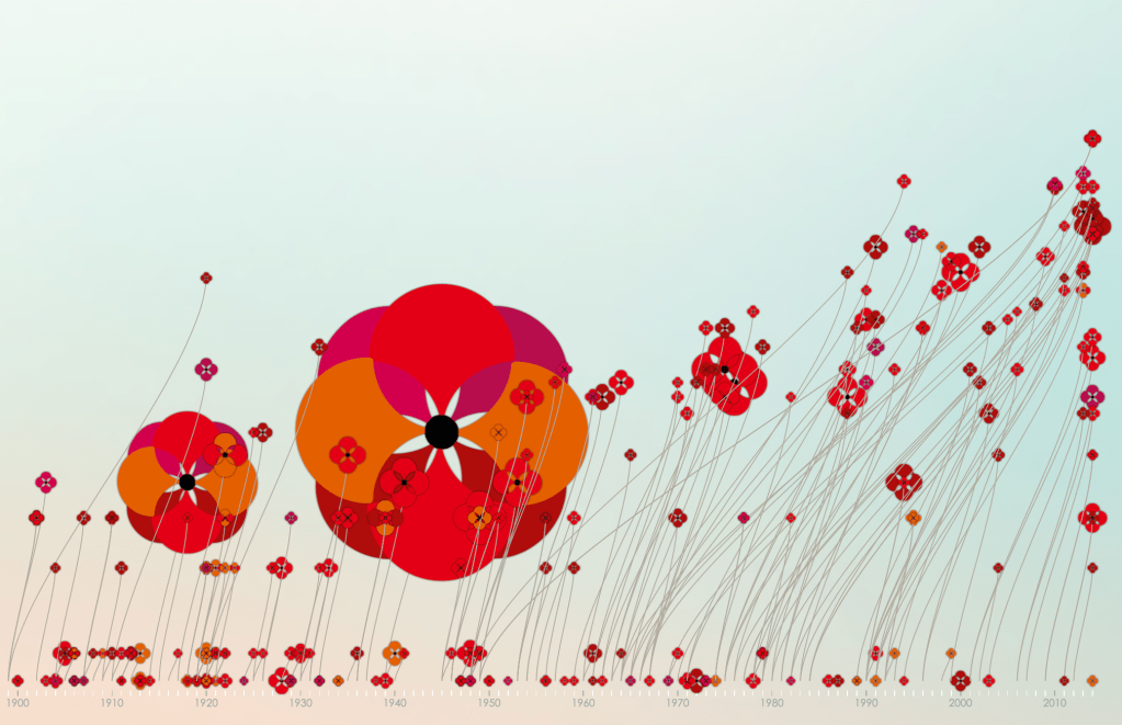
I quoted Valentina d’Efilippo as an influence in my work – her viz at https://www.poppyfield.org is a beautiful example of the powerful metaphor of the poppy as a flower while encoding data within shape, colour, size, position and dimensions/direction of the stalk.
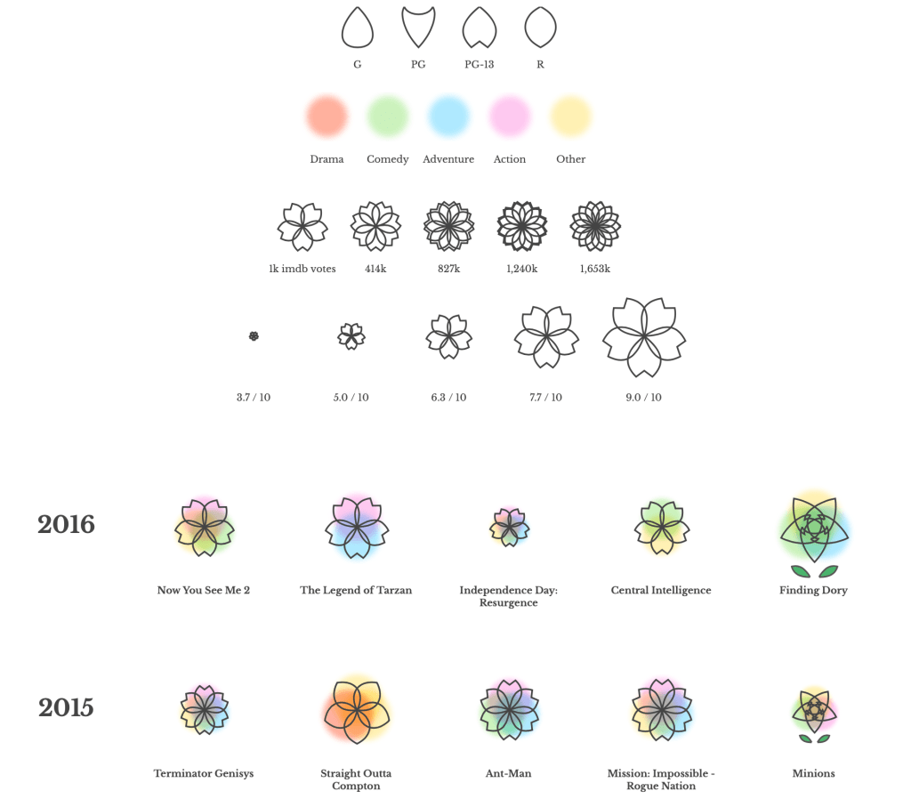
And Shirley Wu’s Film Flowers (an excerpt of which is shown below) was a definite influence for my Rugby Flowers viz in particular, focusing on the variety in geometry of regular shaped flowers.
These flower vizzes have coincided with great excitement around Shirley’s upcoming Data Sketches book, not least by myself – it will definitely feature in my review series this year once I receive it! But Alberto Cairo summed it up best, as reported here by Cole Knaflic on twitter:
It’s absolutely right – flowers may not be right for a business report! I would never imagine someone showing my flowers viz to the Newcastle United boss Steve Bruce in advance of their game against Aston Villa and explaining that the different angle of the black and white flower versus the claret and blue flower explains how few changes Villa have made compared to Newcastle, and perhaps that would explain their different success so far this season (as shown by the larger stamen!). Of course not. I hope that flowers can be delightful in another setting. Many of those who liked my viz (and a large number of people didn’t!) are more likely to have appreciated it than they would a simple bar chart.
And speaking of Alberto Cairo, he writes about the upcoming book (illustrating it with sketches of flowers) in this Nightingale article Orthodoxy and Eccentricity – I’d be first to agree in the need for so-called eccentricity for keeping data visualisation exciting, artistic, and open to all. If eccentricity means encoding my data as flowers, then colour me eccentric!
9 Comments