I could have entitled this “How do we visualise complexity?”. But that might have been confusing for two reasons. This post is a review of Visualising Complexity by Nicole Lachenmeier and Darjan Hil of Superdot Studio – a captivating book which is subtitled “Modular Information Design Handbook”. The book systematically and graphically details their bespoke method for creating data visualisations, with examples throughout focusing on one simple to understand dataset. I’ve read many books that I’ve thought might spark an inkling of an idea for a future project, or that I’ve vowed to return to when looking for inspiration. But this book was faster-acting than that – I wanted to emulate it and start visualising using their techniques right away, before even finishing the book. And it wasn’t only a wish, I acted on that impulse – I have many newly-designed examples.
But first of all, why did I decide that focusing on the title (Visualizing Complexity) would be confusing? First, it’s also a title from a trilogy of great books by Manuel Lima. Two such books are already reviewed on this site, featuring the joy of circles and trees. But this isn’t by Lima, or related to those books. The second reason is that the word “complexity” might be confusing. Before I looked further into the book, I was expecting this to be a primer for Big Data with its millions of rows, endless columns and gigabytes of data. But every example from start to finish uses just one dataset with only ten rows. A family, with first names, surnames, places of birth, home towns, names of children, and years of birth and death. Nothing more. Really, the complexity only comes from the many combinations of ways you can visualise each dimension in a simple, geometric way.
Add to that the Swiss design ethic throughout, and I was instantly drawn both to the style and the methods. Just four simple primary colours are used throughout – yellow for the data layer, and blue, red, green for the design modules. So what do those terms mean that I’ve just introduced?

The yellow layer represents the data cube. In fact, the book shows us how we can strip data and create a dataset even from unstructured text, and introduces us to different ways elements can be categorised and depicted in hierarchies. Essentially, each encodable dimension in the data is thought of as a face of the data cube, to which can be assigned an individual design module.
These modules can be diagrammatical dimensions (blue, of which there are 25 – either quantity, position or relationship); visual dimensions (red, of which there are 40 – either colour, shape, line, pattern, contour or isotope), or structuring dimensions (green, of which there are 15 – either sorting or grouping). In all, the different blue, green and red design elements total eighty, and every one of them is stylishly symbolised in such a way that you are instantly reminded of the Gestalt principles at play in each design choice.

This schematic from the book shows how the elements combine together in modules – you can interpret this in either direction to determine how to either encode or decode an MID visualisation (I’ll use this term as a shorthand for Modular Information Design from hereon in). In other words, which of the red, green or blue dimensions are you going to apply to each of the available data elements in your yellow data cube?

The book is structured in five sections – the first four are devoted to explanations each of the four colours and, in the case of chapters 2-4, simple explanations of the principles of every one of the modules. The fifth section shows a number of examples (specifically, there are 26 in fact). In each of these cases an example covers a double page spread, with the example visualisation shown on the left, and the modules used in its design on the right hand page.

As I enjoyed and took in each of the examples in the book, two key points occurred to me. The first point was that, as alluded to above, the visualisations aren’t necessarily dealing with complexity, but what they are dealing with is disaggregated data. Every example in the book showed either ten data points (one for every element of data) or more (when data was further disaggregated into unit-style visualisations).
There are more examples with a larger dataset to be seen in these postcards, which were timed with the release of the book by Superdot Studio to visualise their individual Kickstarter contributions.
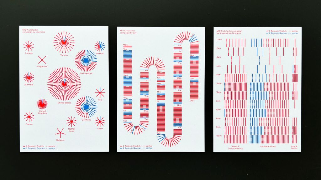
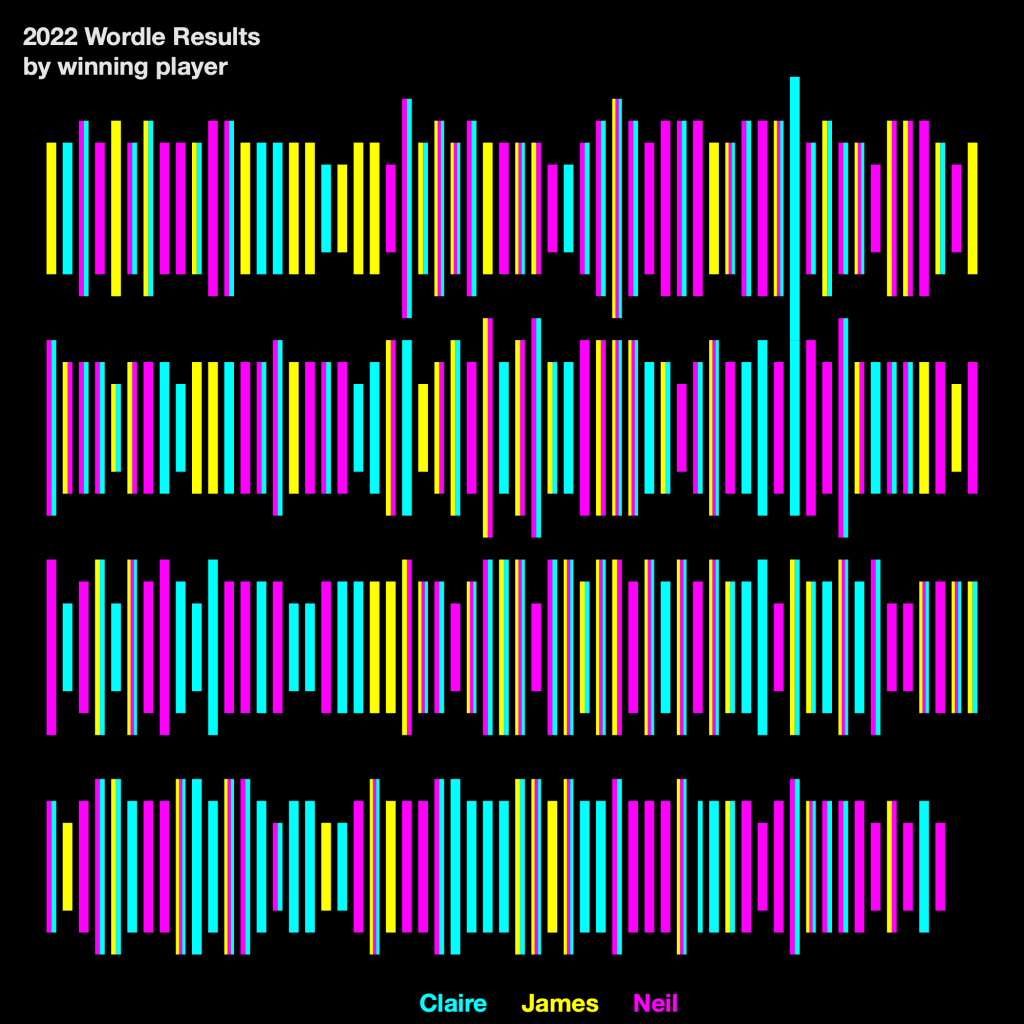
OK so this is when I wanted to make a start. I had a pretty good dataset I’d been scratching my head on how to visualise. It’s the family’s 2022 Wordle results! Every line of data has the guesser, the number of guesses, the puzzle number, the word, and (by dint of simple calculations), the winner. Let’s start with some that look a little bit like the postcards:

Number of guesses in each victory is shown by line length, this is module 2A.1 in the blue section (Diagrammatical Dimensions / Quantity). Each player is denoted by colour, which is module 3A.1 in the red section (Visual dimensions / Colour). Each Wordle game is sorted in order, radially, at an angle, which is module 4A.4 in the green section (Structuring dimensions / Sorting) and grouped by player, freely in space, which is module 4B.5 (Structuring dimensions / Grouping). So if it were in the book, we would see the four module elements (one blue, one red, two green) on the right hand page to explain its construction.
Similarly, the example below uses line length and colour in the same way. But they are sorted by order along a linear axis with a break and grouped by a grid (I won’t replicate each of the module codes).
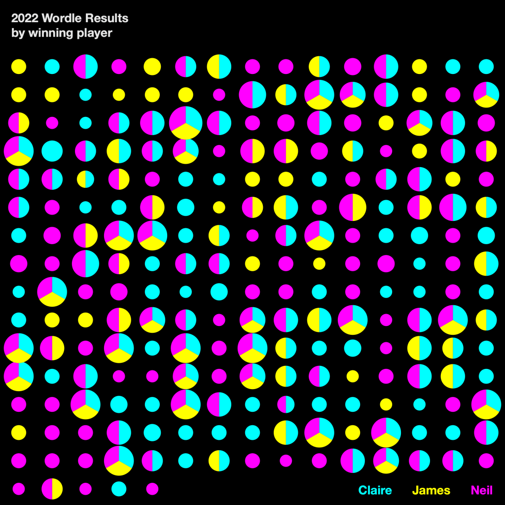
The small multiple example below (another distinct type of grouping module) introduces angle to determine each winner (where joint winners are shown in pie chart form) and area size to determine the number of winning guesses for each Wordle.
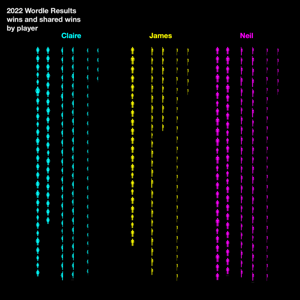
For the next example, I couldn’t resist using isotopes as featured in the book. Many examples use unit counting rather than, for example, line length, and isotopes feature prominently too – adding to the vintage Swiss design ethos of each of the examples.
Here’s one more which is probably the least conventional of all my examples. Each contest is arranged round sides of a shape – I chose the hexagon to account for the possibilities of winning number of guesses ranging from 1 to 6. Within this, we are using colour again to determine each winning player, and angle to determine instances where there were multiple winners. We then count the pie charts as units to determine quantity of wins by each player (or player combination), and each winning combination is also sorted along the hexagon axis. With a bit of imagination and a lot of fun, it’s possible to stack up quite the combination of modules! I don’t think that detracts in any way from readability though – when made clear that each mark shown on the visualisation represents a Wordle game and its winner, our curiosity and our innate reaction to Gestalt principles does the work for us

All of these can be seen on Tableau Public (with a couple of further examples) – interactive versions have more information on individual words and guesses in the tooltips.
Much further up in the post I mentioned how two things occurred to me while reading the book, before getting distracted with several examples, so I never mentioned the second thing. The second point is that the systematic encoding of disaggregated data onto different geometric elements for different dimensions in the data layer is exactly what I already love to do in some of my more unconventional projects.
For example, when I visualised Premier League data as flowers, this is almost exactly what I was doing! Below is a section from my visualisation, which I featured in more detail earlier in this blog. The stems were line charts – aggregated running totals of the teams’ scores which don’t really fit into MID. But what about the flowers?

Petal shapes are sized by appearance numbers per player, coloured both by squad colour and by appearance in the first team of the season, arranged around a shape (a circle, which is also sized by team point totals) and sorted in order of squad number order. And each flower is grouped by team. All of these decisions have been made with an MID way of thinking – how could I encode diagrammatical dimensions (such as quantity and position), visual dimensions (such as shape and colour) and structural dimensions (sorting and grouping) on to each geometrical constituent of my flower? The design-driven data mindset meant that I was approaching from the unconventional “reverse” direction, so I could be thought of as decoding geometrical and design elements (circles, ellipses and colours) rather than encoding data, but the end result is where these processes meet in the middle. Just like the schematic diagram shown earlier in this article.
The back cover of the book asks “how can you turn dry statistics into attractive and informative graphs?”. But in my opinion the classic Swiss design and MID system explained in Visualising Complexity answers that question. And it does that in such a definitive and step-by-step way that anyone might be inspired to try it for themselves.

3 Comments