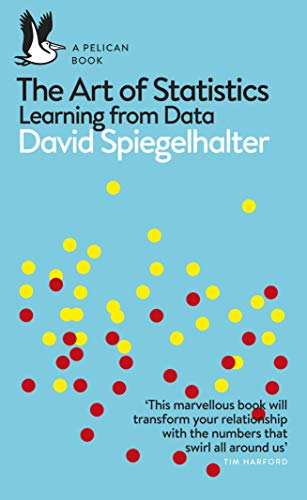
This question forms the perfect title for this blog post, since it is the first question on the back of the book “The Art of Statistics: Learning from Data” written by Sir David Spiegelhalter. I first learned about David Spiegelhalter when I watched his keynote at the UK Tableau Conference in London in 2017. His talk was on “Dodgy Data, Shabby Statistics and Naughty Numbers”, and it’s fair to say that he is charismatic and captivating in his presentation manner, giving a very entertaining and enjoyable talk. It’s not hard to see why he has made many TV appearances since, not least with the context of so many COVID-19 statistics being in the public domain.

The Art of Statistics, like Spiegelhalter himself, aims to emphasise the importance of the two areas of statistics and communication. It’s clear from the book cover itself that data visualisation pays a crucial element in this.

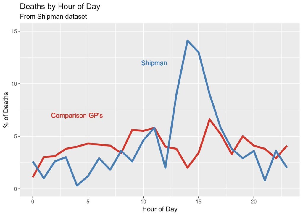
And it’s clear from the introduction that this importance is not taken for granted – the image below is presented with the text “The pattern does not require sophisticated statistical analysis” – an early example on how communicating data via data visualisation can make a point very clearly.

Shipman, for those who don’t know, was a notorious UK serial killer masquerading as a kindly GP (general practitioner doctor) who preyed on elderly and vulnerable patients. His patients would usually die in what were proven to be suspicious circumstances when he made personal house visits in the afternoon. So the book doesn’t just present data such as the above (which, given what we now know about Shipman, tells an alarming tale that matches what we now know), but postulates that statistical analysis of early deaths could have gone a long way to saving many of his future victims. And that’s where the connection with statistical presentation of data, and the detailed considerations laid out in the rest of the book, start to become integral.
The problem-solving cycle (PPDAC – Problem/Plan/Data/Analysis/Conclusion) is introduced as a process of running projects based around statistical analysis. Specifying any such project around a “Problem” is usually done in the form of a question, and this holds equally true for an analytical request or data visualisation. Learning to define the problem (the question that needs answering, the requirements of the client) is the crucial element of a statistical project and that, to me, was a key takeaway (as someone who is more aligned to analytics and data visualisation than statistical research per se).
Similar in style to the Truthful Art by Alberto Cairo, the book is an entertaining read on what could potentially be seen as a dry subject, and much of that comes from a witty writing style where it’s easy to see the author’s personality and charisma coming through. It’s certainly a good companion for any data visualisation or analytics practitioner who wants to make sure they are doing the right thing where statistics are concerned. Once the introduction and PPDAC concept are covered, most basic statistical concepts that are crucial for anyone in data visualisation or data journalism to understand are then introduced with visual examples of both good and bad.
As someone with a mathematical and statistical background, I was most drawn to the final two chapters: “How Things Go Wrong” and “How We Can Do Statistics Better“. One thing to look out for is the HARK – Hypothesis After the Results are Known, described as one of many possible reasons how results can be presented that we might otherwise need to be sceptical about, and that definitely seemed like something I’ve come across before on more than one occasion! I’ll leave you to read the book to learn other contributing factors, but it has given me renewed resolve to always carefully consider every step when making conclusions based on data.
In the very first line of the conclusion, Spiegelhalter admits: “To put it bluntly, statistics can be difficult.” After reading through the book to reach that particular line, I was left with the conclusion that he had done a pretty good job of making statistics not seem quite so difficult after all. A recommended read and companion book for any data researcher / analyst / journalist / visualiser who needs to work with and draw conclusions from data.
1 Comment