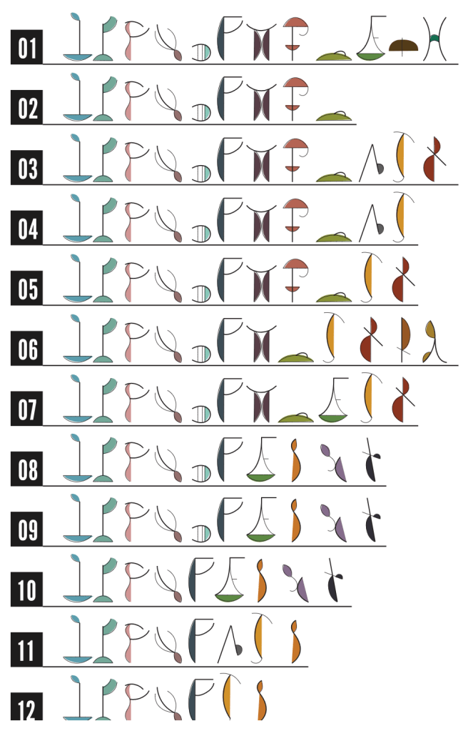
That’s a big question – we’ll get to that, and the motivation for asking that particular question later!
But the most important context about this post is the time of writing it – the third of January of a brand new year is when many of us look either back, or forward, or both. With 2021 not exactly a simple or conventional year for many of us, it feels completely OK not to worry about whether me made great progress or hit our goals for last year. And similarly, we shouldn’t feel there have to be great achievements next year either. After all, how can we strive to talk at a conference that we don’t know if it will happen? Or strive for a great new job/role when there is so much uncertainty about home versus remote working, with different firms affected in so many ways by the pandemic? And, perhaps more importantly, with our own personal and mental challenges thrown at us from the ups and downs of COVID-related 2021 (and 2020), aren’t health, safety, family and sanity more important aspirations?
I suppose in my case, I had three aspirations bubbling through the second part of 2021. First of all, I had a Questions in Dataviz manuscript to write. I’m delighted to say, as of a couple of hours ago, that task is complete! More on that, I hope, in upcoming months. Secondly, I had an ambitious target last year to review 24 data and data visualisation books. That has slowed right down in the second part of the year – I do plan to continue this through 2022 and beyond but at my own pace. You can see the latest review here and I hope to get another one or two out during January, but I have no targets or promises where this is concerned.
My third aspiration, as always, was to continue creating and publishing data visualisations. It’s what I love best, and what keeps this blog going. But the combination of my book deadline, procrastination issues, and prioritising other difficult things that have been going on, have put paid to that somewhat. Now, faced with two weeks of relaxation over the holidays, after a couple of months away from any of the aforementioned projects, I could finally finish my manuscript and work on a visualisation. Of course, in typical fashion, I prioritised getting back into data visualisation over and above finishing the manuscript (which had an impending deadline) and my book review series (which was already ongoing) But enough about my tendency to procrastinate …
It’s not easy to create a personal project if your creative inspiration and your dataset don’t match – no amount of putting time aside can make that happen. My first idea was to look at UK climate data. My initial thought seeded from the idea of wondering whether a White Christmas was likely, or whether we get as many of those in the UK as we used to (“just like the ones we used to know”, you might say!) If I wanted to know what December 25th data looked like over the years, I’d need climate data disaggregated to every specific day of the year, but then once I had that, wouldn’t it be amazing to see daily trends over almost two hundred years, not just Christmas Day data? Might we be able to come up with something a bit like the iconic climate stripes?
I found that data that granular just didn’t quite work. Below are mean temperatures every day since 1772, with year increasing left to right, and day of year from top to bottom (each row is a month, with January at the top). Can you see progression from blue (below average temperature for that specific day) to red (above), as you travel from left to right? Possibly, but it’s hard to see that story in the data. I might return to this dataset purely due to its size and potential, but it didn’t grab me enough to continue with it.

I lost momentum with this idea and decided to “park” it. At least I have the dataset curated and loaded ready to use again should I get another idea. But best get back to my book instead. However, a couple of days later (again, I suspect, looking for a chance to procrastinate), I was reminded of a Sports Viz Sunday challenge which was still current at the time. A simple challenge, to visualise your favourite sports moment of the year 2021. Perfect! Another chance to procrastinate the final edits of my book manuscript or review another book on my to-do pile, which felt easy to justify if I was going to visualise data instead, especially on a community project.
I enjoyed looking for data and reliving Emma Raducanu’s amazing US Open win that summer. My coloured pens and blank paper came out as I tried to imagine how I could depict the amazing feat of the first ever Grand Slam tennis winner, male or female, who had won as a qualifier, and won every match convincingly in straight sets to boot. All at the tender age of 18 while the nation of the UK took her to our hearts. But I couldn’t gain the momentum – my ideas inevitably seemed flower-related which made me wonder if I was running out of ideas. And could I really generate a flower themed viz that depicted all 128 players in the draw? It was back to the metaphorical drawing board (and back to the book for a while).
Not content with procrastinating twice, I made a third attempt. On this occasion I was inspired (as I so often am) by Sonja Kuijpers. Not, this time, by a specific piece, but by the release of a course she had put together on the Domestika platform. Effective Data Visualization: Transform Information into Art. This was one of a number of heavily-discounted courses available (aren’t they always?!) but it really resonated with me. After all, that describes what I like to do in my visualisation style – hence the question for this blog post. And I knew that Sonja, as a significant influence on my work already, would be a great person to learn from.
The course itself introduces you to Sonja and her portfolio where you can get a good background to her way of working. But it was the section on hand-collected data that really resonated with me and gave me the incentive to start another project. I already knew that she loves to collect data by hand through reading books, as was already shown in the process behind her art-style visualisation about the book “The Hotel New Hampshire”

This was one of the visualisations that had inspired my own Hitchhiker’s Guide to the Galaxy visualisation too, there’s a real pleasure in going through a favourite book (either online or old-school) and annotating/curating the data by hand. The course takes us through the process as she chooses the Wonderful Wizard of Oz and records occurrences of characters, locations, colours and more by hand, underlining such mentions in the text. It was the underlining of colour mentions that gave me my light-bulb moment.
I had my idea – visualising mention of colours in a book (or collection of books) would be a fun idea, both in the data curation/collection and then in the visualisation. I’ve always loved the display and visualisation of colours used – there seems to me to be no simpler or more intuitive way of displaying data. When it came to books and their text, I wanted something that was easily available online, and therefore plumped for the idea of looking at colours in some of Shakespeare’s plays. Would we see interesting differences between comedies, tragedies, and histories perhaps? Fortunately the text was available freely online thanks to the Folger Shakespeare Library. I went through the process of searching through text for all the colours I could think of that Shakespeare was likely to use and counting the total number of mentions. And after I’d done this for half a dozen or so plays, I felt that the only way to do this properly was to painstakingly collect the information for every one of Shakespeare’s plays – choosing only half a dozen or so felt like skimping out on the full set (and would potentially not be a representative enough sample). True, it was a matter of repeated CTRL-F to find words, but was never just a count of occurrences, since some words (such as gold or silver) could be used either to describe the metal/object themselves, or the colour of what they were describing. So all of the data was hand-curated and based on my own assessment of whether words were being used as colours.
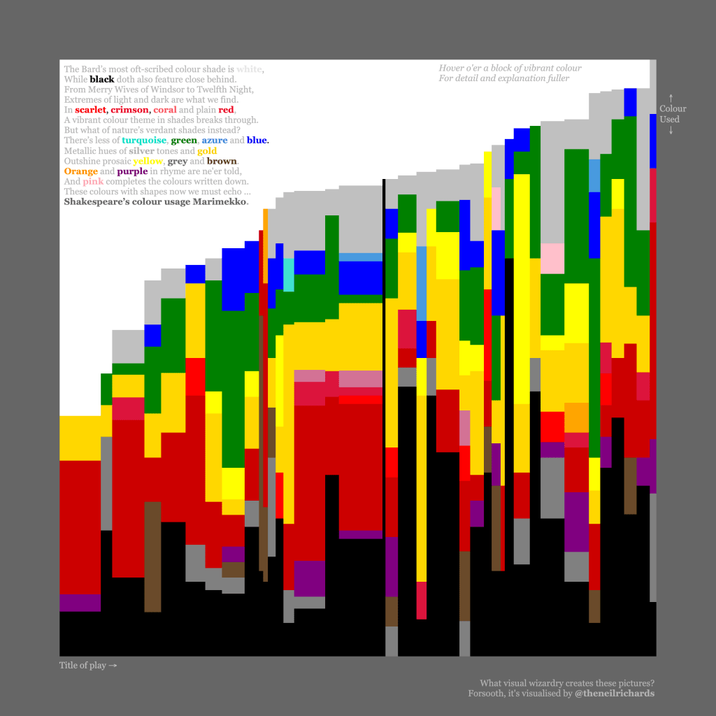
At this point I diverged from the course, which then demonstrates methods for displaying the data as art in Illustrator. I’m genuinely excited to return in future to learn how to use Illustrator to create visualisations. For now, I wanted to head straight to Tableau to explore the results. Eventually I decided on a Marimekko – a perfect chart choice to show proportions of total mentions for each colour per play while making allowances for the overall number of colour mentions. In other words, if “white” was 20% of all colour mentions in a play with 10 mentions overall, I wanted it to show the same area as a play where it had 2% of mentions but 100 mentions overall. Number of mentions per colour per play should therefore always be a consistent area.
Here’s the final visualisation – I couldn’t resist one or two other Shakesperean touches too.

I’m not sure what my ratio of published versus unpublished visualisations is, but I hope this indicates that there is at least some kind of ratio – for every published visualisation there’s a good chance there is an unpublished visualisation that, for whatever reason, just didn’t work. Keep exploring, getting different ideas, and persevering with ideas when you are happy that they work for you, and you’ll continue to progress. I tried initial inspiration thoughts of a Christmas song, a community initiative around a sporting event, and then a data visualisation online course. Only one of these ideas “took off” for me, but follow tangential thoughts until you get to an exciting place. But don’t get hung up on the ideas that don’t take off. There’ll always be more!
2 Comments