My most recent visualisation could probably be described as an unnecessary visualisation but that’s never stopped me before. I was looking to visualise information on the Premier League and the changing squads of each of the twenty teams, and I chose to represent the teams using flowers: Click through to the online version to toggle […]
Tag: football
Why is sport such a good topic for visualisations?
Sport visualisations won’t be for everyone, but I do think that the debate on this question is quite simple. Sports by their nature are full of numbers and data: times, goals, scores, dates, rankings, statistics, averages, records, tables, and the like. Most of these are not too difficult to get hold of, either via Wikipedia […]
What alternative ways are there for visualising timelines?
In my last post I led up to a first draft of a timeline chart featuring the lifespans of US presidents. Without further ado, here’s the final version: There were quite a few changes from the previous version, mostly with the addition of bars to indicate number of future and ex- presidents alive at any […]
What were my favourite visualisations of 2017?
As promised, part two of my review of 2017 focuses on my favourite six visualisations I created in 2017. I’m not overly comfortable about self-promotion and am having second thoughts about showing these, but I think it’s inevitable that blogs should be a combination of learning, sharing and self-promotion so as to get the maximum […]
How important is interaction in visualisations? (aka Where’s Big Sam?)
Last week, I saw this visualisation tweeted by Gregor Aisch of a visualisation he produced for the New York Times. I really like the look of this – striking, simple but quite unique-looking. The visualisation aimed to show that Angela Merkel’s latest election victory cemented her status as the longest-serving EU leader and compare her […]
Should data visualisations always tell a story?
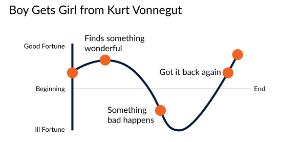
I feel a bit of a fraud asking this question. It’s been asked, debated, blogged and further debated many times before. You can get opinions on the subject from people with much more experience in data visualisation than me. For example: Cole Nussbaumer Knaflic, Alberto Cairo, Jon Schwabish, Georgia Lupi, Chad Skelton, Sophie Sparkes, Robert Kosara […]
Exploratory or Explanatory?
Today’s question is all about how much explanation should be included with a visualisation. In terms of your overall look, should you clarify, or simplify? It’s a topic that often comes up in visualisations, and I think it’s one I don’t always get right. Earlier this week I revisited an idea I had following the […]
What were my data visualisation highlights of 2016?
I’ll be honest – I don’t for a minute believe I have the standing, expertise, or width of knowledge and experience to comment on data visualisation generally in 2016 (or, similarly, to make predictions on future developments for 2017). But 2016 was an eventful year in my progression into the field of data visualisation. So […]
Is it OK to steal?
So, is it OK to steal? Of course not. In the data visualisation context, that would be passing someone else’s work off as your own. Anyone would agree that would be the wrong thing to do. But that would make a very short and uninteresting post. At the very least, I’m shooting for quite long […]


