In my quest to review as many data and design themed books as possible during 2021, I will be mixing books I have owned but not yet read with brand new books as they are released. One such book that I have been really excited about is Data Sketches, by Nadieh Bremer and Shirley Wu. Their project was a collaboration of beautiful data visualisations living at https://datasketch.es – the front cover bills the book as “A journey of imagination, exploration and beautiful data visualizations” and that description works equally for the website and the book.
Due to some delays or other (I blame Brexit), it took a while for me to receive a copy of the book here in the UK, even though the book was released in February in the US. And this delay just added to the anticipation of a book I’d been looking forward to for a long time. On or around the US release, Alberto Cairo published the full foreword of Data Sketches (the book) as a Nightingale article here on the subject of Orthodoxy and Eccentricity. It featured images from the online project (and the book) such as flowers below from Shirley:

And the foreword celebrates eccentricity. Too many visualisations may have been criticised in the past for not being orthodox enough, but this collection celebrates imagination, creativity and, well, eccentricity. “Now go ahead: read, think, and discuss. And consider becoming a bit more of an eccentric.” says Alberto Cairo.
This is absolute music to my ears – as someone who loves to create visualisations that others consider unorthodox (or eccentric, I don’t mind!) then I’m delighted to see this being encouraged. After all, as someone who delights in visualising data using flowers I would always encourage the unorthodox approach if it’s appropriate to do so. And my biggest influence in using flowers? Shirley Wu of course! Nadieh is also a personal inspiration of mine who has been mentioned a couple of times in this blog before, too, and I came to this book in the knowledge that I was a huge fan of the online project. So that’s why I was excited when the book finally arrived.
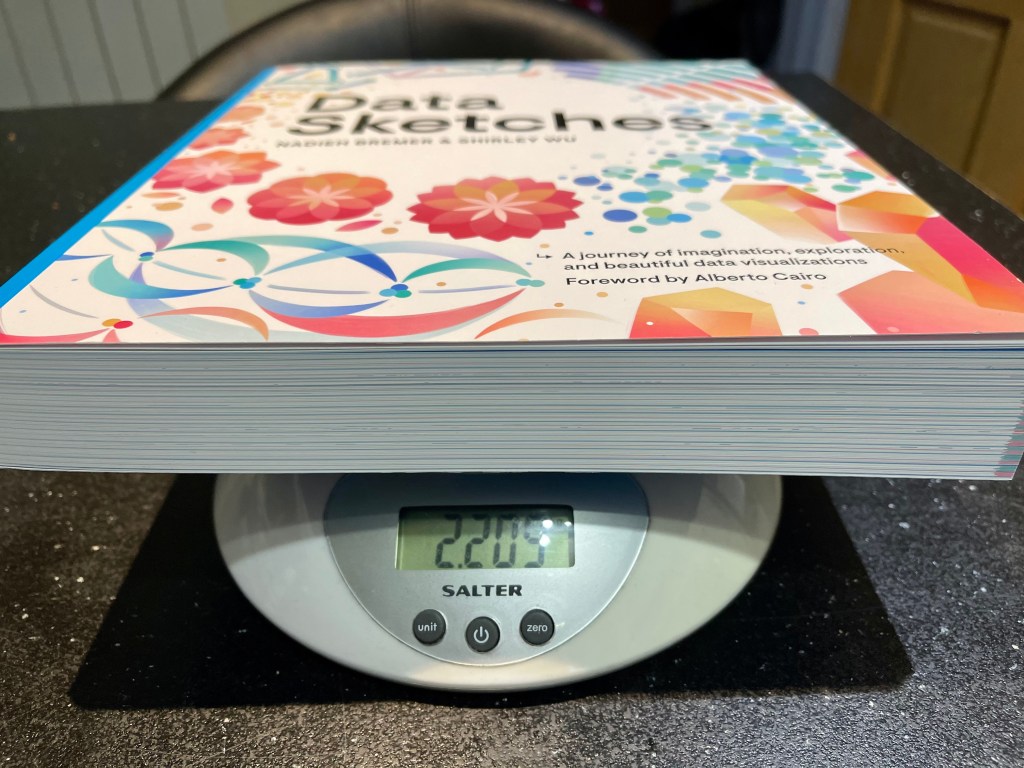
First of all, a rare mistake from Alberto. He states in his foreword that “the book that you have in your hands reveals how Nadieh and Shirley think”. This is wrong … the book is huge! You can’t possibly hold it in your hands for too long, I’m a big guy who used to be handy on the piano due to the size of my hands, and I can tell you now, it’s not one for the hands – I’ve read this book with it resting on the table! This is not to get into a daft argument about wording, but more a point to demonstrate that you will be getting your money’s worth. For those old enough to remember such a thing, you’re getting a phonebook sized tome, at 2.2kg or just under 5lbs!

(I bet I wouldn’t have tried anything like this in the days before reading I am a book!)
The book itself is also unorthodox. Packed full of colour and image, it might not be obvious how to approach it at first. But that’s only really due to the nature of the book, it’s a book that you don’t instinctively open up at page 1, rather you let it fall open somewhere in the middle and instantly marvel at the visual content while reading the context. You could probably get all the enjoyment you need reading the book in this manner. But I wanted to read from the start to get the maximum from the content (and to provide a fair review). And so the book explains the construct simply enough.

After the introductions are twelve chapters, each representing one of the twelve projects the duo decided to focus on for their visualisations. Each chapter has a section for Nadieh’s visualisation and a section for Shirley’s visualisation, each written up by the designer themselves. Within each chapter is an introduction, a view of the data, the initial sketches, a section on the code used to design the viz, and then Nadieh or Shirley’s reflections on the particular project. And following that are the final designs in full. If you weren’t loving it already, this is where you really appreciate the physical size of the book and its pages! Moreover, the sections are colour coded as green for Nadieh and pink for Shirley, with general/code elements in blue (you can even see pink/green strips on the page edges, see the header image of this article!)
And so what follows are twenty-four chances to immerse yourself in a project by one of the two designers. In reading/reviewing this book I decided to read every page from start to finish but much in the fashion that I mentioned above – appreciation of the sketches and design elements, reading of the introductions and reflections, while parking the code sections for another day. This is what I hoped would make me become more Nadieh or become more Shirley.
Here are just some of my takeaways from the book:
- Find a great data source on something you’re passionate about – this isn’t a particularly hard sell to me as it’s something I’ve always preached (for want of a better word). Many of the datasets used by Nadieh and Shirley are clearly based around their absolute favourite things in life, and that joy really sets the benchmark throughout the project
- It’s OK to enter/generate data by hand, or at least go through the process of manual enrichment – this is linked in with the above takeaway somewhat, but it’s easy to think that if the data just doesn’t have enough, or the wrong information to be sorted quickly, that you are going down the wrong path. That doesn’t have to be the case though. Sure, it can become something of a labour of love, but if you’re adhering to the point above that’s not a problem. Nadieh comments that the process can be worth the time investment.
- Reach out for help if you’re stuck – it sounds obvious but I know that I don’t do that enough. My own creations are so “me” that whereas I try and learn or work out new techniques the whole time, very often if I can’t do things a certain way I just don’t. Why don’t I reach out more? If both Nadieh and Shirley credit specific examples of where their projects went from just good to downright amazing thanks to help they got from reaching out, then we should all consider doing that more.
- Document your processes – the book came about because as the authors were going through their great online DataSketches project in 2016 they documented their process. And, obviously, they kept their initial sketches too. What a great way to revisit, learn and share the process, as well as to always look for ways to improve earlier creations. As I write, I have been procrastinating on an idea for two or three weeks to go back and improve one of my earlier major visualisation projects (not featured on this blog). But I can’t easily recreate the data or get back into the mindset of how I created it in the first place – a situation which has led to frustration (and very little progress!)
- Sketch, iterate, sketch again! – OK, this is obvious, as the whole project is entitled Data Sketches. But it would be an omission from this list if I didn’t include it. I think I pre-sketch my visualisations, but in reality I only do this sometimes. And I’m not sure that I often go back and re-sketch. Now this is partly because I feel that Tableau is a tool that can visually iterate quickly, as opposed to tools such as d3.js used by the authors which perhaps needs more pre-planning. But that shouldn’t be an excuse. And specifically …
- Sketch to discover and remove thinking errors – this is an example of a great way that the book is structured. In making my notes reading the book I highlighted this and wrote it down for advice, before realising it came up again and again. If the same advice is a recurring theme across more than one project, it is captioned in exactly the same way. Several examples are given throughout both designers’ projects where the initial sketch process illustrated something that actually wouldn’t work. Keep sketching – subsequent sketches are the best way to eliminate those pesky bits that don’t work!
- Projects are fun – it’s clear how much fun this is for the two designers. Coming up with the idea of Data Sketches meant they could both immerse themselves into personal projects they enjoyed from start to finish, and also acts as great motivation. I found this too (albeit in a love/hate kind of way) when I undertook my own month-long project last year, and this makes me wonder whether to restart another project. Is there something else I can do this upcoming May, for 31 days? I make no promises, but the book inspires me to think of a project (maybe a collaboration?) to get visualising again soon!
- It’s OK not to plan every step – “I never plan out all of my steps; instead I try and focus on the most fundamental change/addition to be made at that point, see if I can make it work, and then think about the next step.” – this was refreshingly honest from Nadieh. With personal projects, this makes sense – the nature of sketching, coding and iteration means that plans will change, so why not embrace that and concentrate on one step at a time?
- The act of finishing is important – Shirley mentions that there was one project she wasn’t overly happy when finished (the beautiful Dive Fractals project) but was encouraged that at least the act of finishing a project is important. It turns out that the main doubt she had, the overall look and aesthetic, has actually grown on her over time, and she now thinks it’s beautiful (and I agree!). I do have projects I lose impetus on when I don’t think they are impactful, beautiful or just plain good enough. Ironically one such project is an idea I had to visualise the words in Hamilton, I gave up because it’s not a patch on Shirley’s own project! But I digress … this, and other projects I haven’t finished, need me to persevere more. Without finishing, you will never know whether you might just get to something you have pride in after all!
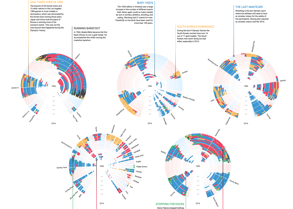
- Some great ideas – Colours in photographs, Olympic results radially in feathers, words of musicals, beautiful tracks of butterflies … I won’t mention all 24 projects but the book by definition will give you 24 new visualisation ideas.
- Sometimes interim versions are just wrong – I knew this, and there are many twitter feeds and hashtags devoted to vizzes gone wrong, but it’s refreshing to know that even the best come up with interim versions that plain just don’t work! This is mainly an excuse to point to Shirley’s “man peeing into puddle”. I won’t highlight it here, but you can check it out on p105!
- Sometimes sketch with code / design with code – Actually this contradicts some of the above, but Nadieh mentions that in some projects the sketch process can be done using code rather than pen/paper (or iPad/pencil). Sometimes it’s important to acknowledge that if you are experimenting/iterating in your software tool that you are going through the sketch process, so to keep iterating in the same way that you would if you were sketching.
- How I feel about my own projects – Shirley gives a great point in relation to disappointing reaction to her favourite project (Putting Emojis on the President’s Face – check it out on datasketch.es!), that it taught her that “how I feel about my own projects shouldn’t be dictated by external validation, but rather by how much fun I had building it.” I’m as guilty of this as anyone – we all crave reaction and tend to “rate” or evaluate our creations by external reaction. But the correct reaction was pride in her work and the process she undertook. A lesson for me and a reminder not to judge my own projects based on external reactions!
- People rarely remember numbers, but how stories in a viz makes them feel – a paraphrase of Shirley’s reflection on her Hamilton visualisation. The key word here is “remember” – of course accuracy and precision are important but the data points themselves are less likely to be remembered than people’s aesthetic and visceral reactions. Again this feels like great validation for personal projects (not business charts!) to remember that what your audience will remember is their feelings and aesthetic reactions, not the numbers behind your visualisation.
- Learn to love math – This isn’t a new takeaway for me, I love maths (I’m English, so we love our maths in plural, not singular). So much of visualisation, especially when circles, angles and radial elements are concerned, needs us to embrace trigonometry. “Learn to love math” is another section like “Sketch to discover and remove thinking errors” which is a recurring theme (albeit, interestingly, usually in Nadieh’s projects). It always pays to remember that some of the most beautiful natural or abstract looking visualisations have the underlying principle of maths behind them, and it’s something I stress in my own work too. One of the reasons I love projects like this so much!

When I finished reading through the book there were just two things I wanted to do right away. One was to stop doing book reviews and start a fun (eccentric?) visualisation. And the other thing was to sketch it out first and really embrace the creative design ideas before diving right in. I have a feeling that’s exactly the reaction the book was hoping for from its readers, so I can vouch for the fact that in my case it has definitely succeeded!
3 Comments