The first draft of this post initially had a simpler question: “What is an encyclopaedia?”
This first question might seem like a strange question – those of you who are around about my age will know well (albeit those of you from across the pond may debate the spelling). But there are genuinely people, more likely from a younger generation, who do not know. They might have wondered how Wikipedia got its name – what does the “pedia” bit even mean? It reminds me of the question “Daddy, how did people know how to get to different places before Google Maps?”
I’ll give people the benefit of the doubt though and assume you do know: an encyclopaedia was a reference book, often in many volumes (some of us may even remember the door to door salesmen of old) which served as the ultimate reference book for facts and explanations, long before the concept of the Internet or online access was a familiar part of life. Its Oxford Languages definition is “a book or set of books giving information on many subjects or on many aspects of one subject and typically arranged alphabetically.” The prime example, certainly in the UK, was the Encyclopaedia Britannica, shown here ironically in Wikipedia:

In the online age the concept of a shelf full of books to answer all of our factual questions may seem to be a thing of the past. This post is a review of Brittanica’s new Encyclopaedia Infographica, a beautiful revival of the traditional encyclopaedia, targeted at children and guaranteed to be loved by kids of all ages who love facts, figures, and visual information, whether they realise it or not! The reason it features in this blog is that it heavily features data visualisation in the form of infographics on every page. It’s absolutely the reference book I would have loved as a child, and still appreciate every bit as much today.
Written by Andrew Pettie and Conrad Quilty-Harper, the images are supplied by Valentina d’Efilippo, an information designer who has featured many times in this blog (and in my own book) as one of my major influences, featuring here for her iconic poppy visualisation and here for OddityViz. With Miriam Quick, co-creator of OddityViz, and co-author of I am a book, I am a portal to the universe also involved as a data researcher, I knew the content would be fun and engaging.
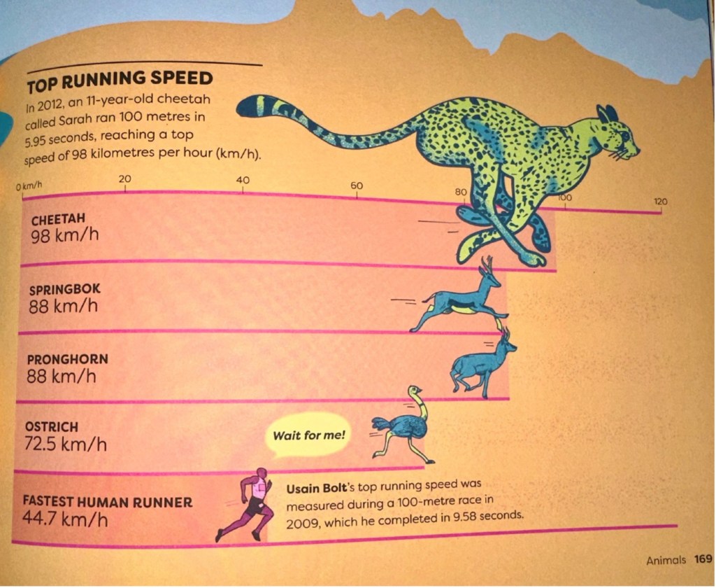
The main appeal of this book is that it’s instantly accessible and readable, and the infographics so well designed that you may not even always realise you are looking at a data visualisation. With data blended seamlessly into design, our pre-attentive attributes that we as data visualisation practitioners are so familiar with take over, allowing us to enjoy the facts associated with every image. This image illustrates this idea, with animals ranked by speed placed subtly over a bar chart, respectfully comparing and displaying speeds of animals (and Usain) to our young human readers with the correct proportional bar lengths. As a kid, I might’ve known that Usain Bolt was really fast, but a cheetah was even faster. But by how much? And what about other speedy animals? The infographics answer in such a way that we can learn all of this information in context if we want to. But if we just want to know which animals are fastest, well that’s OK too.

The infographics cover all sorts of visualisation types – I spotted bar charts, pie charts, isotypes, maps, area charts, a stacked column chart (in 3D, but rightly so!), and crucially the introduction gives advice on how to read and understand every data-derived infographic in the book, explaining how to interpret scale, read bar charts, recognise colours and patterns, make comparisons, and read positions on a map.

And when the image is a little more “custom” (a poo chart, anybody?), there’s always a friendly additional “how to read” included.

Covering space, our geography and planet, animals, the human body, and the human world (including sport, art, engineering, and inventions), any young person who was anything like I was as a child will absolutely love this. And best of all, something I was never aware of at that age, the final “Find out more” spread encourages readers to explore more about infographics and data visualisation pioneers, showcasing the likes of Florence Nightingale, WEB du Bois, Marie and Otto Neurath, Hans Rosling and more.

In that sense, this book allows for a child of any age to take their love of facts, figures, and statistics about the world around them and translate that into an understanding and passion for infographics and visualisation. An option that didn’t open for me until probably over thirty years later.
And to return to the blog post’s question (something I admittedly don’t always do!), then put down your phones and tablets, ignore Wikipedia, and spend some time with this book, appreciating the infographics and the fascinating data behind every one of them: you’ll be glad you did, whatever your age.