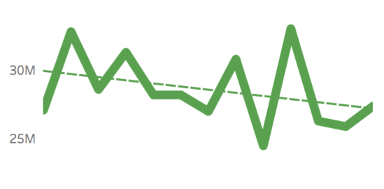
Some might say, the question should be “Why …” – and I don’t have an answer to that, other than to describe my thought processes from my last post, on the first day of May, where I set myself this challenge. A visualisation a day, all on the theme of one album. Did I complete […]
Tag: album covers
When are multiple visualisations better than one?
This post is partly inspired by a recent post from Ben Jones explaining his love for dot plots here. Like Ben, I do enjoy dot plots, and it got me thinking that it would be good to go back to basics from the point of view of a data visualisation blog: when was the last […]
Do we take data visualisation too seriously?
It’s been a while since my last post – there’s a good reason for this. Well, a reason anyway. I have a 90% written post which I have been mulling over for a long time. Because I haven’t felt comfortable with it, or finished it, it’s been a bit of a logjam for the blog […]
What were my favourite visualisations of 2017?
As promised, part two of my review of 2017 focuses on my favourite six visualisations I created in 2017. I’m not overly comfortable about self-promotion and am having second thoughts about showing these, but I think it’s inevitable that blogs should be a combination of learning, sharing and self-promotion so as to get the maximum […]
How do you visualise to a pre-determined design?
This is another post that’s quite difficult to frame into a question, but I want to take the opportunity to show off a bit about my latest album cover themed data visualisation project. After all, it’s a niche (some might say pointless) thing I’m doing, so why not justify it with some writing, pictures and, […]
How was it for you?
One of the reasons I love data visualisation and I enjoy producing what I might consider to be data art (many would disagree, but as with all art, isn’t there always the “is that art?” or “I don’t know what’s art but I know what I like” debate?) is the very fact that the same […]


