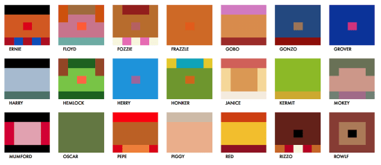
Anyone who becomes involved in data visualisation will become interested in colour palettes. We know the importance of colour from a best principles perspective and from a cultural perspective – it’s something I wrote about right at the start of this blog (was it really nine years ago?!), which formed a crucial chapter of my […]
Tag: small multiples
Which chart types are most engaging?
Before you skim down or look for a summary of my response to this particular dataviz question, I’m not even going to try and answer this question. I will at least discuss it though in the context of a recent project I created. First of all, here are two similar but different outputs of the […]
When are multiple visualisations better than one?
This post is partly inspired by a recent post from Ben Jones explaining his love for dot plots here. Like Ben, I do enjoy dot plots, and it got me thinking that it would be good to go back to basics from the point of view of a data visualisation blog: when was the last […]
Haven’t I seen this somewhere before?
This post is thinking about those situations where you produce a visualisation that looks remarkably like another visualisation, whether that was the intention or not. It’s a hot topic, and with so many people entering the field it’s an issue that comes up more and more often. I think there are three separate situations that […]
How important is interaction in visualisations? (aka Where’s Big Sam?)
Last week, I saw this visualisation tweeted by Gregor Aisch of a visualisation he produced for the New York Times. I really like the look of this – striking, simple but quite unique-looking. The visualisation aimed to show that Angela Merkel’s latest election victory cemented her status as the longest-serving EU leader and compare her […]


