This is another post that’s quite difficult to frame into a question, but I want to take the opportunity to show off a bit about my latest album cover themed data visualisation project. After all, it’s a niche (some might say pointless) thing I’m doing, so why not justify it with some writing, pictures and, in this case, a technical snippet or two?
There are quite a few things driving why I’m continuing with my works in this series, but here are three:
1. I love the idea of visualisations on display as artworks.
A few weeks ago I was invited to speak at the London Tableau User Group and mentioned, albeit in passing, that the Viz Gallery hosted at the conference represented my “proudest moment”.

I have a feeling I’ve mentioned this once or twice on here before but it bears repeating because it would be a shame to think this was a one-off. It would be fantastic to see this recreated in the future if it inspires people to think about data visualisation for personal projects in a different way. It’s the first time I’ve seen people pore over my work with interest, pointing at points and discussing individual elements. I don’t even mind if people hated it if they couldn’t see beyond the point that it was a poor attempt at true analytic representation – that’s what I’d expect, and that’s equivalent to what any traditional artist might expect.
It was a fantastic gesture by Tableau to make ordinary analysts feel like artists for a week and a true highlight for me. Tableau, if you’re thinking about recreating this in future, perhaps at larger US venues, but aren’t sure whether to invest the time once more, please do! You’d do more than just make half a dozen analysts’ days, but could really kick-start a genuine interest and passion which can lead to your product being used in many creative and eye-catching ways. Data visualisation has a place at both sides of the form/function spectrum as well as every point in between. Data *is* beautiful! (there, I said it, Stephen Few!)
2. Design Driven Data
I mentioned the concept of design driven data as championed by Giorgia Lupi more in my previous post here so perhaps won’t go into as much detail. But I really enjoy the freedom of having carte blanche on your design (or, in my case, using a pre-existing design, more carte rouge, bleue et jaune …) and curating the data (legitimately!) so that the final project works as a visualisation.
3. It’s fun!
I really enjoyed making this! Having the final design firmly in mind as I worked through the data visualisation elements is a little like completing a jigsaw or colouring something in. Maybe it’s a combination of these childlike fun creativity stages along with visualisation principles and software tool skills which are new and relevant to me as a grown person, but it’s a combination I really enjoyed this time around. And that’s important for personal projects. It makes the blog post a little bit easier too!
I’m well aware that you can’t just pick an album cover and visualise it. Everyone knows iconic images from classic albums by, say, Abbey Road by the Beatles or Born in the USA by Springsteen. But photographic album covers, and/or album covers depicting people, are not really going to be suitable. I’m looking for stand-out covers which are geometric in nature, usually hand-drawn or computer-drawn. Something that looks like it *could* be a data visualisation if you squinted hard enough or used a bit of “artistic license”. My folder of images I’ve sourced for these purposes contains probably no more than about eight possible future album covers, some of which are quite tenuous. In a way though, that adds to the satisfaction when a data and image idea comes together.
Below is the album cover for “Screamadelica” by Primal Scream, released in 1991.
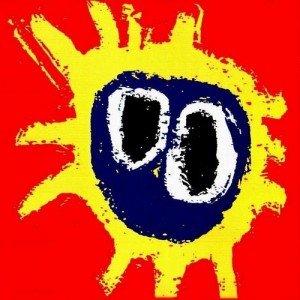
While I’m slowly trying to make a name for myself in data visualisation, there are two things I could never be accused of being: an art aficionado or a music aficionado. I know very little about either (OK, to coin a phrase: I know what I like …) which might be an odd frame of reference for a project like this. But I know this album cover ticks all the boxes: geometric, stand-out, hand-drawn, and formed of plenty of elements (lines/circles) that could be used in data visualisation. So whereas I feel that I can’t really explain much about the original artwork, it helps in this case to do some research. NME summed up nicely why this was a great album cover of its time here There’s also an article crediting the original artwork artist Paul Cannell in the Daily Record here
I’ve had this particular album cover in mind for a while. As someone not afraid to shy away from circles, this should be right up my street. Could the twelve radial lines represent twelve months of the year? Climate change spiralling out of control again? (a pity that’s been done so well!) And two roughly circular internal elements. Perhaps they could tell something else? Maxima/minima? Rainfall figures?
I’m trying to be a bit more “different” in my association between image and subject though. What if I considered the image to have eleven arms and not twelve (since one is much smaller and streakier). Eleven ordered data points featuring an additional two, featuring the the summer sun? My idea was born (US readers I’m aware you may still be scratching your head at this point!). UK readers you probably get it by now although my association with the British summer and sunshine might be somewhat tenuous …
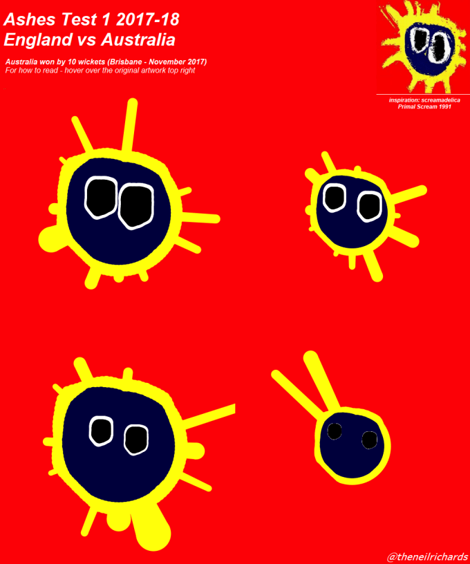
Using the principle of design-driven data, I now have my idea. I have data which fits into the idea of eleven line lengths (batsman scores), eleven line widths (batsman strike rates), one large circle size (team score), and two smaller circle thicknesses and areas (bowling figures: wickets/runs against). I can visualise a cricket scorecard. And because there are several thousand scorecards throughout history, I can visually compare any one innings against another, be they opposing innings within the same match or any number of scorecards from different scenarios.
To be clear, the thing I don’t want to do is recreate a piece in Tableau simply as art.
(As an aside, that’s not the last thing I want to at all, it’s just not my aim on this project – it’s a fascinating project. Some great Tableau work has been done by Ken Flerlage here: Geometric Art in Tableau demonstrating how it’s possible to completely recreate images consisting entirely of circles in Tableau. I have attempted this using Ken’s blog and love the process and final result, shown below. However, this isn’t my interpretation of a data visualisation, this is using a visualisation tool beautifully to recreate an art piece or photo without underlying data)

My visualisation, using the four innings of the first Test of the recent England versus Australia test match, is below. For full reading instructions and tooltip information, please click through to the Tableau Public version:
I usually try and keep this blog technical-free and relatively tool-agnostic, but it’s fair to say that this isn’t as easy as it at first looks! It’s not easy to draw thick-line circles like that out of the box in Tableau, so I knew I would have to overlay shapes on top of each other. Here’s an individual sun:

My thinking behind creating each individual sun was that this is basically a large yellow circle with spokes radiating from it, a dark blue circle overlaid on top. and two smaller circles created in a similar way (white circle with black on top). The yellow and blue circles would need to be centrally aligned, and the black/white ones offset.
The problem is that it’s not possible to float the different elements on top of each other. With every element created within a rectangular sheet, it’s not possible, for example, to place the blue circle over the yellow one without the corners of the containing “box” obliterating the yellow circle. Transparent backgrounds are not (yet) a thing in Tableau so this had me scuppered for a while, and the project mothballed for a while.
But then I considered other ways of drawing circles. It’s possible to specify every point on a circle with a bit of schoolboy/girl trigonometry, I’m OK with that. With 100 data points I can draw a circle as thick as I like, but that doesn’t solve the problem of “colouring in” the circle.
My solution was to make 200 data points for each circle I want to draw. 100 for each point on the radius, and 100 copies of the origin. I can kill two birds with one stone here, because on the yellow circle I can pick eleven of these points, not evenly spaced, but placed to approximate the points in the original artwork. So I have 89 points on a circle and 11 specified data points with an additional measure (number of runs). I can bring that into Tableau and increase the line length by a distance proportional to the number of runs.
By drawing 100 lines (and repeating this principle for the blue, white and black “circles” the below should give you a clue to how the visualisation takes shape:

Thickening the lines then “colours in” all of the circles. It doesn’t give a perfectly smooth set of circles, the thick round edges of each line giving a more wavy effect, but that’s a bonus because it inadvertently recreates the hand-drawn nature of the original!
Our data structure now gives the ideal platform to push and pull every spoke so that each circle becomes a little less geometrically accurate and elongates/contracts exactly where we want it to. So I assigned a “scalar” to each data point. If every point was 1, it would draw a circular wheel/spoke, so it’s a matter of increasing the scalar for where we want the circle to expand, and contracting for where we want to contract. Other key flags in the data are “status” which essentially just tells the software which circle it’s drawing (“real” became the yellow circle”) and “path” which was 1 for all outer points and 0 for all origin points, allowing Tableau to draw each individual line when assigned to “path”

You can even download and print off spoke/radial graph paper. I tried this below for one of the “eyes” allowing me to judge where the scalar would be for each data point. In this case each segment represented 4 and one-sixth data points (maybe if I’d known that I would use this paper I would have used 90 or 120 data points, not 100!)
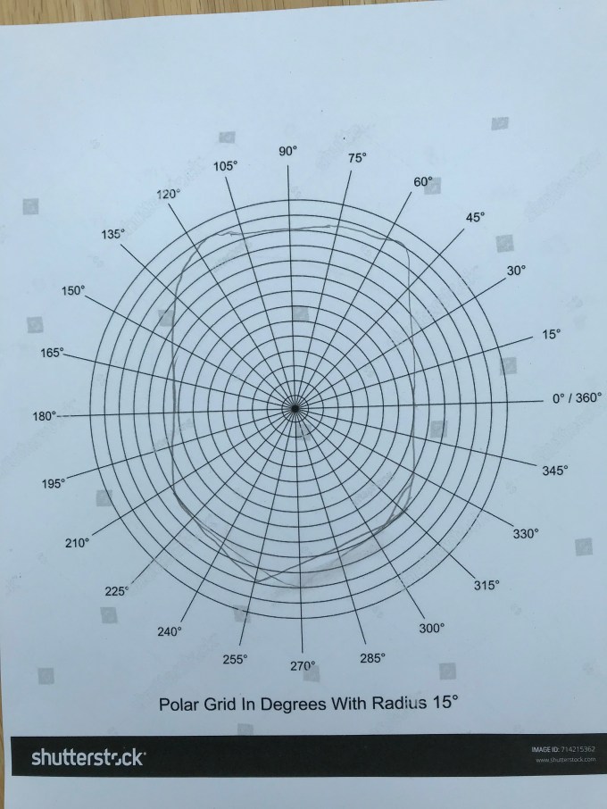
This was where I refer back to the process being fun – once I had my method it felt like a grown-up version of painting by numbers, which is very much at the top end of my artistic talent!
Important to me is that the process is scalable. Having generated one “sun”, how easy is it to generate four, to compare performances across innings? Fortunately, this is relatively easy. With no need to touch the scalars/paths or id structure, it becomes a matter of pasting in batsman, bowler and team scores only (and updating the descriptive dimensions).
I’m hoping the explanation widens the appeal slightly from middle-aged white cricket fans who remember nineties music – it might describe me, but it doesn’t exactly describe the diverse range of participants I envisage either as creators or consumers of data visualisation! But in creating this I’ve learned new techniques and forced myself, with the aid iconic pre-existing designs, to make design decisions which are sympathetic both to user experience and underlying data. If you’re interested further in how this particular visualisation was created, please download the workbook and/or get in touch. And in making a scalable visualisation I can recreate happier experiences which don’t make me want to emit a primal scream of frustration (a familiar feeling for England cricket fans when touring Australia). Headingley 1981, anyone?
5 Comments