Obviously the answer to this is “yes”, at least inasmuch as it can’t be the other way round. I’ve learnt (well, I knew really – let’s say “confirmed”) today that you can’t just decide on a visualisation without thoroughly knowing your data and its suitability for the job.
Take the excellent visualisation below, published in the New York Times (click to visit/interact)
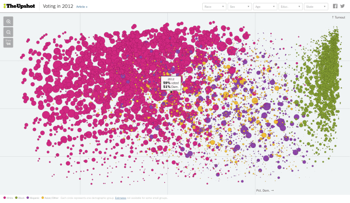
Every circle represents a demographic group, with this beautifully showing the dominant affect of race (ethnicity) on how the US population voted in 2012.
With the Tableau #ironviz competition imminent, on the subject of politics (more on that later) I came up with the idea of recreating this for a big UK vote. My first thought was the EU Referendum, but that hasn’t happened yet and will be a close run thing to do anything with that data before the deadline. So I looked into the 2015 general election. The difficulty with this is the UK is far from a two-party voting system. I could categorise the votes into three: Conservative, Labour and “Other”, to include the nationalist parties, Liberal Democrats, UKIP, Greens and other minor parties. In order to do this I’ll need to do something triangular, using three axes, but that can be my twist on this chart, and I felt up for the challenge.
The first major issue, though, is that we just don’t know demographic information of how people voted. We know geographical information, because of the individual constituency voting, but nothing to do with gender, race, or much else. This data does exist, but in the form of research data from agencies collected after the event, using a much smaller sample size.
The British Election Study (www.britishelectionstudy.com) was one such study. With c.3000 respondents from all constituencies across Great Britain, it looked promising. Northern Ireland data was not included, but given the different political parties, from the point of view of my visualisation, that was fine (they’d all have been 100% “other” anyway). The dataset is rich with attitude and opinion questions, but crucially had the verified information of whether and how the respondents voted, along with their demographic information. It was also weighted, so that it it could be scaled up to national proportions.
One downside is that the data was in SPSS format. In order to get the required percentages for each demographic category, we’d need a lot more than a Tableau import. We needed to be able to understand the survey data format, apply the weighting, run some recoding and analysis in SPSS, pivot the data, and understand the structure once imported into Tableau. As luck would have it, that’s my day job …
The US data has 2 gender categories, 50 states, 4 races, 5 categories for educational attainment and 4 age categories, totalling a possible 8000 blobs. Unfortunately with our dataset we can’t get near that. I decided to go for 11 regions, 2 ethnicity values (white versus all other), seven age categories, and 2 for gender, giving 308 categories in total. This worked OK, but only gives an average of 10 or so respondents in each category, therefore several with a lot fewer. The issue then is that a lot of categories are empty, or have odd looking results (e.g. 100% Labour, or 0% turnout). Even those that look reasonable will have huge margins of error if only represented by a single-figure number of respondents.
The first attempt had a bit of a problem because the data split between white and “other” ethnicities was a long way from fifty-fifty, meaning that a lot of the non-white demographic groups were zero or very small amounts. It wasn’t going to be possible to use race/ethnicity in such a key way. Instead I looked for another demographic which would be closer to fifty-fifty, and went for those working versus those not (students/unemployed/retired). This gave better breakdowns, though understandably most of the over 75 age group were in the non-working category. It was a better fit though through the rest of the age groups, so I decided to run the visualisation using the revised data.
So, the visualisation “works” inasmuch as I have what I wanted, including a three-way axis I’m quite pleased with. I’m even pleased with a few new tricks I’ve learned/worked out, such as how to change the colour scheme depending on which demographic you pick (ask me and I’ll blog that separately if there’s a demand!). There are 300 or so blobs instead of 8000, so the overall look is not going to be the same. The US data source must be phenomenal! I like what I produced enough to publish and share it, but realised that it was time to call it a day. To publish requires a huge caveat on the quality of data and the size of the confidence levels. So, consider this blog entry that caveat! But here’s my effort:

The original question was: “Should the data drive the visualisation?” I probably only phrased it that because of the gimmick of this blog such that every post poses a question. But the dataset I used is a cracking dataset. It just wasn’t big enough to divide into 300+ smaller subsets to show anything meaningful. I continued because I wanted to get to the final “triangle” look – in that respect I achieved what I set out to do and it’s a template for a future visualisation with a larger dataset. However there’s plenty that can be done with this dataset though – who knows, with #ironviz approaching, we could see something more legitimate some time soon?

3 Comments