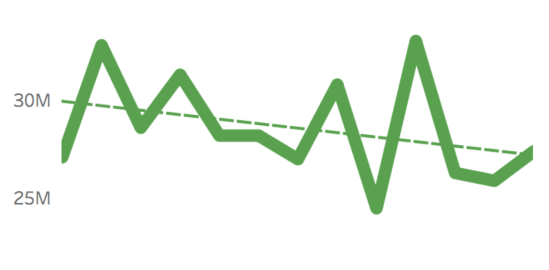
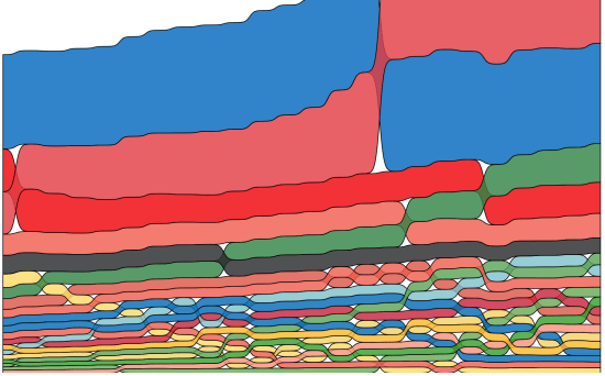
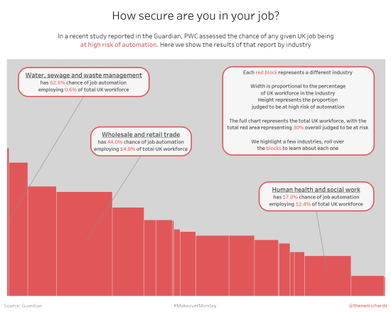
As promised, part two of my review of 2017 focuses on my favourite six visualisations I created in 2017. I’m not overly comfortable about self-promotion and am having second thoughts about showing these, but I think it’s inevitable that blogs should be a combination of learning, sharing and self-promotion so as to get the maximum […]
Tag: makeovermonday
What were my highlights of 2017?
As we approach 2018 I want to take time for a quick review before looking forward to the new year. So I’m going to do six highlights of the year, six visualisations of the year and six goals/aspirations for 2018. So that’s six, six and six – put them together and you’ve got 18 for […]
So, what’s the point?
Another blog post – another question. But this one might suggest that I’m losing my love of data visualisation. Losing the momentum that drives me to produce lots of work. An introspective question it might be, but don’t worry, it’s not an exasperated cry for help. Let me explain. Earlier this year, not for the first […]
Why have I stopped contributing to Makeover Monday?
It’s difficult to be a regular contributor of Tableau data visualisations online via Tableau Public without knowing about the excellent Makeover Monday initiative. For those who aren’t aware of it, I penned an ode to it last year. As last year continued, I posted a contribution every week, from the simple to the complex, learning […]
What is a Marimekko chart (and when should you use one?!)
If you’ve read previous blog posts, you’ll know that I’m a fan of different and unusual chart types. If the chart types are visually interesting and striking, but don’t necessarily follow visualisation best practices, then, for me, sometimes, so much the better! I’ve blogged about, and attempted, sunburst charts, radial bump charts, bump charts, spiral […]
Is there a place for chord charts in data visualisation?
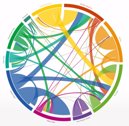
I have a number of dataviz questions I still want to cover, but this has usurped a few others and moved right to the top of my list for the moment. The debate focuses around this chart here, published at http://www.global-migration.info/ You can probably skip to the concluding statement of this post (which I haven’t […]
How important is clean data?
Kind of an obvious question for this post. Of course it’s important to have clean data. For me, I’ve been involved in the thankless task of producing clean data for the last twenty years, much longer than I’ve been involved in visualisation. This article was one I wrote last year which confirms that most people […]
