Last year I posted about tile maps and the fun I had devising one for Africa in particular. My approach up to that point was simple – just devising a square grid, basically based on graph paper and an atlas. Or at least the slightly more up to date version of rows/columns in Excel and an online map.
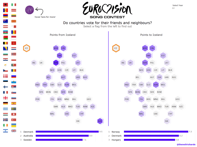
On that occasion I tried Africa and France, and have since published square tile versions for Scotland and New Zealand using a similar low-tech technique. Last month I tried something a little more complicated, but only a little more, by trying a hexagonal tile map. My choice was Europe (well, Europe and Australia, but then that’s the Eurovision Song Contest for you) with the resulting tile map below:
Logistics about setting up a tile map notwithstanding, Eurovision is an ideal subject for a tile map. The reason for this is that each country is equally as important as any other, with exactly the same weight given to a vote from (or a performance by) a small country as for a large country. But the first issue with tile maps will always be the disparity in size between countries. There’s no getting away from the fact that in the European example above, Russia and San Marino are the same size, despite the fact that you can fit over a quarter of a million San Marinos in the area of Russia.
The second issue is often the fact that you might not have data for every country/region, whether due to incomplete data, disputes/changes in territory, or small city/state areas which are often not included. My Europe example has many of those issues. I’ve included Andorra and San Marino because they have been included in the contest, but not Liechtenstein, since they have never taken part. I have included Luxembourg, since they have participated in the past, but they have ended up as a blank tile. But not included is Kosovo, only recently recognised as an independent state. This is more common than you might think – does your America data include D.C? Does your UK data consider Bristol as a separate county or part of Gloucestershire? Is Kosovo recognised as a separate state? Is Greenland a separate entity in your data? … etc
The third issue is just one of aesthetics. Does it work? Tile maps aren’t for everyone, and none can be done without a certain amount of displacement and distortion. But is the overall shape/format recognisable as the country or continent it represents? Plainly and simply, does it look nice?
To compile a hexagonal tile map (in my case, in Tableau) the method is very similar. You can even download hexagonal grids if you want to print off and colour your map while planning manually. The only difference is that as a “grid”, some of the columns will be offset by 0.5. This is really well explained in this post by Matt Chambers, aka Sir Vizalot, and so I used the techniques he explains to generate my hex tile map in Tableau.
Last month in Manchester I was offered the chance to speak at a Data Science conference (as alluded to in my last post). I decided to attend the full two days of the conference, partly to acclimatise for my first major conference talk, and partly because it seemed like a great conference, which the organisers had made me feel very welcome to be part of. Scanning through the list of talks, I noticed that Dr. Graham McNeill from the Oxford Internet Institute was talking about how to automatically generate tile maps. He and his colleague Scott Hale are to present a paper on their findings at Eurovis in Barcelona later this month (June 2017). In a conference where a lot of high level mathematics and science was included (my talk, on the second day, was the first not to include equations, algorithms or Greek letters!), this stood out to me as one that really reached my interest.
Graham’s talk explained that he was devising a program/application that would convert input locations to a given tile map, using algorithms where users could determine the most important features. What is most important – overall shape? Positioning? Geographical accuracy? Are there certain arrangements that can’t be broken? For example, he showed several different interpretations of US tile maps, probably the most widely recognised tile maps, explaining that different publications use slightly different “house” versions. Some have the most optimised versions with North and South Carolina actually adjoining east and west, whereas some have North above South, and need to make concessions in other areas. Problems I’m well aware of from my low-tech map generating!
The other thing that attracted my interest was the fact that he was easily able to toggle between four types of polygon: square, circle (essentially the same thing – the arrangement is identical, it just doesn’t tile snugly), hexagon and triangle.
(Wondering how exactly a circle tile map could work? Take a look at this from https://flowingdata.com/2017/05/18/chernoff-emoji/ with further explanation within)
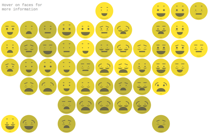
The first three (square, circle, hexagon) I’d seen, and tried, but not a triangle tile map. The talk was therefore exciting on two levels: firstly, is there a method in the pipeline that will do the mapping part for me, better than I can do myself (though secretly that’s a bit of a shame, as it’s the best bit!), and secondly, regardless of the algorithm or not, it completely opened my eyes to the fact that a triangle tile map was an option. We were shown a few examples, some of which looked better than others, but it was quite exciting to think that a triangle map could look good in certain cases.
Graham mentioned that he’d tried two in particular, because he’d seen some good manual versions of France and Africa out online. Cue moment of surprise and the slide below (for those who haven’t followed my blog or clicked on earlier links, these are, of course, mine!). As a newcomer in the field of data visualisation, I was quietly chuffed to see my work (via this very blog) had been noticed and publicised.
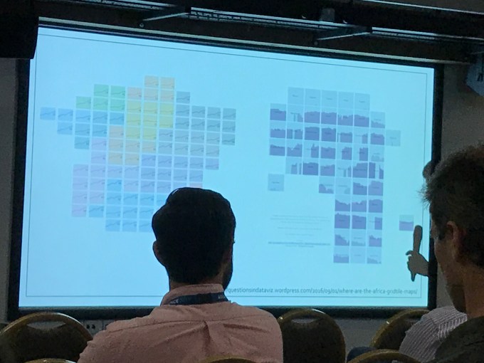
So this got me thinking – could we work together to see whether there were some interesting tile maps that would work for data visualisations that I could try using in Tableau? Shortly after the conference I asked Graham if he had some interesting triangular maps to send me that his application had generated.
There were three versions of Africa:
The first thing to notice about triangle maps is that there are two different types: essentially those where the triangles are all on their point/base (so the bases align horizontally), and those where the bases align vertically. The one thing that a human has over an algorithm is their own aesthetic choice. I don’t know which of the three is most accurate, but instantly I saw one of them (the largest of the three images above) and loved it. I prefer the former kind to the latter kind, but that might be because of the longitudinal nature of Africa – perhaps a different-shaped country or continent would suit the alternative alignment better?
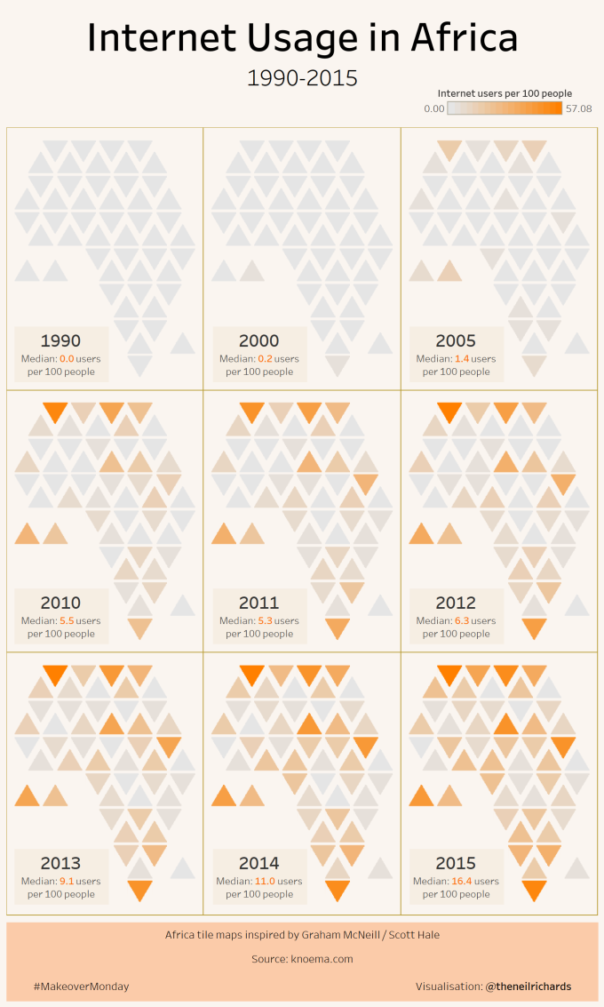
The algorithm had done a great job of aligning Africa into a really pleasing shape, but there were three things that didn’t quite sit right. Morocco pointing up out of the horizontal plane in the North, Somaliland poking out to the East, and Lesotho occupying the furthest tile south. Along with the image, Graham supplied me with a row and column number to use to import into Tableau, and one extra parameter, essentially whether the triangle is to point up or down. This is the only difference to a square or hexagonal map, since two separate alignments are needed within the same map in order to tesselate.
Fortunately this is where overriding some of the choices manually becomes an option, and some of the quirks of African nations worked nicely in my favour. First, I swapped Lesotho and South Africa, so that Lesotho sat above South Africa instead of at the very bottom. Perhaps this is the equivalent to the North/South Carolina quandary I mentioned above, but it didn’t sit right without having South Africa at the bottom, especially since Lesotho, though entirely surrounded by South Africa, is not a coastal nation. Secondly, Graham’s map included Western Sahara, which is still considered a disputed territory. The dataset I planned to use was the latest Makeover Monday (you may have heard me mention that before) which didn’t have Western Sahara, so I was able to manually adjust the surrounding countries and smooth out the Northern coast. Thirdly, Somaliland was also not included in my data, and a quick google suggested it’s also not a recognised country.
Finally, the island nations (Sao Tome & Principe, Cape Verde Islands and Madagascar) weren’t included in the original algorithm. Those just need to be added manually.
So I had my version of a nice smooth tile map and used small multiples to show each of nine separate years. My design choice was to use ochre shades of brown/orange, but much of the rest of my design choices were down to a bit of luck. I struggled to get the triangles to line up, and decided it didn’t matter too much. The added zig-zag lines, as well as leaving a bit of visibility between nations, alluded to African patterns, and really helped the design theme. The resulting image, below, was one I was very happy with:
The feedback has been quite overwhelming – it seems many of you are appreciative of a new type of tile map not seen before. In particular, Tim Ngenwa in his feedback pointed out the following page https://uk.pinterest.com/sharonlwhittake/african-patterns/ which included African patterns that it resembled, such as the pattern below:

From a Tableau point of view, if anyone was to download my workbook, you’ll see how simple it is. The only slight difference to the work I’ve done previously is that the row/column values are not 1,2,3 (or 1.5, 2.5 etc), but numbers relating to the latitude/longitude of countries (and to several decimal places). But once brought into Tableau, because the points will be shown to scale, and the axes suppressed, it doesn’t make any difference.
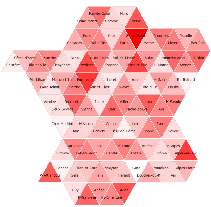
Not all tile maps work, and there will be tile maps that work well with certain tiles, but not so well with triangles. With the UK election on the horizon, I’ve been badgering Graham for a UK constituency triangle tile map, but the upshot is, with the algorithm as it stands at the moment, it just doesn’t look very good! The non-smooth geography of the UK makes it a difficult proposition. And 650 constituencies probably make it a leap too far for a manual approach (though I won’t rule it out!) In addition, I’m not a big fan of the US tile map above, whereas the established hex and square tile maps do a good job. But Graham’s France map (below) looks promising! So I’m looking forward to investigating more tile map options.
So expect more tile maps from me in due course – all feedback welcome, I may even consider requests!


7 Comments