Last week, I saw this visualisation tweeted by Gregor Aisch of a visualisation he produced for the New York Times.
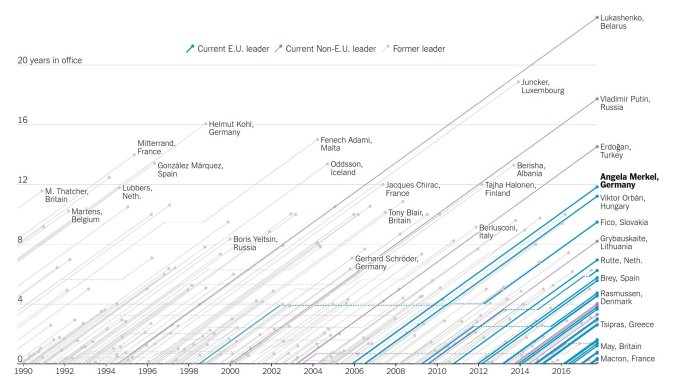
I really like the look of this – striking, simple but quite unique-looking. The visualisation aimed to show that Angela Merkel’s latest election victory cemented her status as the longest-serving EU leader and compare her against other European leaders since 1990, highlighting all those currently in post.
As with a lot of my visualisation ideas, some of my best inspirations come while walking the dog. A couple of days after I saw this viz, I thought: why not recreate this in Tableau? If I can recreate using football data (so often my go-to data source of choice) then I could look at manager tenure and I’m sure I could show a very similar range of data, with the managerial reigns of Wenger (current) and Ferguson (recent past) really standing out. Sure enough – I created a viz I was pretty pleased with. As is usual in this blog – do click through for the interactive version hosted on Tableau Public:
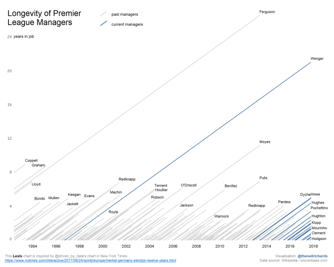
The original visualisation, I believe, doesn’t feature any interactive elements, as it is intended just for NYT readership. So I didn’t worry too much about that in my version. I could have included the ability to filter or highlight based on choice of club, or manager. But I was well aware that most of the labels for the individual managers have been suppressed because of room, so at the very least I wanted to include more information on the tooltips. I actually really liked this – the obvious similarity with the NYT graphic, the fact that you could see Hodgson, just a couple of weeks into his job, but that others didn’t have their labels showing – a little air of mystery hidden behind the tooltips. If you want to find a manager that isn’t immediately visible then you can hover on any line to find out. And if you can’t remember who Lloyd is, or you don’t know who Redknapp was managing in his first long stint ending in 2001, you can find all this further information there too.
I tweeted this image, with due credit to Gregor and the NYT original. Now I’ve admitted on here before that I keep half an eye on likes and retweets, for no more scientific reason than it’s good to know what is being well-received and what isn’t being noticed. And I was delighted to see the attention that this was getting – dozens of likes and a handful of retweets meant that it was doing very well.
But several hours later I realised the views count on my Tableau Public viz was still in single figures. It wasn’t moving – the only views were my own. Unlike the image above, I hadn’t included the accompanying Tableau Public link. Sixty people had “liked” my viz, and not one of them had bemoaned the lack of an interactive version. They didn’t care that they couldn’t see all the names or find out individual details of each managerial reign. They liked the overall look and the standout message from the visualisation., and that was enough. Eventually I resent a tweet with the interactive link, but the majority of the exposure to the visualisation had come from the first, linkless tweet. As I write, it’s of only two of my tweets ever to have more than one hundred “likes”, and the overall number of impressions is the highest ever, at over 25000. I know it’s not Gangnam Style, but it’s all relative …
Now there are lots of reasons for this – whether it’s my second “best” ever, or second most eye-catching ever, is debatable. I can tell from the reaction that it was shared around a few football twitter accounts, hence it was particularly popular among football/analytics enthusiasts. Perhaps because it’s been popular amongst a less vis-savvy audience there hasn’t been such a call for the full functionality of an interactive viz.
My story is a classic example of the way many visualisations are consumed at the moment. If you can spot a visualisation that catches your eye in your twitter feed, among all the gossip, hype and Brexit/Trump hysteria you might also see, you will usually only have a couple of seconds to consume the visualisation before moving on. People don’t have time to click through and interact unless (a) they really like the visualisation, (b) they have time and (c) there is a call to action to do so. Key word in the last sentence is “and” – in my experience it tends to take all three requirements. If the potential viewers make the decision that they don’t have all three requirements, in two seconds the visualisation will be gone.
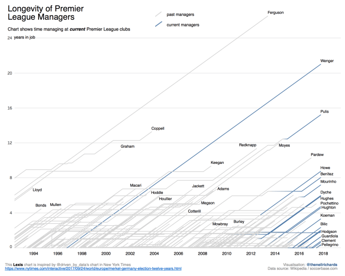
Back to the chart – a little googling suggests that the chart with parallel diagonal timelines is known as a Lexis chart. So in the interest of showing off a bit more about the data without having to dive in, here are static images of two further iterations:
First – one line per manager (instead of one line per job) – see how the lines have changed for managers such as Benitez, Pulis and Coppell who have managed several clubs over the course of the Premier League. (NB – there’s Big Sam, between Hughes and Pochettino, much of his career has been at Bolton, not included in this dataset because they are no longer a Premier League team).
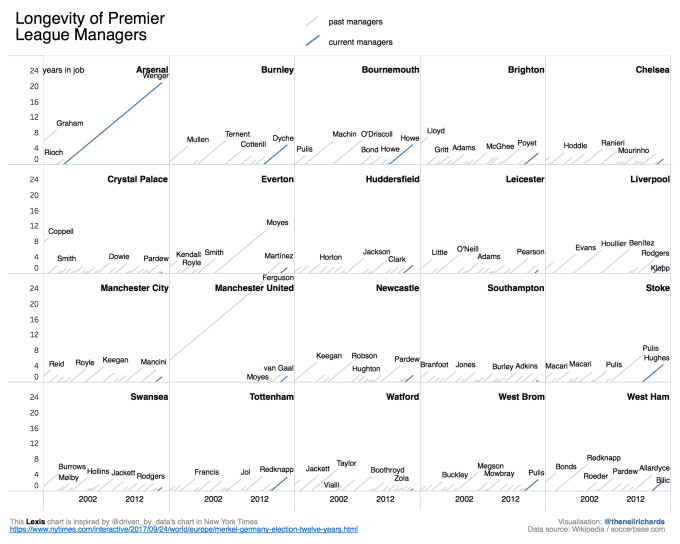
Second – a small multiple version showing one chart per club.
Not many of my blog posts go past without referencing the community project that is Makeover Monday. In this case, as the project grows in popularity, the organisers Andy Kriebel and Eva Murray have to see 100+ visualisations every week (and not as part of their day jobs). The reality is that they won’t have time to click through to many visualisations, if any. More and more it becomes clear that interactivity only has its place in certain situations – but as a default we need to learn to swallow our pride and accept that a visualisation can either be a visualisation of differing layers which can be seen, liked, even “liked” without the viewer seeing everything that’s there. Or, keep it simple and static!
I’ll always enjoy producing the full range of visualisations, from a static table to a swirly data art piece (my words!). A propos of nothing – my latest visualisation for the aforementioned Makeover Monday project. Simple, to the point, and static, right back to first principles. No link included, no click through needed.
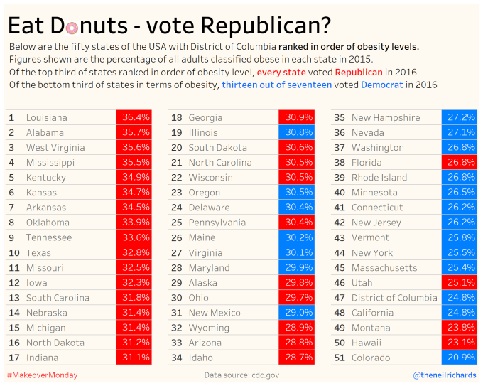
The title and implied causation is slightly tongue-in-cheek, but the design is such that no further information or interaction is needed. Maybe the way to go?

4 Comments