This post isn’t a strategy debate for the local DIY superstore, but rather a question about tile maps. We’ve seen tile maps for countries, regions and continents (many of my own efforts referenced here) but what about a tile map for the whole world?
Before I go too far into this, this isn’t so much a debate on the pros and cons of using tile maps, or world tile maps in particular. Rather, this assumes that we’ve decided to display our global map-style visualisation as a tile map. We know the pros and cons – the issues of geographical recognition and large varieties in area of different territories, and we’ve made the decision. We’re tiling the world.
Recently, I decided that a one tile per country tile map was just a step too far. What on earth do you do with Russia when it’s just a matter of miles from Alaska on the east and borders Norway on its west? A country that’s literally millions of times larger than many of the smaller countries on the map? When tiling the world, the need to normalise every country to a tile of identical size is a step too far which just obscures the geography too far. With that in mind, this was my first compromise a couple of months ago:
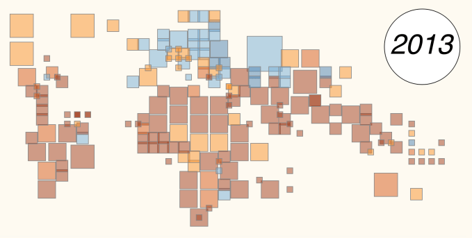
This has five different tile sizes: tiny (e.g. Andorra); small (e.g. Ireland); large (e.g. Mexico); very large: (e.g. Australia) and Russia (e.g. Russia). This has enabled me to create grids of country sizes from 1×1 to 5×5, with the “tiny” countries sitting on grid axes. The latter works really nicely for things like Lesotho or Luxembourg, where the tiny countries can sit inside or in between territories without taking up space.
I like this, and will use it again. It mostly manages to keep nice recognisable continent shapes and does exactly the job I wanted it to do. But in compromising, it’s neither a true tile map nor a true geographical filled map. But that’s OK isn’t it? After all, nobody would try a true tiled map?
Then in recent weeks Jon Schwabish, with help of contributions from his blog readers at policyviz.com, published a “true” World Tile Grid Map

Now this, as with all the charts in this blog post, is untried and in prototype, open for discussion. After all, Georgia appears twice (whoops!). But this would be fun to do in Tableau, right? I’m all for the debate over its analytical use (without a healthy debate or questions arising, this blog would be pretty pointless). So with the most recent Makeover Monday project making a dataset available of public holidays around the world, I had the perfect dataset to experiment with.

Bingo. Map recreated using colour gradient to show the measure we’re interested in; in this case number of annual Public/National holidays per country. You can see the interactive version here:
which also includes the next two versions I’m going to demonstrate, although the interactivity is intentionally relatively limited. There’s enough for the reader to do already without needing to investigate further.
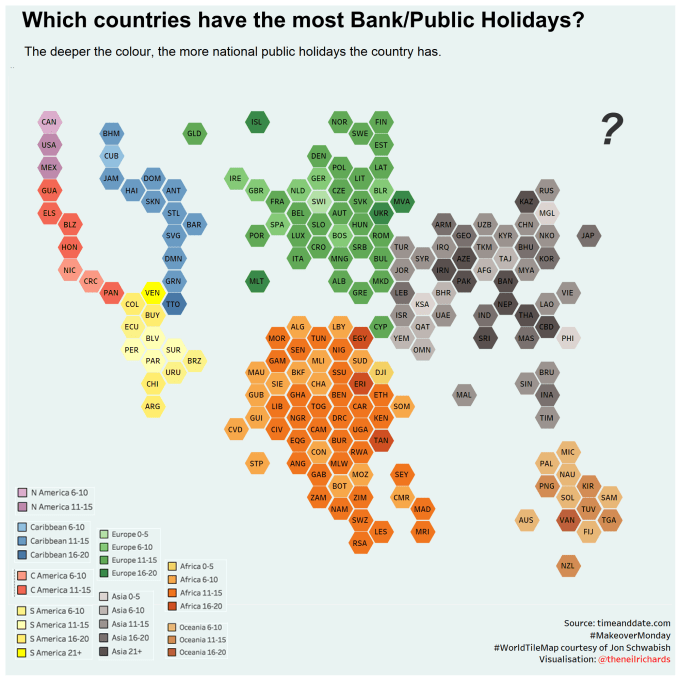
I was particularly keen to include continent colouring, to assist with geographical recognition. After all, North America has shrivelled into one corner, Asia is distorted through the great variety of country sizes (not least Russia) and the island areas such as Oceania and the Caribbean show more like land masses. The continent colouring is, I think, a nice visual aid. But the feedback I got from this first version was understandable. How can you compare across continents? You can’t tell if a particular shade of green is equivalent in darkness to red, blue, grey or yellow. The legend is of use but only a limited use, and cross-continental comparison is impossible.
I admit I haven’t paid too much attention to the analytical possibilities of the chart, but the criticism is 100% valid. So I reproduced the chart in one single colour, with the following result:
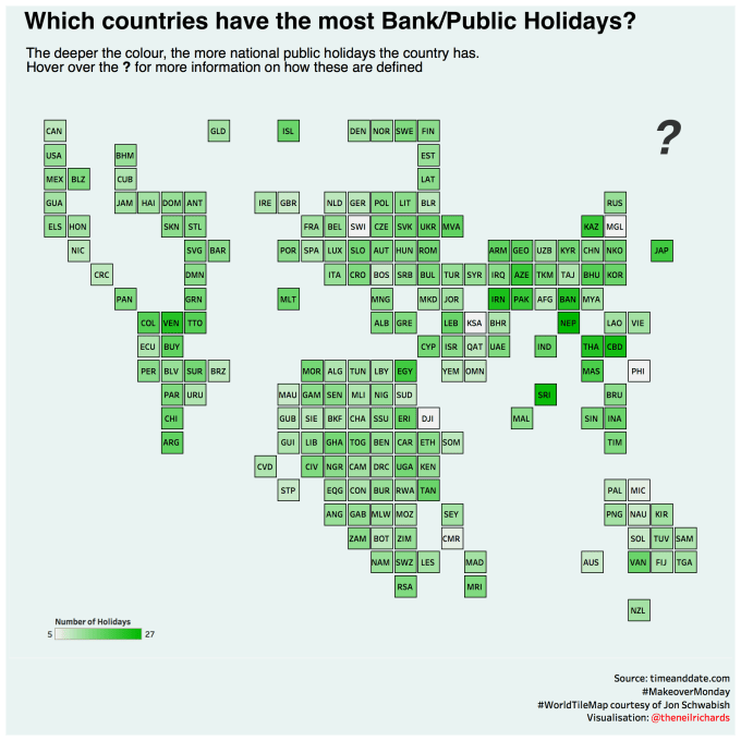
Probably analytically better (it’s still hard to tell steps in gradient, but at least is consistent across continents). But I don’t think it’s as aesthetically pleasing, and it’s a harder to find where one continent ends and one begins. Without colour coding, then, for example, North/Central America and the Caribbean are not intuitively obvious.
In the end, I submitted both for discussion and feedback, and not surprisingly had a few opinions in favour of each version. It’s probably fair and understandable to assume that at least some of those who didn’t offer an opinion didn’t particularly think much of either version. In submitting the #MMVizReview hashtag, I volunteered for a public review (via webinar) from the two Makeover Monday organisers: Andy and Eva. And whereas I was pleased by the overall feedback, I wasn’t at all surprised that one preferred the multi-colour version and one the single-colour version (with both perfectly aware of the limitations of each version too as you might expect)
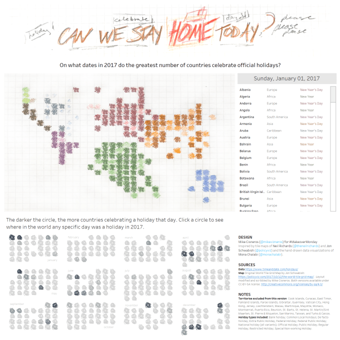
It’s only fair to point out that the discussion, impact and interest generated by an unusual chart type is only secondary to the story-telling and design talent that accompanies any viz. Using the same template and principles, Mike Cisneros produced this beauty:
I still think we can do better – especially those of us without Mike’s talent. Every tile has a maximum of four neighbours in a square tile map, whereas in reality Russia borders 14 countries. Brazil borders 10, France and the Demographic Republic of Congo border nine. Using hexagonal tiles instead of square tiles increases the number of borders between tiles so that a surrounded country borders six others instead of four, so instinctively it feels that it should be a better fit. Here’s my version of the map above using hexagonal tiles:
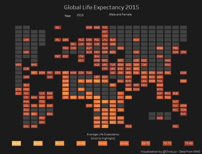
There are still more alternatives. Today Chris Love, using a map from gist.github.com/rbrath/5903399 showed an interesting hybrid approach, using a tile map with approximate land masses behind for context. Chris’ map is here:
As might be expected there are contrasting views as to whether this is clearer or more confusing. Personally I think this is a fascinating interpretation which does its job of clarifying the geography, but takes some understanding at first. My worry with all of these maps and more is that the first mantra of data visualisation is “Know your audience” and I’m conscious that my audience is “People who find tile maps interesting”! There are clear benefits for their use in, for example, UK and US as they have made their way into popular media to show fairer coverage of election votes.
Do let me know your thoughts/feedback on any of the above and I’ll continue having fun with tile maps. It’s likely that no one type will work for all circumstances. I doubt that any of the charts in this post do as good an analytical job as a simple bar chart. But not everyone pays attention to a bar chart that flies past in an article or a twitter stream, and for as long as our visualisations are consumed in such a manner, there will always be a time and place for alternatives.
6 Comments