One of the reasons I love data visualisation and I enjoy producing what I might consider to be data art (many would disagree, but as with all art, isn’t there always the “is that art?” or “I don’t know what’s art but I know what I like” debate?) is the very fact that the same software packages and languages, and many of the same skills, can be used to create either. And while I try to keep my blog tool-agnostic, I make no secret that my own tool of choice which allows me to do this is Tableau.
In producing something more unusual I would always expect the criticism that I might be sacrificing function for form, or impact for insight. And although it’s important to consider, I would counter that it’s just as important as a visualisation designer to consider all the same principles one would otherwise consider for more conventional visualisations.
In designing something more unconventional, for personal projects in particular, I can learn more skills and be more involved in the project, because it allows me to pay more attention to things like colour, form and exact pixel placement. And it’s important to consider explanatory measures such as footnotes or tooltips more than it otherwise would be.
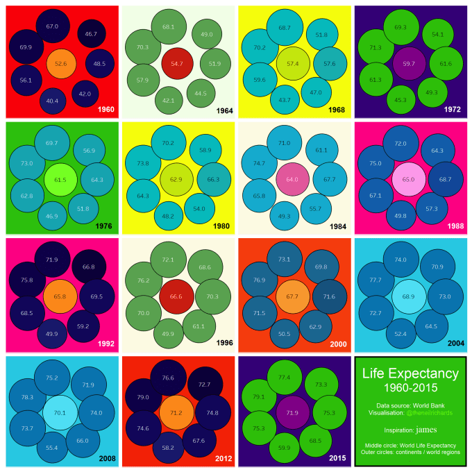
OK I’m being coy about describing what I’m up to – I’ve used the words “unconventional” and “unusual” and danced around the subject of data art. Take this example, created last week, for the Makeover Monday project.
I’ll talk about this specific visualisation in due course, but first I want to talk through my (spontaneous) thought process. The dataset used here was the dataset for the MakeoverMonday project from last week, visualising life expectancy from 1960-2015 for all countries worldwide. A lovely dataset rich in possibilities, I was strangely devoid of inspiration
It wasn’t for the want of trying: I had many potential ideas left incomplete or unpublished – including world tile maps. I could find stories in the data but they were obvious stories that many in the community were finding and presenting in a way better than I could do. Here were some of my rejected first drafts:
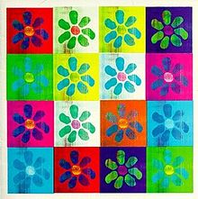
Then Mike Cisneros produced a blog post, entitled “Say Something”. Mike’s post, here, referenced an obscure song by 90s group james to reinforce the importance of a message in the work you post. Needless to say, it’s well worth a full read and not just for the 90s indie-pop references. The accompanying image was one of their iconic album covers, shown here:

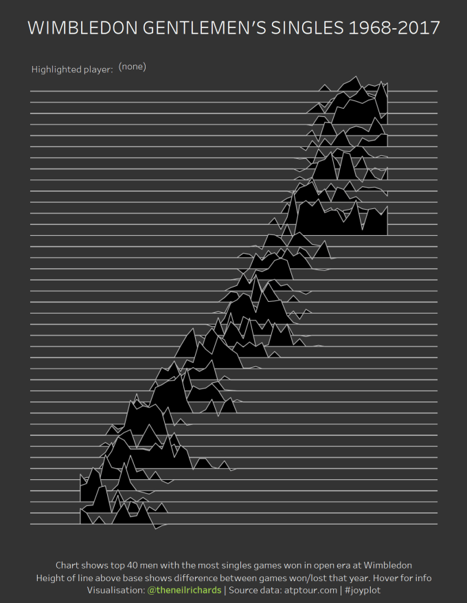
My first thought in seeing such a geometric yet artistic cover (and, crucially, person and photo-free) was a flashback to the viz craze of earlier this year – the joyplot, derived from Joy Division’s iconic album cover. I blogged about this in depth here (including my attempt at a follow-up “Depeche Plot”
Could I use the james album over I just seen as the inspiration for a visualisation? It’s a perfect set up for a small multiple visualisation. I’ve got 55 years of data to visualise, I could do this in a small multiple as 15 or 16 graphs. The flower looks like eight circles – one in the centre with seven surrounding the inner circle. I’ve got the data aggregated to world (centre) and seven separate continents/regions (outside circles).
Bingo! The rest of the exercise was in replicating the colours, designs and layouts, but following data visualisation rules. The circles are not uniform, but instead increase and decrease in area in proportion to expected life expectancy. Of course it’s true that circle area is not as good as bar length and other marks to compare sizes, so this is where the user needs to do more work. But I haven’t (just) done this to have fun and recreate an album cover. I’ve done this for my visualisation to be enjoyed aesthetically, be noticed, be talked about, and stand out. Makeover Monday had 250 contributions last week. There were many beautiful crisp line charts – my own contribution would never stand out from those. But make it a bright green, multi-coloured geometric nod back to 90s popular Brit culture, and it’ll be picked out from the crowd. My trade-off then is to ask the viewer to interact, explore, learn what the flowers mean and read the figures from the tooltips.
Here’s the visualisation again next to the album cover that inspired it.
I enjoyed the recognition of recreating an album cover as dataviz, so I began research of more possibilities for future visualisations. There are a few great album covers, but only a few, which heavily feature colour and geometry at the expense of photography and people. So a bit of googling and rummaging through my CD collection had given me a handful of candidate future visualisations at this point. But then a few other things influenced my choice.
First of all – the latest keynote speech given by data artist Giorgia Lupi (of dear data fame). Her talk was full of ideas that challenge usual data visualisation thinking. After I watched this, I scribbled a few key take out points:
- Design driven data, not data driven design
- Look around you for inspiration, not just at prior data visualisations
- Don’t focus on numbers but what they represent – see through the data
- Blur the boundaries
I love the idea that against all thinking you can let design drive data, not necessarily the other way round. You can still do that while following data visualisation principles, right? This is what I am doing! In looking round for inspiration, I snapped this photo from a shop window (ignore the price tag)

This already cemented the idea I had for my next suitable visualisation. What if there were a dataset with just one dimension (with a lot of categories) and one measure?
The CD cover inspiration for this is from the Pet Shop Boys and depicted in the bottom right corner. The original has 85 squares and a lot of experimenting with Excel and flashbacks to number theory convinced me that I couldn’t actually create an offset 10×10 diamond to show sustainability scores for 100 cities, however hard I tried – all square-based solutions are incomplete or ugly!
Back to the drawing board (literally!) and the solution of extending the original into a more rectangular form fits the 100 tiles in a more regular pattern, and gives the idea of a world map which we are more used to seeing in landscape form. The final deal-clinching idea was to arrange the world cities in approximate geographical order west to east and we not only have a heat map shoe-horned to look like an album cover, but also an art themed world tile map too! As mentioned above, we require the user to do some work in hovering over each square to learn which city each square represents, but the knowledge that we go west to east from Vancouver to Tokyo makes the exploration somewhat intuitive. And it does give us a little extra added insight. The pale pink mass on the left points to poor sustainability scores in the US, and the magenta core in the centre shows strong sustainability scores in west and central Europe.
So I hope this post has shown two things. One, that with imagination and willingness to blur the boundaries, you can have creative fun breaking the mould producing more artistic visualisations using anything around you as inspiration, while following basic principles of data visualisation and showing hints of insight within the data. And two – look at me, I’m doing a fun new uncompleted series of Album Covers as Data Viz (or even #AlbumCoversAsDataViz). If I can’t pimp my stuff here, where can I – blogs are supposed to be vanity projects aren’t they?


2 Comments