Some might say, the question should be “Why …” – and I don’t have an answer to that, other than to describe my thought processes from my last post, on the first day of May, where I set myself this challenge. A visualisation a day, all on the theme of one album.
Did I complete the challenge? Well, I wouldn’t be posting this blog post if I didn’t. Though I fully admit it’s taken almost as long to write this one blog post as it took to create the 31 visualisations. It seems like I needed a rest! You can see below what each of the visualisations looked like.
I also gave a presentation to the Tableau community where I described the process and showcased the project. I’ll try and put the process down in words in this blog post, but you can see the recording of my talk right here – my talk runs from 51:38 – 1:23:00. Coincidentally, that’s a smidgen over 31 minutes for 31 songs in 31 days. It’s also a bit more than a smidgen more than my allocated slot for the event, so apologies again to the organisers for my over-run!
Finally, if you want to explore all 31 of the visualisations at your leisure, the link to explore on Tableau Public is right here
So what did I need in order to start my challenge on May 1st?
It made sense to have a head-start, but as I alluded to before, it wouldn’t really have been possible to start on day one from scratch. I’d been mulling the idea of one visualisation (admittedly not 31), so I already had the data at word and syllable level. Now there was plenty more manipulation (and correction) I would be doing as part of the iterative process during the month, but having the main data file helped me to get started.
I also had the basis of my first visualisation (as posted on May 1st), and a few ideas. Ideas which I had iterated on but hadn’t finished, or didn’t like. I thought that would give me a few starts for future days. It wasn’t going to be easy though. By about day four, I decided I need a plan. What vizzes would definitely go in, and what was the full list potential ideas/candidates? They both added up to 23, and that included a few I really wasn’t happy with. This was going to be a challenge.
What was my process?
I was working full-time throughout May. Lockdown has allowed me, with a 9am start, to have an hour or so to myself before the start of each day, which proved valuable time for scoping of ideas. Whether that time was spent walking the dog, running, or scanning the internet/social media for ideas, often that would be the source of a brand new idea. If I liked it – I’d abandon all other plans/ideas and run with that one, so at the end of the day my work in progress and future plans looked exactly the same, but I had one more bonus viz in the bank.
(It’s a simple message and I’m leaving out the whistles and bells)
The evenings then became the time to finish the current visualisation. As part of doing it, any tangential thoughts or iterations that didn’t quite work but let me down a different path would be kept. This could be the seed of a great idea for later in the project! The crucial thing also was to make sure the viz was “good enough” but didn’t have to be perfect. If I had ideas of interactivity and beautiful additional formatting, I needed to put them to one side.
By the end of each day it would need to be complete, and tweeted out using #31DaysOfFlood so I would meet my challenge. An added incentive was that the band themselves saw one of the early visualisations and retweeted it. I now had a lot more people interested in the project – I really had to finish it!
What rules did I have?
This is something I should have planned from day one, but eventually the criteria fell into place.
Font – I decided on Helvetica Neue throughout. It’s a design style I love, and though it may have ended up predictable, it was important to have a consistent look and feel.
Colour – The difficulty of visualising Flood by song number is there are 19 songs. Nineteen is really too many for a colour palette. I’d already released day 1, where I used a “Hue Circle” palette to circle through bright colours for songs 1-19. It’s a palette that’s colourful and has an element of progression to it, but the downside is that it’s hard to tell between two adjacent colours. However, this isn’t going to be a great analytical project. Having set my precedent to use the hue colour palette, I wanted a consistency throughout, and I’m pleased with the decision I made. Eventually the viewer learns that the album passes through the cyans and greens, through mustards and oranges to reds, purples and darker blues.
Size – My first 8 or 9 visualisations were initially different sizes until I realised the restriction of Tableau Public, where I wanted to display the project as a whole, was that all tabs would allow for the maximum space of the largest tab, thus leaving lots of them swimming in white space. The solution was to find the common size that worked best for the first nine, and stick to it. Hence all visualisations ended up at or around 1500 x 1800 in size.
Functionality – All had to look good (in my opinion) static. The only interactivity I would include would be a tooltip, so that those who could browse via Tableau online could see which word/song etc each data point referred to, but that would be all that would be needed. Again, part of setting an acceptance threshold
What did I learn?
I confirmed that I was designing for a specific audience, consisting mostly of
- Fans of They Might be Giants
- Fans of non-traditional data visualisation – those looking for inspiration, variety and novelty rather than best practice
- Casual browsers – those who may be looking for something interesting and unorthodox
There’s no point trying to please people who are insistent on every visualisation being best practice in a business environment, because there is literally no conceivable situation where a client would want to see words of a thirty year old album analysed in as analytical way as possible that is designed to reduce their cognitive load while allowing them to make data driven decisions based on the information presented before them.
But all of this meant that as well as occasionally eschewing good practice, I didn’t even necessarily have to strive for the technically difficult viz every time. Some of these have a certain amount of skill (which I briefly explain a fraction of in my talk, and for those I don’t cover, every single viz is downloadable from here), but sometimes it was the vulgar, colourful, “out of the box” bubble chart with just minimal improvement that was the most popular.
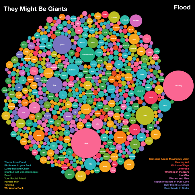
And rightly so. I’m not sure how many of the 31 would get past the strictest viz police, but I’m happy with the choices made. Overall, the audience were enjoying the simplicity, the fun visual element, and most of all, the variety. And, as luck would have it, that’s exactly what I was enjoying too.
Another thing I learned (something I always had every intention of doing) was to use other tools. My background may be in Tableau but there’s no denying that certain chart types are hard work to replicate and not necessarily worth the investment in time. Stream charts, chord charts, dendrograms and custom word clouds all made an appearance, and all thanks to other tools such as RAWGraphs, Flourish and WordCloud.
And it will be no surprise to followers of my blog that I was always looking for inspiration. Some entrants were strongly influenced by other album visualisations (with the blessing of the original artist) or, as is my wont, by album art work. I would continue to advise that before, during, or after any project, always to keep your eyes open for future ideas. I always consider my lack of absolutely original ideas a real weakness, but I try to make up for it in imagination based on existing art, patterns, nature or publications.
What were my favourites?
Let me pick a few …
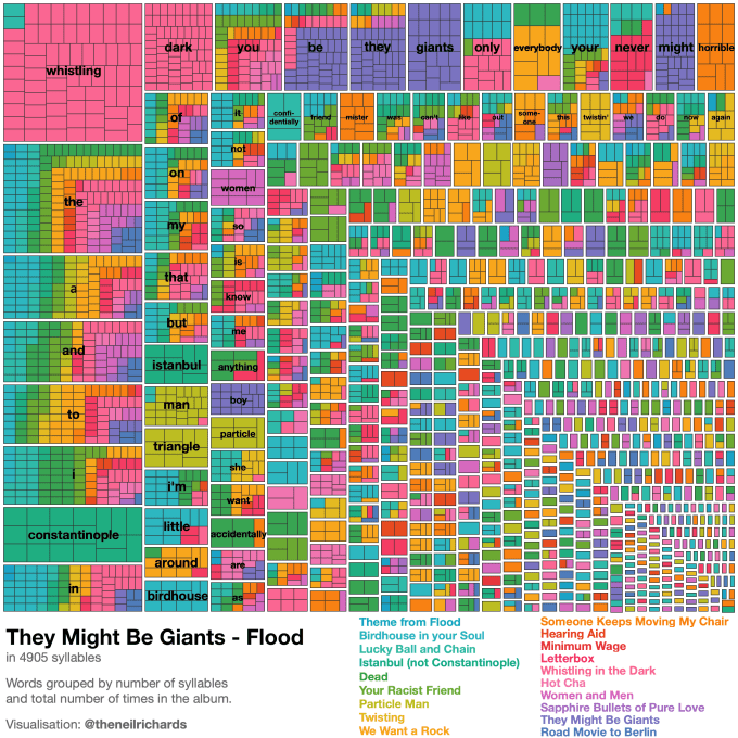
Day 2 – a simple treemap. Well, the treemap is simple, the text formatting is a nightmare, but that’s another story. This was the first to be picked up and retweeted by the band, and gained a lot of traction. It’s garish, colourful, and not overly analytical. But it draws you in and it’s fun to look at if you know the album (see how both Istanbul and Constantinople appear, for example).
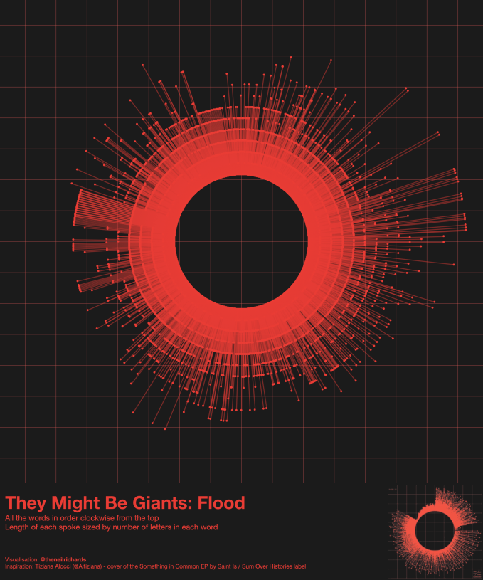
Day 7 – a rare monochrome departure from rainbow coloured visualisations, felt like a simple tribute to the original data visualisation from Tiziana Alocchi
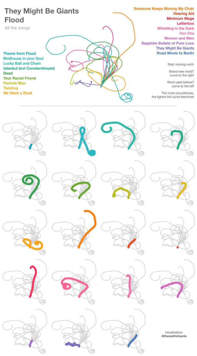
Day 11 – probably my most abstract, told an interesting story of word repetition in songs. It was certainly one of the most satisfying to build, as every tweak in a different parameter or calculation led to a hydra-like monster of different shapes and sizes.
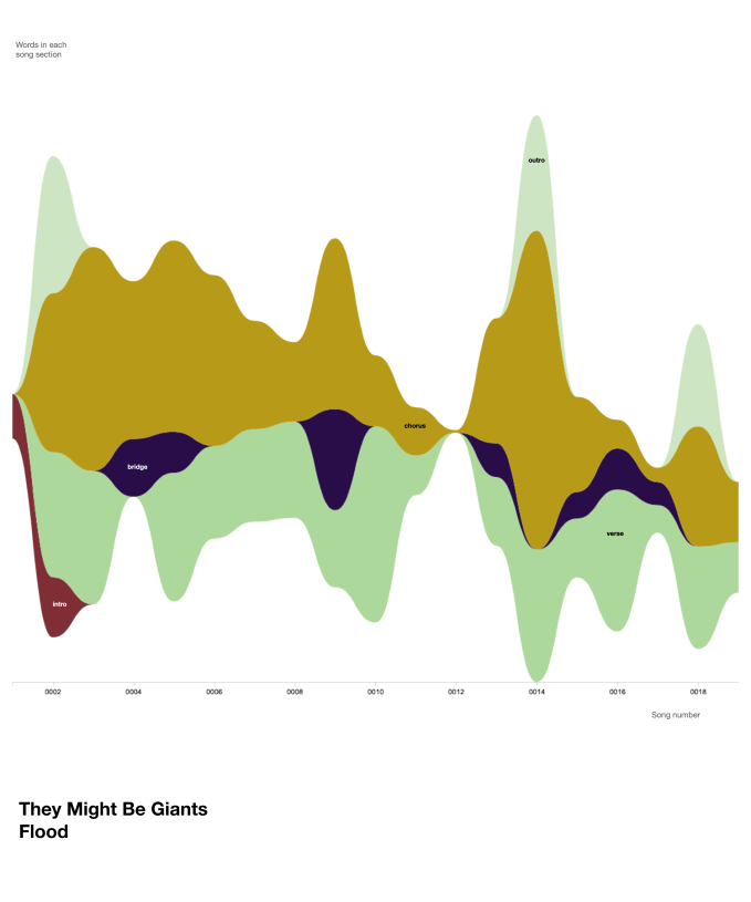
Day 14 – because stream graphs are fun and it was nice to spend so little time (thanks to RAWGraphs) on creating something so eye-catching. Plus it was in a new, Flood-themed colour palette too.
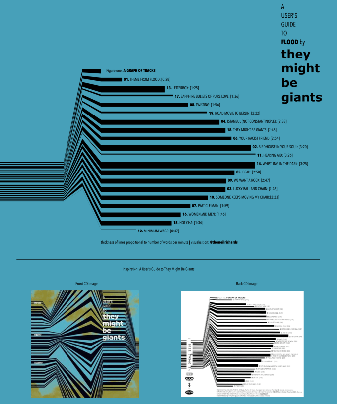
This one (day 15) – is simple but I just really like it. The font, colours, size and general scheme sum up the most common style I was using throughout. And while this is not much more than just a relatively simple bar chart for every song, the visual effect makes this (in my biased opinion) a great and simple poster-style visualisation.
Throughout, many of my favourites are those where, if you know the songs well enough (and by this time, believe me, I did …) you can sing along to each element of the viz and recognise the signature shapes in each one.

It wasn’t till over half way through the month that I had the idea to try an “album covers as dataviz” project that I’ve loved doing so much in the past. And there was no better example than another album by the band themselves – a great example of an idea conceived half way through the project and released the same day!
I just like this one – inspired by Information is Beautiful and a workshop I attended during the month, I never thought I would try a visualisation using their signature colourful curved squares, much less did I think it would make it into this project. But then, on May 29th, with at least two ideas still needed, it came to me …

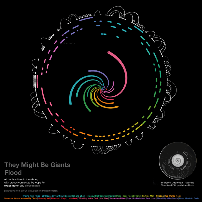
And finally, Day 30, because I’d spent the first 29 days thinking anything inspired by the brilliant OddityViz might not work, or might be too far outside of my skillset. But a re-think, and the bravery to go outside of visualisation software to hand draw elements of the graph, made me see that wasn’t the case.
What were my dislikes?
Surprisingly few!
I wasn’t too keen on the “badge” style visualisations on day 5, they weren’t really abstract enough for my liking. I enjoyed the process and always thought I might improve on that later in the month but never did. So I’m happy to conclude that there are perhaps one or two that didn’t work in quite the way I’d hoped. There was also no way the word clouds were going anywhere other than day 31, as a tongue-in-cheek sign of relief and celebration that the project was over!
In reality though, I started off with two half-done visualisations apart from day 1’s simple start. One of these was a bee swarm chart done in Tableau, either small multiple or all in one. But I just didn’t like it – I had it as a back-up plan, knowing that I wouldn’t love all 31 as much as each other, so I was ready to include it if things got to that stage. But it just acted as an incentive. Instead of “I’ve got to get something new done today, otherwise I’ve got nothing left”, I had “I’ve got to get something new done today, otherwise I’ve got to put out that beeswarm I really don’t like.” In many ways, that was a better incentive! So the main thing I didn’t like never actually got released. And probably the beeswarm was fine, but we artists are fickle folk …
And finally …
So what advice would I have to anyone considering a similar project? I’d just say – put the work in beforehand to get the data you want or need, make sure you have a few ideas before you start, and make sure the topic is not something that will drive you nuts by the end of the month. If you’ve got all these things in place, then just jump in!
3 Comments