As we approach 2018 I want to take time for a quick review before looking forward to the new year. So I’m going to do six highlights of the year, six visualisations of the year and six goals/aspirations for 2018. So that’s six, six and six – put them together and you’ve got 18 for […]
Category: Uncategorized

How do you visualise to a pre-determined design?
This is another post that’s quite difficult to frame into a question, but I want to take the opportunity to show off a bit about my latest album cover themed data visualisation project. After all, it’s a niche (some might say pointless) thing I’m doing, so why not justify it with some writing, pictures and, […]

How was it for you?
One of the reasons I love data visualisation and I enjoy producing what I might consider to be data art (many would disagree, but as with all art, isn’t there always the “is that art?” or “I don’t know what’s art but I know what I like” debate?) is the very fact that the same […]

How do you tile the world?
This post isn’t a strategy debate for the local DIY superstore, but rather a question about tile maps. We’ve seen tile maps for countries, regions and continents (many of my own efforts referenced here) but what about a tile map for the whole world? Before I go too far into this, this isn’t so much […]
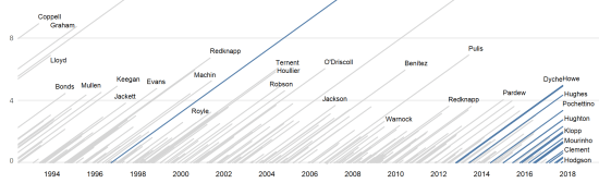
How important is interaction in visualisations? (aka Where’s Big Sam?)
Last week, I saw this visualisation tweeted by Gregor Aisch of a visualisation he produced for the New York Times. I really like the look of this – striking, simple but quite unique-looking. The visualisation aimed to show that Angela Merkel’s latest election victory cemented her status as the longest-serving EU leader and compare her […]

How should you frame the title of a visualisation?
It’s probably not ironic that I’ve changed and rewritten the overall title of this blog post probably a dozen or more times. It’s true that the theme for this blog is that each title poses a question, so that’s a very specific (and probably unnecessary) restriction. But I’ve had many other stabs at this title, […]
So, what’s the point?
Another blog post – another question. But this one might suggest that I’m losing my love of data visualisation. Losing the momentum that drives me to produce lots of work. An introspective question it might be, but don’t worry, it’s not an exasperated cry for help. Let me explain. Earlier this year, not for the first […]

Where is the joy?
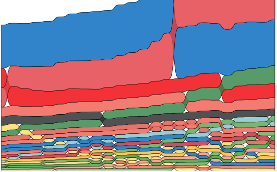
I haven’t gone all contemplative on you for this post, nor am I channelling my inner Black-Eyed Pea, but instead this is a post about the recent phenomenon of the Joy Plot. And it’s fair to say it’s resulted in a bit of a division of opinion. Those who know the derivation of the Joy […]

What is the best choice of background colour?
This week I began work on a Wimbledon-themed viz. I’m sure when I started this blog I had a stubborn determination not to use the word “viz”, rather to use the full term “visualisation” wherever possible. But I have a feeling it didn’t pan out that way, and given my propensity to veer off-topic, anything […]
