I haven’t gone all contemplative on you for this post, nor am I channelling my inner Black-Eyed Pea, but instead this is a post about the recent phenomenon of the Joy Plot. And it’s fair to say it’s resulted in a bit of a division of opinion. Those who know the derivation of the Joy Plot will see what I did there … those who have no idea what a joy plot is but have good recollection post-punk gothic type music from the late seventies might have some kind of confused association going on …
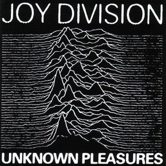
As far as I know, the term “joy plot” has only recently been derived. It owes its name to the iconic cover of an album by Joy Division from 1979 (below)
Robert Kosara has an excellent EagerEyes blog – and in his recent post here, he mentions that the term was coined earlier this month by Henrik Lindberg, with examples here
https://eagereyes.org/blog/2017/joy-plots
It’s hard to give an accurate, exact definition, so instead I’ll give a vague one here:
- A succession of horizontally close-packed area charts over time, usually showing defined peaks
- The lines are sufficiently close together that the peaks overlap/obscure the lines behind (giving a sort of 3D effect)
- Looks a bit like the cover of “Unknown Pleasures”
It turns out that the original artwork was based on radio / magnetic waves from a pulsar star. But I think the recent popularity of joy plots (edit: I deleted the words “explosion in” – let’s not overdo this) is down to a brand new addition of a module making similar chart types available in R.
To explain how I stumbled on to the idea of creating a joy plot, first I probably need to explain that my blog posts are slightly out of order. My last blog post was based around the choice of colour for a tennis visualisation I was planning, and after a long process of obtaining, poring over and cleaning the data, I was left with my finished visualisation. Cue my next post (currently about 25% written) about working with datasets over a longer time in larger projects, and showcasing my resulting visualisation. But as is my wont, I continued to be distracted by other ideas for new projects.
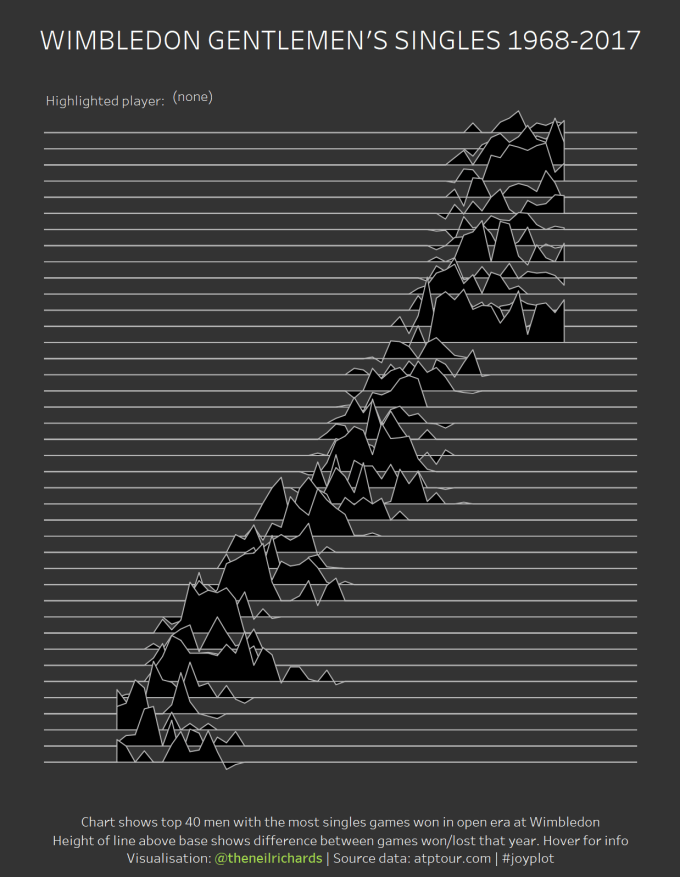
Since my aforementioned tennis dataset consisted of the individual game/set results for every Men’s Singles match at Wimbledon from 1968-2017), it seemed a shame not to use such a rich data source for new visualisations. As will become apparent, my visualisation considers the full dataset of male tennis players and compares the journeys through their individual careers by looking at the +/- scores of cumulative games won. But it doesn’t split the trails into individual lines for each player. What would be a good “small multiple” type way to show this? I began to try one or two things.
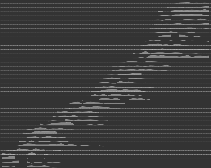
My first attempt (above, not annotated), might be described as a series of sparkline area charts. This shows the years from 1968 to 2017 on the x-axis, and the top 40 tennis players on the y-axis, in terms of total number of wins. Players are ranked in order of debut – Roger Federer is about the ninth player down, showing the thickest area marks over a particularly long career. At this point, I’ve already had the light bulb moment that this looks a bit like the album cover I’ve seen in discussion with the current trend of joy plots, so have deliberately made the chart very minimalist using white marks on black backgrounds.
But this isn’t a joy plot because there’s no overlap. Now it’s important for me to say at this point, that although it seems like stating the obvious, some people might assume I haven’t thought of what come next: I know that overlaps aren’t good. I know that 3D effects aren’t good. If I wanted to get analytical value from a chart, this might not be a fantastic visualisation but it serves a purpose, especially if annotated. But I am interested in discussion, in technically challenging myself, in new styles, in art within visualisation, and post-punk 1980s music, All good reasons to pursue a joy plot.
As might be expected, this needed a bit of thinking “outside the box” – with apologies for the cliche, it required less orthodox processes within Tableau. Once I realised how to overlap the individual lines, I reached a few possible joy plot alternatives: either fully opaque or partially transparent, and with or without grid/zero lines.

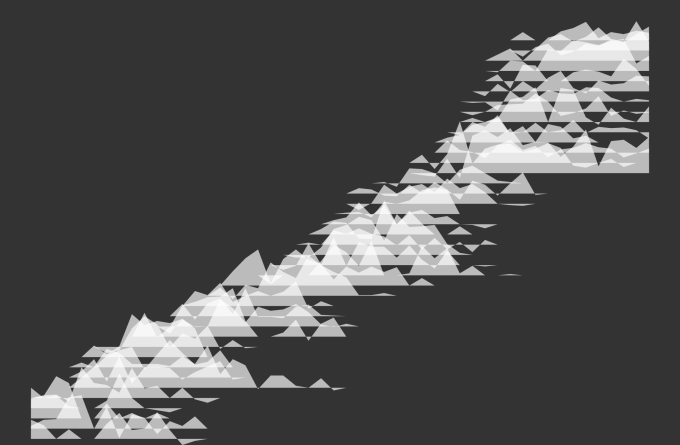

The second and third options here are starting to look quite nice. Option 3 here shows some transparency, allowing all values to be seen (I’m well aware that I’m not showing player names/axis values at this point). Option 2 in particular, from a distance, looks like clouds drifting across the screen.
At this point – a quick (very high-level) technical note on how I did this. From a Tableau point of view, putting player detail on the row shelf will always lead to a non-overlapping visualisation, so the answer lies in plotting co-ordinates. I looked around for some examples and inspiration and found that Bora Beran has recreated the original already. See his blog here and you can download his Tableau dashboard which does that. Looking at Bora’s work, I could see that it was done creating a polygon for each row, with each of the points pre-determined rather than calculated within Tableau. So, I exported the data from my first chart (top forty men only), added some bottom “corner points” and some path indicators to distinguish the polygons, and re-imported to a separate project. Then I just need to offset each polygon by a multiple of the rank, and we’re left with overlapping horizontal polygons. Feel free to download the workbook from my visualisation below for any further insight.
Rightly or wrongly, I decided if I was going to do a joy plot, knowing its aesthetic advantages and its analytic disadvantages, I wanted to go the whole hog and go close to the album cover. I changed white shading to black, and here is the final result. Note that my interactive version adds a splash of colour to highlight individual players, in an admission of the downsides of overlapping trails (click on the image to access the interactive Tableau version).
Its worth noting that, as mentioned at the top of the post, this is absolutely not to everyone’s taste. Bora Beran in his blog faithfully imitating the original Joy Division album cover calls it dataviz art, and that’s exactly what it is. You certainly won’t find this in any instruction textbooks.
Here was reaction from Matt Francis – former Tableau Zen master and one of the people I respect most in the community. Now clearly he’s not overly impressed with joy plots which is both fair enough and understandable. But the point he makes is 100% right!
And here is Andy Kriebel’s response – Head Coach of the Information Lab’s Data School and organiser of Makeover Monday. If there’s someone in Tableau data visualisation you should be paying more attention to, then I don’t know who it is (hint: there’s nobody).
Certainly, I had other similar comments. There were those who appreciated the appeal of the chart but didn’t agree with it. Those who, while grudgingly accepting that I was going to attempt a joy chart, preferred the transparent white cloudlike earlier iterations to the final black version.
So should I just show a bar chart instead to visualise the top 40 men of the open area in Wimbledon? Maybe – the below took me two minutes flat and makes it abundantly clear the top forty winners of games and the dominance of Federer, Connors and Becker.
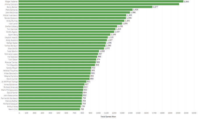
But this won’t be remembered, discussed or explored. Investing time in exploring and understanding a visualisation can lead to a greater understanding and recollection of key information (that’s not an asserted fact, it’s just my own hypothesis, based on how I interact with my favourite visualisation types). Being eye-catching, unusual and fun can be plus points to any visualisation, if used in appropriate situations.
Back to Matt Francis’ question above. To paraphrase – instead of investing so much time devising and iterating on a joy plot, shouldn’t I just consider whether it should be used in the first place (the implication being that because it hides data, that it shouldn’t be)? Well, I’ve done that, and come up with the answer: “yes, it should”.
The key advice that will always be offered when considering a data visualisation is “consider your audience”. Therein lies the answer. If my audience were the general public; if I’d been commissioned to write an article for tennis fans or newspaper readers; if I were writing a report showing findings of my research of 40 years of results, there’s no way I’d create a joy plot. I’d probably spend time making the above bar chart look slightly prettier, include that, and move on.
But my audience isn’t the general non-visualisation consuming public. My audience consists of the following:
- Data visualisation enthusiasts, whether sticklers for analytical best practice or fans of artistic less functional projects
- Blog followers, many of whom enjoy a debate on pros and cons of various methods
- People professionally interested in a variety of visualisation techniques and chart types
- People who know what I’m like, and who enjoy my, still novice, foray into data visualisation
So, I make no apologies for my joy plot. It hasn’t brought joy to everyone, but despite some of the constructive criticism above, some of you loved it, and I thank you for it!
Of course, the sensible thing would be to leave it there. After all, I’ve got personal projects to consider, not least an out-of-sync tennis blog post to complete. But, being me, I stumbled upon Henrik Lindberg’s next idea and couldn’t resist Depeche Plot, anyone?
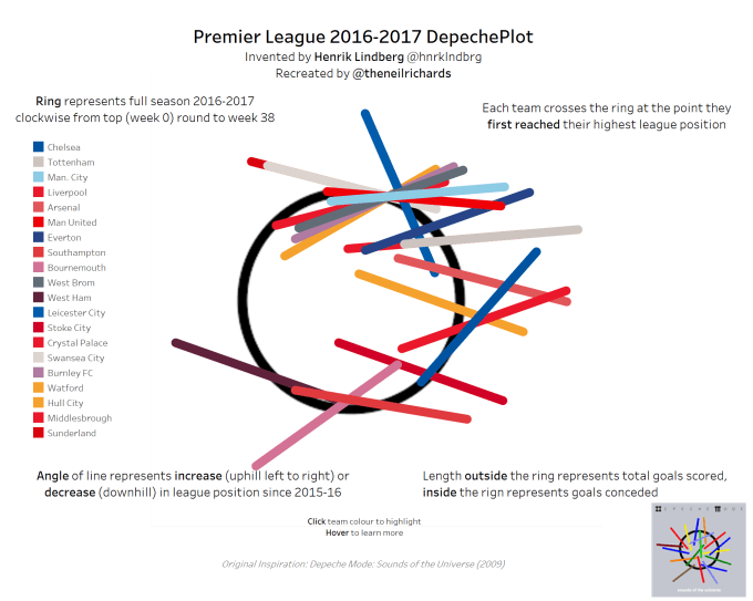
Of course this also has its faults: it’s possible for a line to cross the circle twice, becoming a chord, for example. And although it’s explained with annotations, it’s not going to be a particularly intuitive chart. But, like my joy plot, it’s possible to explore more and find out everything necessary by hovering and examining tooltips. It’s imitating album art, contains genuine explorable data, and is fun. And yes, I’m wondering if there are any other album cover data art possibilities. Why not?!
I’ll continue to find joy in as many ways I can visualising data. Even if it means looking beyond best practice bar charts!

6 Comments