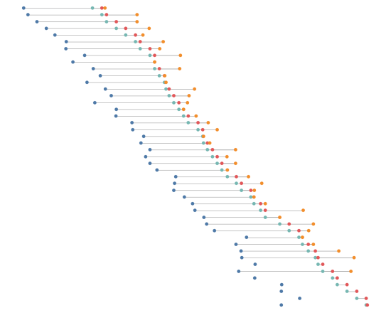
The inspiration for this post, and for the visualisation(s) accompanying it, comes from two places. One, from my last post, where I considered the importance of white space – when considering every text element, does it really need to be there? The other inspiration was from the latest work from Nicholas Rougeux below: The original […]
Author: Neil
Is white space always your friend?
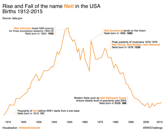
Today’s blog post focuses around a visualisation challenge set by Cole Knaflic, author of the seminal work Storytelling with Data. This year she is setting a monthly challenge, with the first challenge set out here The challenge is simple. Using any data you care to source, create (and share) an annotated line graph. As is […]
What are my data visualisation goals for 2018?
I’ve just gone and added the words “data visualisation” to the title – nobody here knows that I need to eat less and exercise more (though it’s true). I’ve decided to think about my goals because (a) it gives me a focus to look back on to see if the year, and my progression in […]
What were my favourite visualisations of 2017?
As promised, part two of my review of 2017 focuses on my favourite six visualisations I created in 2017. I’m not overly comfortable about self-promotion and am having second thoughts about showing these, but I think it’s inevitable that blogs should be a combination of learning, sharing and self-promotion so as to get the maximum […]
What were my highlights of 2017?
As we approach 2018 I want to take time for a quick review before looking forward to the new year. So I’m going to do six highlights of the year, six visualisations of the year and six goals/aspirations for 2018. So that’s six, six and six – put them together and you’ve got 18 for […]
How do you visualise to a pre-determined design?
This is another post that’s quite difficult to frame into a question, but I want to take the opportunity to show off a bit about my latest album cover themed data visualisation project. After all, it’s a niche (some might say pointless) thing I’m doing, so why not justify it with some writing, pictures and, […]
How was it for you?
One of the reasons I love data visualisation and I enjoy producing what I might consider to be data art (many would disagree, but as with all art, isn’t there always the “is that art?” or “I don’t know what’s art but I know what I like” debate?) is the very fact that the same […]
How do you tile the world?
This post isn’t a strategy debate for the local DIY superstore, but rather a question about tile maps. We’ve seen tile maps for countries, regions and continents (many of my own efforts referenced here) but what about a tile map for the whole world? Before I go too far into this, this isn’t so much […]
How important is interaction in visualisations? (aka Where’s Big Sam?)
Last week, I saw this visualisation tweeted by Gregor Aisch of a visualisation he produced for the New York Times. I really like the look of this – striking, simple but quite unique-looking. The visualisation aimed to show that Angela Merkel’s latest election victory cemented her status as the longest-serving EU leader and compare her […]


