This is not a post about colour theory, though colour theory is on my mind due to my current reading matter. If you’re interested in colour theory then I hope you’re keeping abreast of my book reviews this year. They’re all here on this blog under the #bookreview tag and Josef Albers’ legendary book – Interaction of Color – is up next. (Edit: it’s here!)
In fact the title is inspired by a quote I heard from Steve Wexler in a recent podcast interview with Cole Knaflic for storytellingwithdata. In it, he said that collaboration isn’t “me saying red, you saying blue, and us agreeing on purple, that’s compromise.” Rather, collaboration is “the result of the two of us creating something together that’s better than either of us could create separately.”
So this post is about a recent collaboration, or, more accurately, least two recent projects that started as a collaboration.
I was on a Tableau User Group call with Annabelle Rincon, a friend and Tableau Ambassador who loves to create personal visualisation projects. As mutual fans of each other’s style, we’ve often spoken about collaborations but never gone further than speaking about it. On this call behind Annabelle was a beautiful screen featuring birds on branches of trees, and at the end of the call I mentioned in the discussion that the screen seemed like my kind of visualisation – design inspired small multiples – and led to a conversation that we should use this as inspiration for a collaboration at long last. In fact, I knew at this point that the RSPB were about to release data for their annual Big Garden Birdwatch (and had readily available data fro last year), so it seemed the ideal dataset to curate into a bird-themed visualisation.
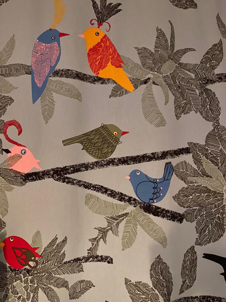
We agreed to collaborate and went in search of ideas. I should say at this point that we didn’t really have a plan of action, just a willingness to get something off the ground at long last, with the context of knowing that, of course, we were both busy. So no timelines, deadlines or anything like that, just a willingness to work together. And our theme was trees and birds.
Around this time I was also reading the Book of Trees – I knew this would be a fertile inspiration. The initial visual had beautifully designed leaves that I wondered whether we could encode with observations from all round the UK. I had an initial explore and came up with something rudimentary and branch-like, knowing that I had already tried something a little similar in the past, as seen in this visualisation snip (from my album project)

Annabelle also looked for some ideas and had similar great branch-like prototypes, both analogue and digital, and to start with we were thinking along the same lines:

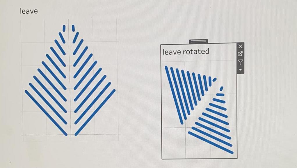
However, unlike me, she can draw beautifully. When we jumped on a call to come up with more ideas, she had beautifully drawn blackbirds, starlings, blue tits and more. I didn’t know if her skill would be a help or a hindrance – being so skilled in traditional art (and me being so unskilled) meant that we were in danger of taking different roles in the collaboration, which wasn’t particularly what I wanted. I didn’t want to leave creation of images to her, and creation of visualisation to me. We wanted to learn skills from each other!
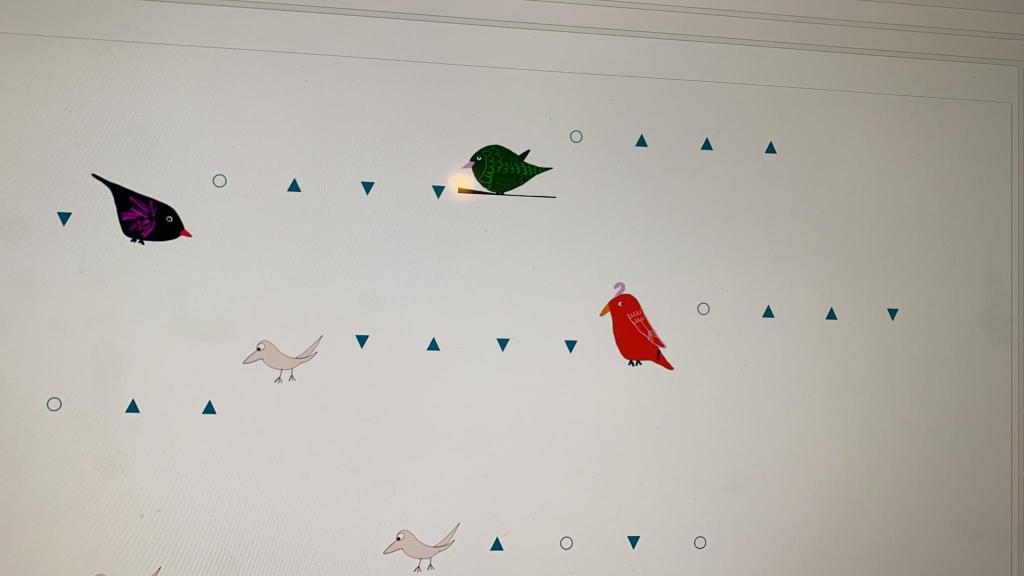
We knew that we wanted to do a visualisation in “my” style, perhaps geometric and inspired by nature, focusing on the idea of trees and branches, but whereas I am always keen to disaggregate, Annabelle’s drawings were perfect for looking at data at a species level. Nevertheless, while we still looked for inspirational ideas, she found this beautiful tessellation from Alli Torban which we both felt would be a perfect inspiration.
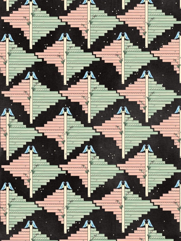
The tessellation led to the idea of creating angled bar charts. Critically, the RSPB release data featuring the current year and the previous year, so this could be a perfect inspiration. We had data at county/local authority level, so I felt the pull of a familiar idea from my own favourite chart types, from my comfort zone. What if I designed a tile map and then tessellated the bar charts?
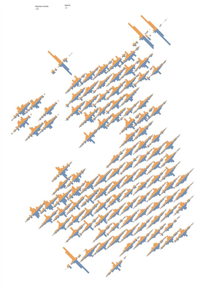
My first attempt was over-complicated, introducing a rotation that in the end I decided was unnecessary, and detracted from the tessellation idea. But I saw enough of a story in larger bird numbers and wilder variations around the coastal islands, that I was convinced this was the route I wanted to take. Annabelle’s ideas were taking shape too – this looked amazing when it arrived on my phone and far beyond anything I could contribute to with my own skills.
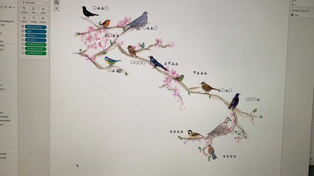
I feel like we were both pushing and inspiring each other, but not to come up with a solution we could work on together, but rather to refine our own ideas using our own styles into better visualisations. As I honed in on a UK tile map in the style of Alli’s tessellation, Annabelle knew that her earlier prototypes and personal bird sketches were taking her in her own direction. Using the illustrations to show beautiful minimalist visualisations around each species, with space and position in a branch-like style denoting popularity, her idea was finalised too. By this point it was pretty obvious that there was only one solution to our collaboration that had started with best intentions … two separate visualisations!
Ideally, as a collaboration we really needed to have set more rules – let’s both work on this, let’s brainstorm that, let’s catch up and share on a call at this time. We might not have done that very well, but what we did do is double the pool of ideas across both visualisations before agreeing to go our own separate ways. You could say that we failed as a collaboration. In some ways, that’s true – to use the analogy of Steve Wexler’s quote above, we didn’t come up with something together that was better than we could have created separately. But four great advantages came from this:
- By starting off working together, we both gave each other the impetus to start a new project we otherwise might not have done
- We inspired each other to keep improving
- Even when we knew we were creating different projects, we were both able to critique and offer feedback on each other’s visualisations
- We created a couple of projects that exist as a pair – two visualisations on a common theme. If it’s good enough for Nadieh Bremer and Shirley Wu, that’s a pretty good start!
As a result, after devising my tile map, trying a few different bar chart layouts and combinations, and adding some additional graphics, I was left with the following visualisation showing the distribution of birds in the RSPB’s 2021 Great Garden Bird Watch versus 2020.
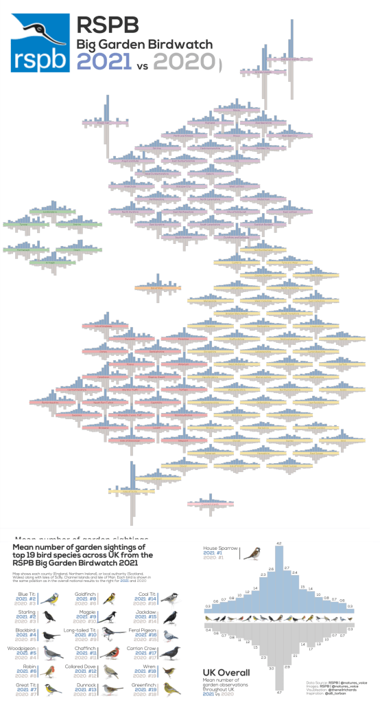
Of course it doesn’t end there. Once released from my geometric mapping ideas, Annabelle was able to take her creations and embellish them to a beautiful visualisation of her own, which went on to win Tableau’s Viz of the Day, quite deservedly. Here’s Annabelle’s visualisation:
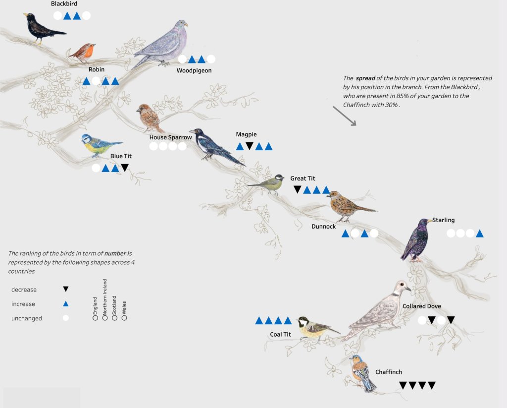
In the end, the result was two quite different visualisations, a complementary pair both visualising the same dataset. We opened up a box of colour palettes, shared and discussed saturations and hues, and settled on my favourite red and Annabelle’s favourite blue. I happen to think they look pretty good by themselves, or as a pair, no purple in sight!