Recently I set about creating a new data visualisation. I don’t think I knew at the time what I was aiming for, but once I’d looked into the data and got inspiration from a few of my favourite sources, it occurred to me that what I was trying to create was a beeswarm chart in two dimensions. Here’s the final image – it was using NCAA Men’s and Women’s lacrosse team data as part of the #SportsVizSunday project.

But is this a two-dimensional beeswarm, and does it work? When I got hold of the data – five year’s worth of stats for a little under 200 college teams (if counting both women’s and men’s), I knew it would be a great candidate to disaggregate the data and look for some patterns or a stand-out story that way. I also wanted something unconventional and stylised – well if you’re familiar with much of my work that won’t surprise you.
My influences were probably two-fold. Firstly, if you read my last post which reviewed Data Sketches by Nadieh Bremer and Shirley Wu, you can see that I’ve certainly been influenced by Nadieh’s Top 2000 viz in style. Leaving aside beeswarm references, it also aided my design choice to go with light and dark grey inner circles to complement the purple and green. I really liked the sloped look, but in fact, it’s actually a traditional beeswarm in one dimension, but the image on the website (below) is angled so that the axis dimension is diagonal – you can see this by following along from 1970 through to 1990. However, tilt your screen (or your head!) and you’ll see this is a simple one-dimensional beeswarm, showing distribution of Top 2000 records in the Netherlands across the decades.

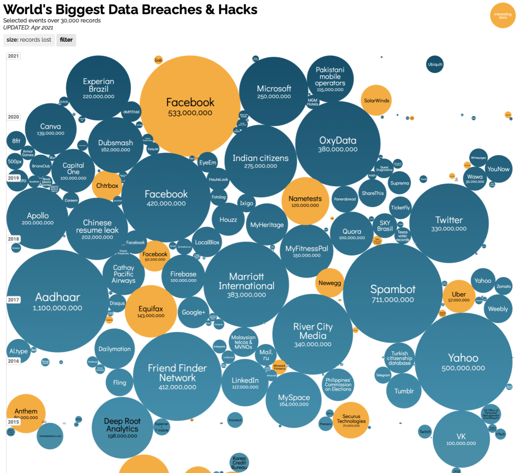
But secondly, it might be that if I’m more interested in the look of the final chart and not so interested in showing distribution per se (which is less easy to show if I am focusing on two metrics instead of one), then could I actually be influenced more by a simple packed bubble chart? In order to find who does these chart types well, you need look no further than Information Is Beautiful. Below is an excerpt from their World’s Biggest Data Breaches visualisation – given that there is a vertical axis (time), I might argue that this sits somewhere between a packed bubble chart and a beeswarm. In this case the bubble size differentials overwhelm the ability to show distribution and the x-axis still has a random feel about it spreading across the full range of the chart, so the circles aren’t “swarming” in the same way as we might expect in a beeswarm chart.
So is my visualisation a packed bubble chart or a beeswarm? My visualisation does show that there is more of a bulge in the middle area either side of zero goal differential, and in the mid range of average goals scored. This is not at all surprising, but it does suggest to me that my choice does visualise distribution. In particular, it does a good job of showing the outliers at the top and bottom of both ranges.
Cédric Scherer spoke about Beeswarm Charts in the excellent series by Jon Schwabish entitled #OneChartAtATime – if you haven’t seen it, it’s a series of bitesize videos featuring experts in data visualisation all featuring one different chart type. (I say experts – have you seen the dodgy English guy they had explaining Line Charts in episode 14? You can see the whole series here and I thoroughly recommend it. But I digress …) In his talk below he describes a beeswarm as a chart that shows all data elements, carefully placing them without overlap, and using just one axis for a dimension variable.
And he confirms that the beeswarm chart is certainly (like its cousin the violin chart or the histogram) a great way of showing distributions, and has the added advantage, as well as showing every discrete data element, of being able to additionally encode using size or colour.
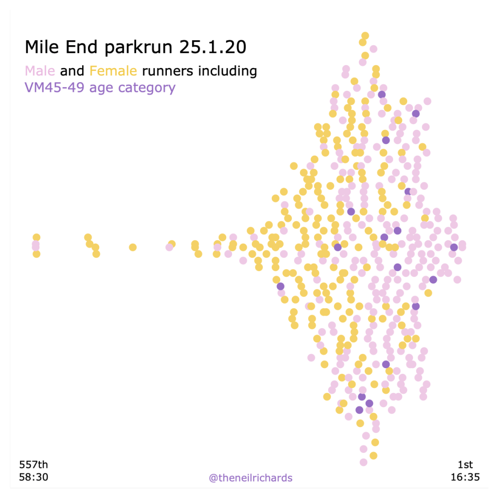
Here’s one simple beeswarm I’ve created in the past, attempting to create such a chart in Tableau (which doesn’t generate this natively or in a simple way at all!). My single dimension is race time, and the beeswarm shows the distribution of runners in each time bucket (with colour encoding for males, females, and old men in their late forties). It shows how one particular old man was significantly slower than others in his age group (I’m sure he won’t mind being called out here …), and also does a good job of showing distribution of finish times overall.
My lacrosse viz also fits this profile if you consider my two visualised dimensions as one combination – I’ve chosen to encode size using average ranking (again highly correlated with the other two dimensions, but still an additional metric of interest), and male/female teams are encoded using circle colour. But, in order for me to get the kind of diagonal beeswarm look similar to Nadieh Bremer’s example above, I’ve introduced two dimensions quite closely correlated. Choosing goals per game versus goal differential gave me that distribution – essentially both increase with better team performance, leading to better teams in the top right and less good teams bottom left. So I’m showing distribution of (goals scored versus goal difference) in beeswarm form.
The animation below shows the circles initially plotted accurately against those axes and the adjustments then needed to get my final visualisation, alternating between the two. The original positioning before packing the circles together is still pretty linear – a quick linear regression test in Tableau suggests that the correlation coefficient (r squared) for women is 0.82 and for men is 0.69 (both of these are high figures that suggest close correlation), so there isn’t too much movement overall to get the final position, but despite that it’s important that the axes are included for guidance only. After all, circles have moved in order to get the final effect, particularly at the lower end of both scales.

Contrast this to a traditional beeswarm, where circle position perpendicular to the one axis is arbitrary only to show distribution, we’re never actually positioning circles to distort or alternatively represent a value.
So, maybe it is possible to have a two-dimensional beeswarm, but it really must only be used as a guidance with caveats, for an aesthetic effect rather than to show exact numbers. I only wanted to show a few findings: (1) NCAA competitions exist for men and women, with more competitive women’s teams than men, (2) On average over the last five years, Maryland has been the best team for both men and women, (3) Yes, it’s a good and obvious yardstick, but actually it’s not necessarily the heaviest scorers, or those that outscore their opponents the most, that become the top ranked team on average.
My choice wasn’t the only way to do this, nor probably the best way, but it was fun to produce and I like the way it looks. What’s more, I’m always happy to introduce discussion around chart choice, aesthetics and principles. This website would be a lot emptier without such discussions!
