The answer to this one is easy – you read Tim Harford’s book: “How to Make the World Add Up” *. But it’s only fair that I give a little bit more of a detailed answer, so this post is a review of the book, first published in 2020. As with many of these books it was a book I have bought on recommendation and reputation and until recently was a book I had not got round to reading. But a chance conversation with Steve Wexler (that’s two shout-outs in two successive reviews for Steve) revealed that he had only read through two books of the genre twice. One was the amazing Factfulness by Hans Rosling, and one was “How to Make the World Add Up”. Since I have also read through Factfulness twice, I could think of no better recommendation. If you want a “tl;dr”, then suffice it to say I wasn’t disappointed.
The tone for the book is set in the Foreword. Billed as “Ten Rules for Thinking Differently About Numbers” it acknowledged the industry classic “How to Lie with Statistics” right from the get-go. Published in 1954 and written by a little-known freelance journalist at the time Darrell Huff, it became a renowned best seller, selling over a million copies. Harford describes it as a master of statistical communication and it calls out means of statistical manipulation with cynicism and great communication. The same year, British researchers Doll and Hill began a wide-ranging work to prove the link between smoking and lung cancer. Convincing skeptical doctors, scientists and the public was not easy, but they wanted to use statistics to save lives – they saw stats not as a means to deceive and swindle, but, in their specific case, as a way to save lives. And so, written in the backdrop of 2020’s global pandemic (which, as I review a year later, is still very much upon us), Harford expresses that his main aim is to persuade us, the readers, to embrace Doll and Hill’s vision, not Huff’s cynicism.
There are ten main sections to the book introducing us to different elements of dealing with data and the different pitfalls, biases and obstacles we might encounter. It did remind me a lot of “Avoiding Data Pitfalls” by Ben Jones (the link takes you to an interview conversation I had with Ben about his excellent book last year) or “How Charts Lie” by Alberto Cairo – and even my recently reviewed “The Art of Data” by David Spiegelhalter, but so it should! Many of these publications were favourably and clearly referenced throughout. The considerations we need to take into account when working with data haven’t changed, and Harford’s friendly writing style introduces us to many of these elements in a different way, full of relevant examples.
To summarise the rules mentioned in the book:
- Rule One: Search your feelings – warns us about biased assimilation or motivated reasoning. Beware how wishful thinking based on personal preference can turn a dubious statistic into solid evidence, or solid evidence into fake news!
- Rule Two: Ponder your personal experience – what should we do if numbers tell one story but day-to-day experience tells us something different? He considers the difference between the “bird’s eye view” of statistics vs “worm’s eye view” of personal experience. In short, both can very well be true
- Rule Three: Avoid premature enumeration – ask what is being counted, what does it mean? A quote in summary is particularly pertinent: “…our confusion often lies less in numbers than in words”
- Rule Four: Step back and enjoy the view – look for information that can put the claim into context, or something that will put the statistic or claim into context
- Rule Five: Get the back story – this went into the concept of publication bias, that essentially “flukes” are disproportionately likely to be published. Look out for HARKing or Hypothesising After Results Known (also mentioned in my Spiegelhalter review) or the backfire effect (people more likely to believe a false claim if they’ve been shown a fact check debunking it!)
- Rule Six: Ask who is missing – a survey or experiment performed on a biased or unbalanced sample can often achieve nothing more than a “very precise estimate of the wrong answer”. And where algorithms are concerned, if they are shown a skewed sample of the world, they will reach a skewed conclusion
- Rule Seven: Demand transparency when the computer says “no” – we are challenged to give the response “prove it”, often “big data” results are less trustworthy than small data, and challenge whether algorithms have been expertly verified
- Rule Eight: Don’t take statistical bedrock for granted – this is an enthusiastic of official government statistical agencies. Though examples exist where they have been less than perfect, they are as close as possible to “statistical bedrock”
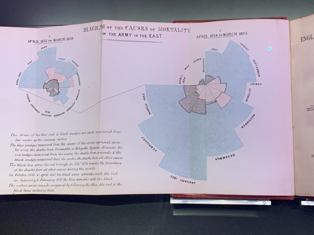
- Rule Nine: Remember that misinformation can be beautiful too: it’s the dataviz chapter! Probably most familiar to me and you, this blog’s readers, examples of how data visualisation can deceive or show misinformation. The chapter introduces us to (and champions) Florence Nightingale’s work but gives many examples of those on the “wrong side of history”.
- Rule Ten: Keep an open mind. Contrasting the life work of economists Keynes and Fischer, we see how it is inevitable that we make mistakes when we don’t believe what the data is telling us.
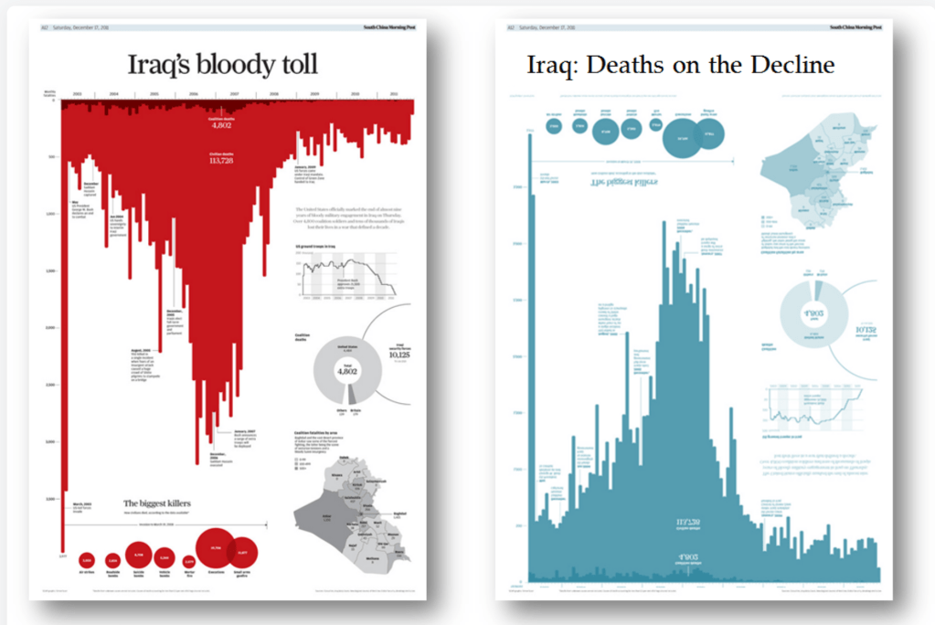
Returning to the chapter on data visualisation – I’ve shown Andy Cotgreave’s seminal re-working of “Iraq’s Bloody Toll” above, which if you’re not familiar with it, is definitely worth reading about on his blog, how orientation, framing, colour and font choice can almost completely reverse the story a visualisation is trying to tell. But it’s also worth calling out Florence Nightingale’s coxcomb/rose visualisations. Below is my own photo, taken at the Science Museum in London, of Nightingale’s viz, which has survived only as a fold-out appendix/frontispiece in a book on the Crimean War by Harriet Martineau, in order to get her visualisation in front of as many eyes as possible, the “vulgar public”.
And Harford continues to champion Florence Nightingale in his Cautionary Tales podcast here https://timharford.com/2021/03/cautionary-tales-florence-nightingale-and-her-geeks-declare-war-on-death/
Crucially, though there are ten “golden rules” there are eleven chapters in the book. The eleventh chapter in the book summarises the first ten chapters with the chapter heading “Be Curious“, an underlying principle of each of the first ten chapters. It’s these two words that summarise the recommended ethos when working with data, reports and statistics. And the very last short paragraph on the very last page resonates perfectly with this blog. Ask questions!

I recommend this book as worthy of reading the whole way through. And, if you wanted to make a rare exception and read it through twice, I would absolutely understand why.
*The book is known as “The Data Detective” in the US.
