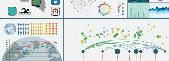
This question might be a pretty broad subject, and a pretty ambitious one to answer. But in fact, the answer is simple – you read “Better Data Visualizations” by Jonathan Schwabish. This post is a review of that book – recently released with the subtitle: “A Guide for Scholars, Researchers and Wonks”, continuing my series […]
Recent Posts
How do we visualise branches of knowledge?
This question is answered by the subtitle of “The Book of Trees” by Manuel Lima. I’m reviewing this as part of my 2021 project to review 20+ books on my shelves – a combination of those that are unread, and those that are brand new. For me, The Book of Trees falls into the first […]
How do you build inspired analytics communities?
This is the question that Eva Murray’s latest book “Empowered by Data” aims to answer. And it certainly does that. Eva’s book is the latest in my list of books to read and review throughout 2021, but in many ways it’s an “odd one out”. It’s probably least relevant to most of my ambitions in […]
Are beeswarm charts possible in two dimensions?
Recently I set about creating a new data visualisation. I don’t think I knew at the time what I was aiming for, but once I’d looked into the data and got inspiration from a few of my favourite sources, it occurred to me that what I was trying to create was a beeswarm chart in […]
What are Data Sketches?
In my quest to review as many data and design themed books as possible during 2021, I will be mixing books I have owned but not yet read with brand new books as they are released. One such book that I have been really excited about is Data Sketches, by Nadieh Bremer and Shirley Wu. […]
How do you make the world add up?
The answer to this one is easy – you read Tim Harford’s book: “How to Make the World Add Up” *. But it’s only fair that I give a little bit more of a detailed answer, so this post is a review of the book, first published in 2020. As with many of these books […]
Why is data visualisation so important in society?
One of the hardest parts to write about this particular blog post was the title. In the end, I’ve gone with my chosen title to make it clear that this is a book review of “Data Visualization in Society” – a book formed of a collection of data visualisation essays and edited by Martin Engebretsen […]
What are Truchet tiles?
In January, I was inspired by the amount of generative art being produced, in particular on my twitter feed. The hashtag #genuary2021 was full of examples of generative art, with each day having a different “rule” to inspire their participants. It’s hard to pick a favourite given there were 31 days’ worth of contributions from […]
How can statistics help us understand the world?
This question forms the perfect title for this blog post, since it is the first question on the back of the book “The Art of Statistics: Learning from Data” written by Sir David Spiegelhalter. I first learned about David Spiegelhalter when I watched his keynote at the UK Tableau Conference in London in 2017. His […]


