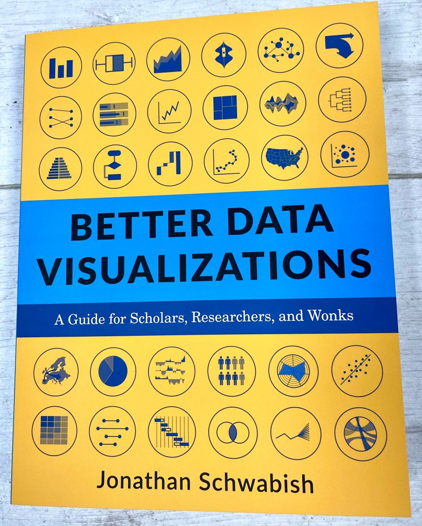
This question might be a pretty broad subject, and a pretty ambitious one to answer. But in fact, the answer is simple – you read “Better Data Visualizations” by Jonathan Schwabish. This post is a review of that book – recently released with the subtitle: “A Guide for Scholars, Researchers and Wonks”, continuing my series of book reviews throughout 2021.

First before I get into the book review at length, I want to start off with one thing I really like about the book and one thing I don’t like. What I don’t like is the subtitle. The book is packed full of content and detail that makes it clear that the guide is not just for scholars, researchers and wonks, but a guide for everyone who wants to be a great (or better) data visualisation practitioner. Clearly that is the author’s background (and, to be fair, it is also, to some extent, mine as well) but I would worry that it undersells the book and its overall awesomeness. Jon’s first book is “Better Presentations: A Guide for Scholars, Researchers and Wonks” and the continued theme belies the fact that the knowledge contained is useful for anyone who works with data. And that, these days, is everyone! I don’t have a copy of his first book as I had initially thought the target audience was too specific, but will now make plans to rectify that.
And the thing I really do like about the book? That’s easy – page 39. What an incredible and unrivalled display of functional yet beautiful data visualisation. I can think of no better example of the example of adding annotation to a graph – once I’d seen that graph I was absolutely hooked on this book. Why so effusive? OK, I admit – the graph is mine, originally published in this post from a few years ago. It’s a huge honour to be a tiny part of this book and I make no apology for re-showing the graph again below. A reminder that even I can keep it simple and follow best practices sometimes! It also means, for the sake of full disclosure, that I was fortunate enough to receive a free copy of the book from Jon (though I’m under no obligation to review, of course), and because I know Jon, that’s why I refer to him as such throughout, rather than Jonathan, as listed on the book cover.

The first thing to say about this book is that it’s so beautifully produced and a pleasure to own and read. That might seem a strange thing to say, but you really notice the high volume of glossy full colour images. This is important for me in a data visualisation book, and something that not all books prioritise. The book is divided logically into three sections: Principles of Data Visualization; Chart Types, and Designing and Redesigning your Visual. And the main thing of note is that these sections are far from equal in length. Although the three sections make a logical journey through the book and progression through principles of designing and creating a chart, the main emphasis of the book is on the middle section.
This book identifies, demonstrates and explains just about every chart type (I’m sure most readers at this point will know that this isn’t necessarily a finite selection – but this is about as exhaustive as possible without veering off into xenographic territory) but it resists the temptation to be concise in order to level up the section size. Instead, every section will be given the space it merits, often with the use of varied examples. For example, within the bar chart section, one example is the highly non-standard curved bar chart made famous by W.E.B. Du Bois. It feels important that each chart type, however standard, is covered in enough detail that the reader knows pretty much all the variants available.
And, though not mentioned in the book, the book is accompanied by a series of explanatory videos of every chart type, in an online #OneChartAtATime series – the YouTube playlist can be found here. This accompanying series features a different data visualisation expert giving their own view on each chart type, no less than 54 in total. If you’re familiar with this series (or you investigate it now), you will start to get a feel for the full range of content found in this book.
But I want to go back to the start of the book – after the introduction where Jon gives his own journey into data visualisation and specifically working in the government field where he continues to work today, we move into Part One: the Principles of Data Visualization. It’s really refreshing to me to see that while introducing visual processing principles, and before moving on to the obligatory standard principles such as Anscombe’s Quartet and Gestalt Principles, there are a few sentences which, to me, are crucial to include (close your eyes, Tufte and Few!)
Perceptual accuracy is not always the goal. And sometimes it’s not a goal at all.
It could be a bar chart, a line chart, or some other chart type. But if it were, would you be inclined to zoom in closely, read it, and examine it?
Boring graphs are forgettable.
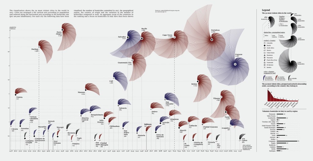
The context of these quotes are in the context of introducing the designer’s thought process when considering their chart choice and considered audience. In particular, the second quote, around “It could be a bar chart …” refers to the below, beautiful, example from Federica Fragapane.

Now I’m a huge fan of Federica’s work and the book does a great job of recognising that visualisation principles related to ease of visual processing, though a hugely important consideration, are just that – a consideration along with everything else. It would be a travesty if the above were never created because it was a bar chart instead! And these visualisation principles are discussed, both in the book and the video series, for every potential chart type, allowing the reader to understand pros and cons in the context of the desired final output.
The principles that then follow this discussion are then divided into five guidelines: Show the Data, Reduce the Clutter, Integrate the Graphics and Text, Avoid the Spaghetti Chart, and Start with Grey. (I’ve tried so hard to use a Z in visualis/zation to be consistent with book and chapter titles, but I draw the line at spelling Grey with an “a”!). Reducing advice to these five topics alone is great advice to anyone looking to improve their chart output and these basic guidelines, along with the perception rules, are a great toolkit to understand the graph and chart types in further detail.
Having mentioned the second, then first, parts of the book, it remains to consider part 3. Part 3, though much smaller, devotes a section to corporate dataviz style guides and a section to chart redesigns. Though overshadowed partly by the bulk of the middle section, the style guide section in particular is something I haven’t seen documented in a book before. Armed with the principles and chart knowledge the book has given you up to now, this is a good primer on how to go about formulating a style guide. As something I’ve been involved with in the past in “real life” – this would have been a great resource to have had available, so I recommend that particular section to those who are involved in setting up such internal standards – a specific area particularly relevant to Jon’s experience and his field of expertise.
And I won’t finish this review without mentioning the appendices – packed full of resources firstly of tools and secondly of data visualisation books. A nice touch which demonstrates the extra lengths the author goes to in order to make sure you have every available resource at your disposal.
I thoroughly recommend this book – much as I loved page 39, you could do a lot worse than read the other 448 info and viz-packed pages too. You’ll have a host of additional tools and knowledge to make better data visualisations than you could before. And that’s the case whether you are a scholar, researcher, wonk, or none of the above!